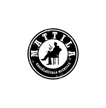
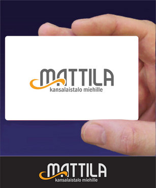
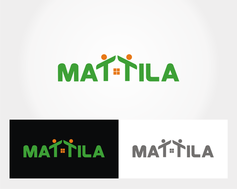
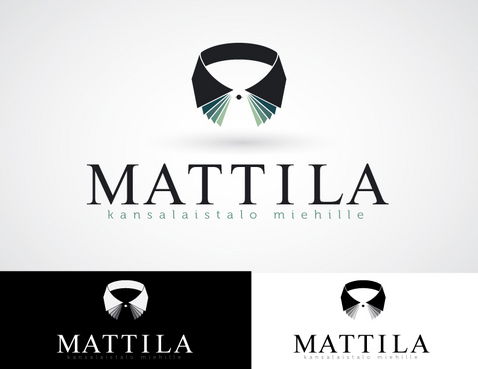
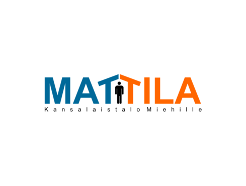
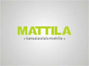
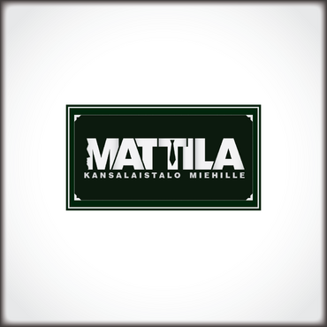
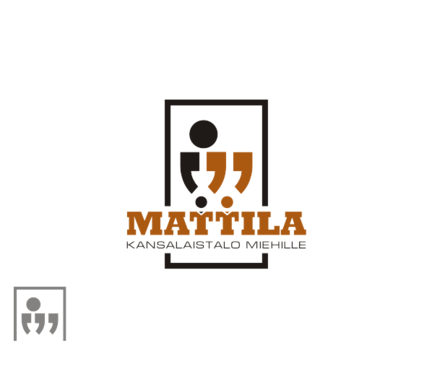
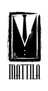
Logo for manly men! Rawr!
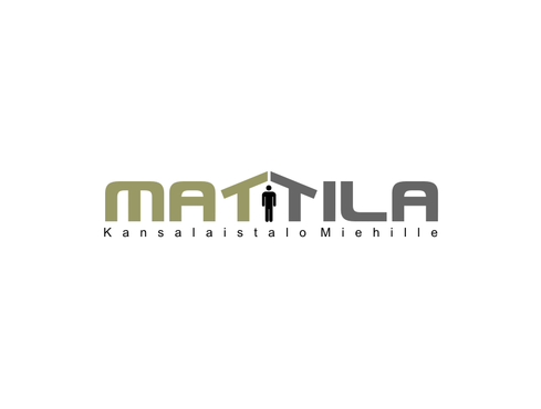
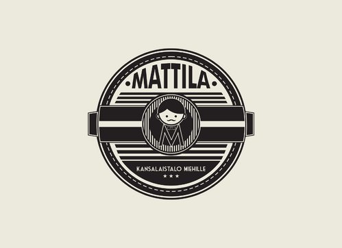
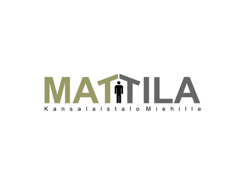
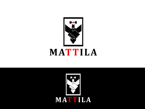
MATTILA
|
Contest Holder
VilleNaa
?
Last Logged in : 3346days17hrs ago |
Concepts Submitted
342 |
Guaranteed Prize
400 |
Winner(s) | A Logo, Monogram, or Icon |
|
Live Project
Deciding
Project Finalized

Creative Brief
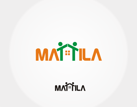
Logo for manly men! Rawr!
MATTILA
No
Mattila is a place for men. Imagine a gentlemen's club where one can relax, talk, play games, read newspapers, drink coffee and just be themselves amongst other men. Kind of a safe haven, if you will. Mattila is part of a non-profit organization that supports all kinds of people.
What is Mattila:
-A place where every man is considered equal. There is no discrimination based on color, religion, age, sexual orientation or anything. In fact any kind of discrimination is forbidden here.
-A place of low threshold. You can visit once a week, every day of a year or something in between. You can participate in activities if you want to (board games, soccer, movie nights etc) or you just can come in, sit down and read newspaper with a cup of tea in your hand if you want.
-A place of cultural exchange. We encourage people of different cultures to converse and as a result reduce prejudices between peoples.
-Free of charge for our customers.
What Mattila is not?
-A gay bar.
-A secret society or an exclusive, selective place.
-Anti-woman place full of chauvinists.
-A political statement.
We’d like the logo to convey the things above what Mattila is. Openness, cultural exchange, certain manliness (not so very serious), a peaceful place. Think cavemen and cowboys, steel workers, stay-at-home dads or molecular scientists. What are the things combining all of these people? Think cigar smoke, white water rafting or a heated battle of Madden on Playstation. Think fellowship, brotherhood and bromances that exceed culture, age or any kind of orientation, be it a spiritual or a sexual one.
It would be excellent if there were some kind of a trick in the logo (perhaps using negative space) that it can be seen in different ways and could have different meanings.
Miscellaneous
Logo Type
![]()
Symbolic
![]()
Abstract Mark
![]()
Illustrative
![]()
Character
![]()
Masculine
Retro
Traditional
Sophisticated
Simple
Casual
Rustic
Not sure.
not sure
Make it cool and restrain from offending any of our customers with your design.
NO swooshes.
NO gradients.
Should work in grayscale also.
http://www.thelogofactory.com/logo-design-articles/what-not-to-do/
Oh, and there isn't that much to see for those of you who don't speak Finnish, but here's our current website: http://www.mattilanmiehet.fi/
Related Contests