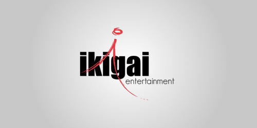
Logo for New Media Company
Ikigai Entertainment
|
Contest Holder
ikigai
?
Last Logged in : 5527days5hrs ago |
Concepts Submitted
126 |
Guaranteed Prize
200 |
Winner(s) | A Logo, Monogram, or Icon |
|
Live Project
Deciding
Project Finalized

Creative Brief
Logo for New Media Company
Ikigai Entertainment
No
We are a start up multimedia production company. The main core of our business is web content that can transition to film or tv. We are a fun company that really enjoys what we do.
Entertainment
Logo Type
![]()
Symbolic
![]()
Abstract Mark
![]()
Cutting-Edge
Unique/Creative
Clean/Simple
Sophisticated
Modern
Fun
Blues, Sliver, but ultimately colors that work best for the design. Should be compatible for use on stationary as well.
2
Would prefer simple, clean, fun, modern, symbols. Should look stunning enlarged on door or corporate entrance way. Logo will also be used for credit roll on various projects to establish brand.
We Like the Blues hues from http://insightmediawerks.com.
Please NO Filmstrips and obvious clipart.
Related Contests