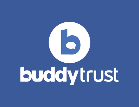
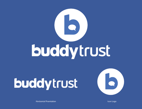
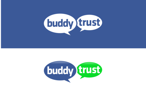
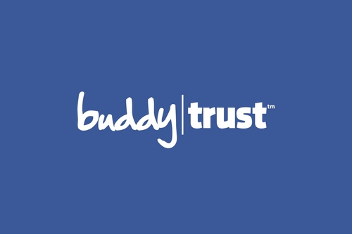
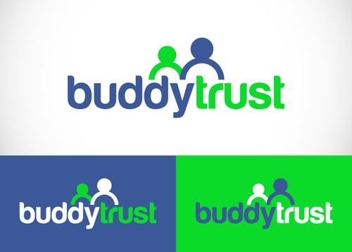
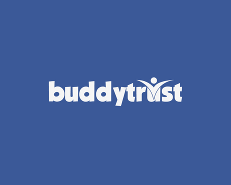
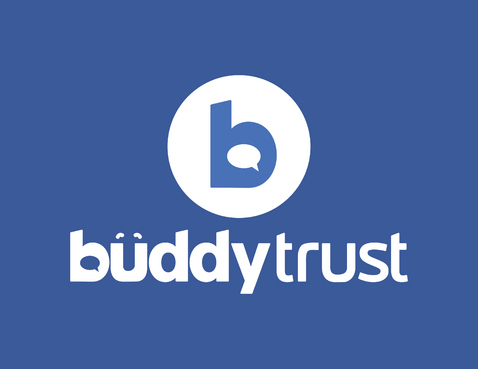
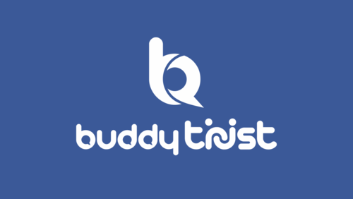
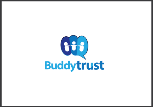
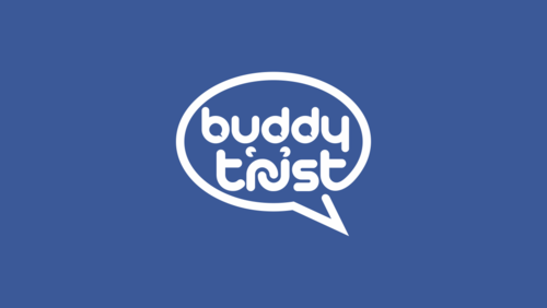
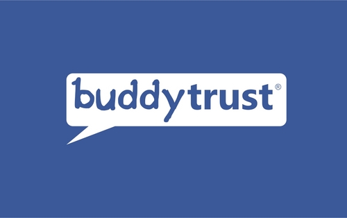
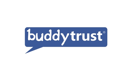
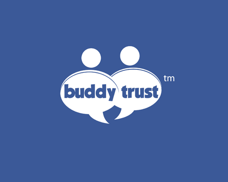
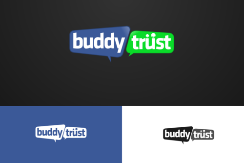
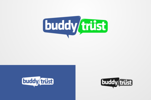
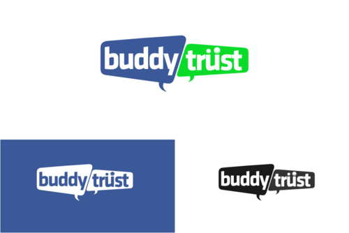
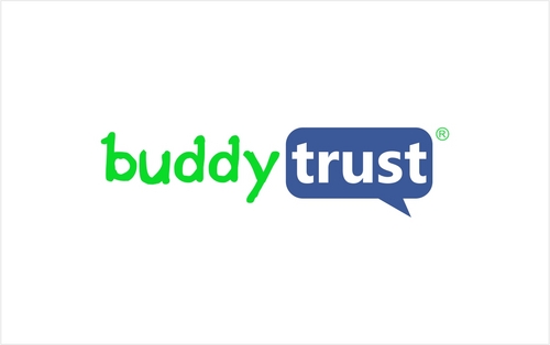
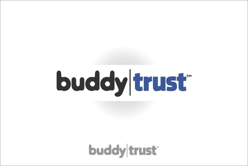
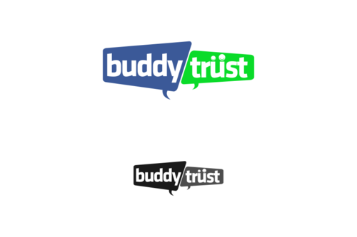
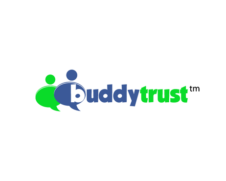
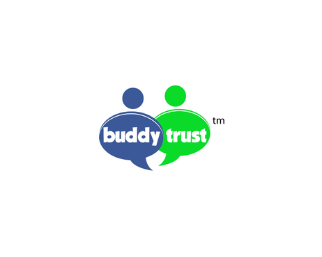
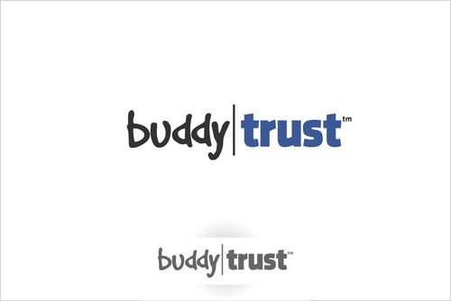
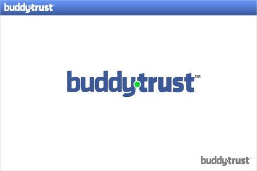
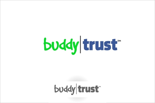
Logo for social media website
buddytrust
|
Contest Holder
chuckedog
?
Last Logged in : 3813days8hrs ago |
Concepts Submitted
246 |
Guaranteed Prize
300 |
Winner(s) | A Logo, Monogram, or Icon |
|
Live Project
Deciding
Project Finalized

Creative Brief
Logo for social media website
buddytrust
No
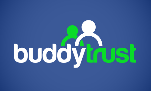
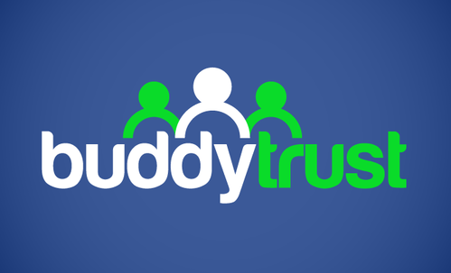
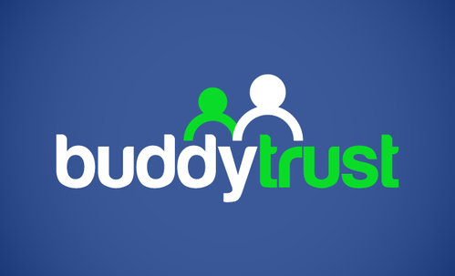
It should be simple and friendly. Main users of this site will be special needs (i.e. Autism) teens/young adults and the friends and family that support them to feel normal. Focus more on the social media aspect of the users CONNECTING in a TRUSTED environment and not the disabilities (i.e.. NO wheelchairs).
Social Media
Logo Type
![]()
Web 2.0
![]()
Youthful
Simple
Blue: #3b5998 and Green: #0adb29
2
a few thoughts: have circles above the letters in the word "trust" that would look like heads and/or heads and arms. see the unum logo for an example. http://www.unum.com. Another thought may be to separate the words "buddy" and "trust" somehow with different colors, vertical line, box shape around one of the words, etc. We like all lower case letters.
Related Contests