SALES / SUPPORT : +1-877-525-5646   |  


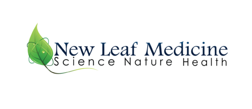
Logo: New Leaf Medicine

New Leaf Medicine

Contest Holder timwalsh ?

Last Logged in : 2786days1hr ago

Concepts Submitted

75

Prize Money
200
Winner(s)

1

A Logo, Monogram, or Icon veildAll design entries are veiled from other designers till the end of the contest. Expedite Expedite Contest
tick_gray

Live Project

tick_gray

Deciding

tick_blue

Project Finalized


Project: Logo: New Leaf Medicine
Industry: Health Logo
Contest Launched: Apr 29, 2012
Selected: 1 winning design from 75 concepts
Winning Design by: AbsolutMudd
Close Date: May 03, 2012


Logo: New Leaf Medicine - Health


Awarded as a winner
Project Report    

Sort by:


#47

#17

#16

#74

#32


Creative Brief


Logo: New Leaf Medicine

New Leaf Medicine

Science Nature Medicine

Yes

I am an integrative medicine practitioner who practices acupuncture, nutrition and functional medicine (western testing, natural treatments). I do educational speaking/workshops as well as clinical consulting. I want the logo to have a marriage of medicine, science and nature. My website is currently : www.tim-walsh.com, but it is going to be redone as part of this project.

Health

Symbolic
Symbolic


Unique/Creative
Clean/Simple
Outdoors/Natural

Green, with blue or brown, or black. Whatever looks good :)

not sure

I have seen a Yin/Yang symbol of 2 leaves that was pretty cool. I also like the plant symbol in Wall-e
Here: http://dapuertorican.deviantart.com/art/Wall-E-Plant-Logos-108828075
I am not married to either of these and I'm looking forward to seeing your creativity and design.

Related Contests


 logo for re-branding new nursing facility
$400
Prize Money
184
Concepts
Logo for a chiropractic health clinic
$199
Prize Money
63
Concepts
Logo for new Rehab company
$275
Prize Money
223
Concepts
Fresh, modern looking logo for Physical Therapy studio
$199
Prize Money
175
Concepts

Discussion


Comments

  • May 03, 2012 9:02 AM
    timwalsh timwalsh
      Project Holder
    Thank you all for the wonderful design work!! I have definitely been recommending this process to others. There was a lot of great work done, I appreciate your time and efforts! Good luck with your future projects, Tim

    Like Icon 0   DislikeIcon 0
  • May 02, 2012 9:27 AM
    SiteAdmin SiteAdmin
     
    Attention Designers, MycroBurst permits you to submit unlimited designs with unlimited variations. However, if you show 2 or 3 different color versions of the same logo in one draft, please make sure that if that draft gets finalized, each color version is separated before final files are sent out. Thanks, MB/LDG Team

    Like Icon 0   DislikeIcon 0
  • May 01, 2012 6:21 PM
    timwalsh timwalsh
      Project Holder
    I would like to see the tagline changed to "Science Nature Health" rather than "Science Nature Medicine" for any new submissions or versions. I like the design element at the bottom of #23. That extra bit of structure at the bottom is great. Xpert, draft #16 is very cool, but kind of too corporate for me. D3zign, thank you for the new renderings. I find them too busy, both the graphics and the leaves over the fonts, but I like your style, the quality of the leaves and lines, and I like the font. Thank you all for your work!!

    Like Icon 0   DislikeIcon 0
  • May 01, 2012 9:20 AM
    AbsolutMudd AbsolutMudd
     
    Project Holder, Please check private message (Top-right link: 'Messages'). Thank you.

    Like Icon 0   DislikeIcon 0
  • April 30, 2012 9:27 PM
    timwalsh timwalsh
      Project Holder
    On draft #7, I like the fonts. The overall design is like 70% science and 30% nature - I prefer a more nature oriented design. If the science/energy component is augmenting the leaf/nature design, that is preferred. thank you.

    Like Icon 0   DislikeIcon 0
  • April 30, 2012 9:16 PM
    timwalsh timwalsh
      Project Holder
    Wow! Great work everyone. My favorites so far are drafts #5, #10 and #14. I was pretty stingy on ratings, so please don’t be offended. On draft #5, I love the depth and color, and the fonts. However, I am a guy and the mauve is a little too feminine. Also, the font, although very cool, is a bit feminine as well. I like the blue design of draft #4 also, but the earth tones I liked a bit more. Draft #10 had the best leaves, cool style, kind of friendly. Very nice. Good depth and use of shadow and light. I like the font – clean and masculine. The Rx in the tagline is too pharmaceutical for my liking. Draft #14 – I like the energy/radiance with the leaves. I am happy to give feedback, so don’t hesitate to ask for clarification. I look forward to picking a design in the next day or two :)

    Like Icon 0   DislikeIcon 0
  • April 29, 2012 6:21 PM
    timwalsh timwalsh
      Project Holder
    Thank you for draft #1. That's a nice design, but I'll need to see more submissions to have a better idea of what I like and don't like. I do know that that font is overused in the Alternative Medicine community. thanks.

    Like Icon 0   DislikeIcon 0