Logo Redesign
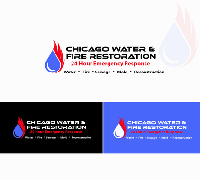
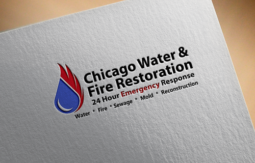
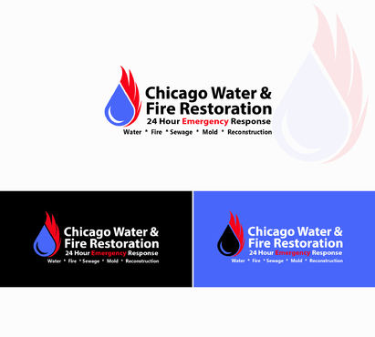
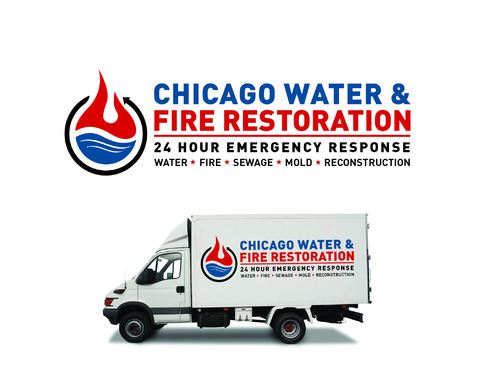
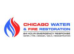
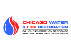
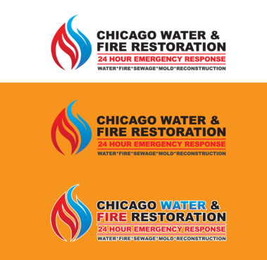
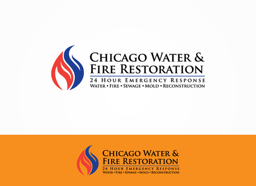
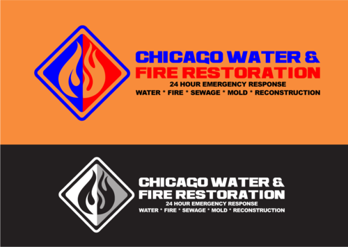
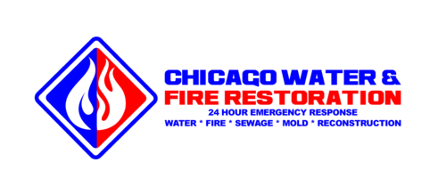
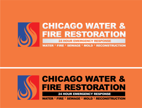
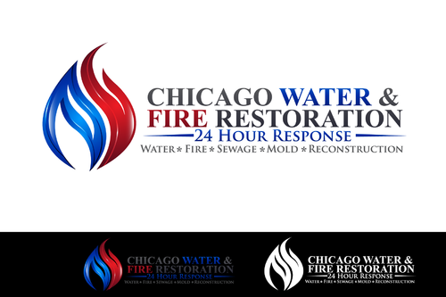
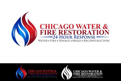
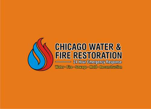
Chicago Water & Fire Restoration (two lines one on top of other separated at end of & symbol)
|
Contest Holder
allied2008
?
Last Logged in : 3628days20hrs ago |
Concepts Submitted
707 |
Guaranteed Prize
700 |
Winner(s) | A Logo, Monogram, or Icon |
|
Live Project
Deciding
Project Finalized

Creative Brief
Logo Redesign
Chicago Water & Fire Restoration (two lines one on top of other separated at end of & symbol)
24 Hour Response (one line under Fire Restoration) Water / Fire / Sewage / Mold / Reconstruction
Yes
www.chicagowaterfire.com/ is our current website.
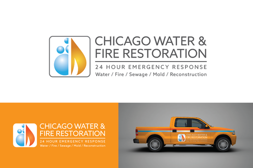
www.chicagocontents.com is the direction we want to move with our logo & branding. We want to simplify the colors or the logo by removing the gradients as well as try with the tag line to help convey what it is that we do a little clearer in order to capture additional business.
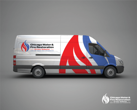
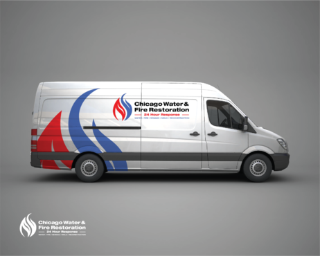
Another big factor is that we need marginally larger & wider letters for our company name to better stand out on our trucks than we have now
Construction
Masculine
Modern
Simple
Professional
Black, Blue, Red
2
Please see pdf upload for a rough design on my idea for how to incorporate all of the elements.
Related Contests


