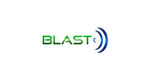
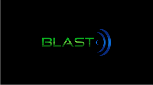
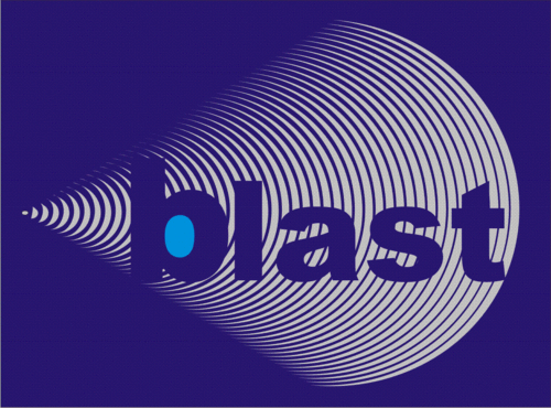
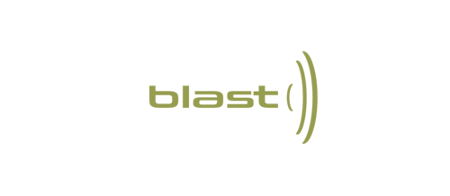
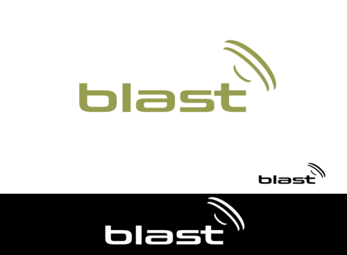
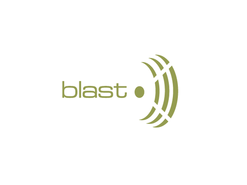
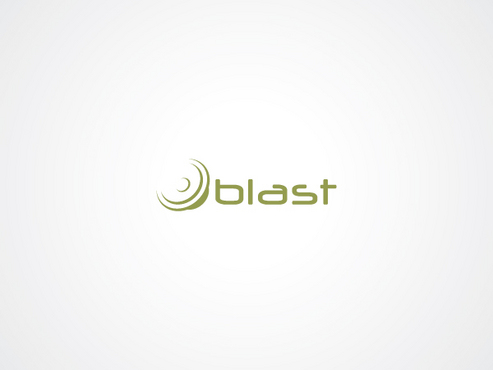
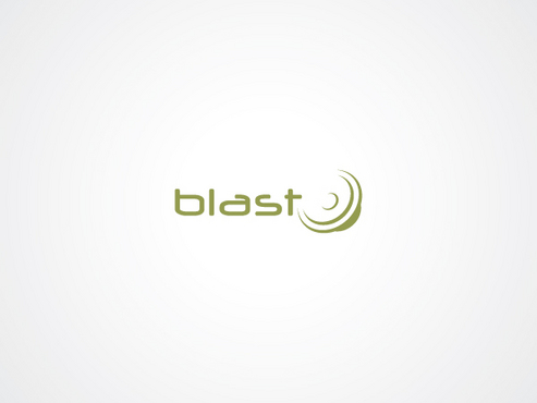
Logo Revision for Audio Postproduction Co.
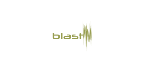
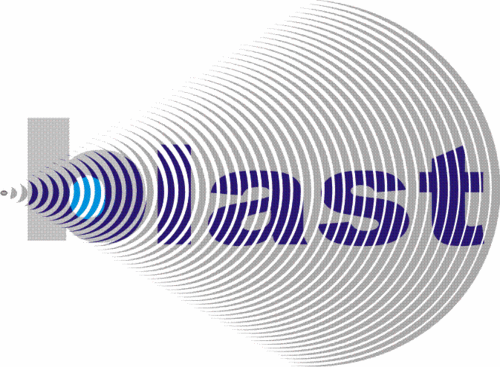
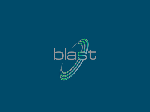
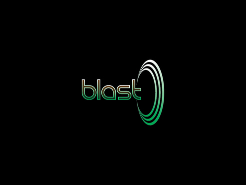
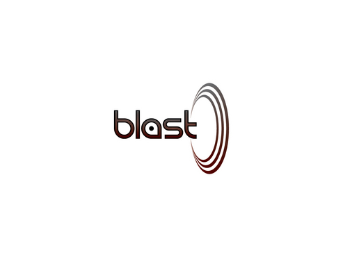
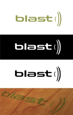
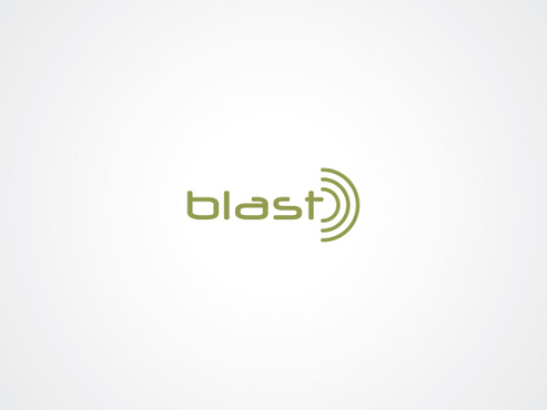
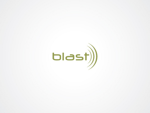
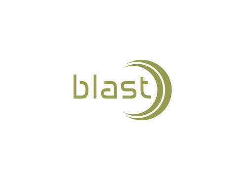
blast
|
Contest Holder
jfoconnell
?
Last Logged in : 3503days16hrs ago |
Concepts Submitted
101 |
Guaranteed Prize
200 |
Winner(s) | A Logo, Monogram, or Icon |
|
Live Project
Deciding
Project Finalized


Creative Brief
Logo Revision for Audio Postproduction Co.
blast
No
Cutting Edge Technology
State of the art
Audio
Abstract Mark
![]()
Modern
Cutting-edge
Sophisticated
Simple
Professional
High Tech
We currently use green, which we like, but would be open to seeing other options
2
I don't think we want to completely change the logo, just update a bit. I would suggest playing with the font, size of the speaker icon, maybe color, etc.
Related Contests