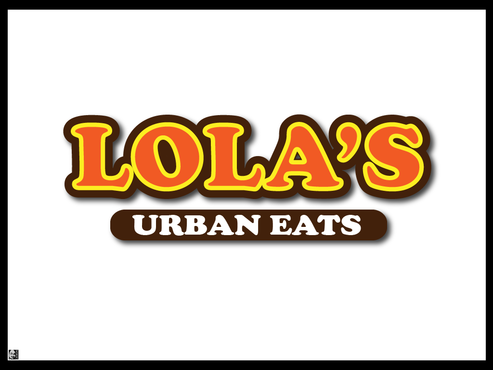
Lola's Urban Eats - Business logo
lola's urban eats
|
Contest Holder
ardethg
?
Last Logged in : 5172days12hrs ago |
Concepts Submitted
219 |
Guaranteed Prize
255 |
Winner(s) | A Logo, Monogram, or Icon |
|
Live Project
Deciding
Project Finalized


Creative Brief
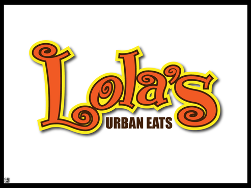
Lola's Urban Eats - Business logo
lola's urban eats
No
lola's urban eats is a casual quick service restaurant with a more upscale product and ambiance than your regular fast food fare. The atmosphere will be contemporary with retro influences with color and warmth. We want the feeling to be fun, vibrant and somewhat youthful. Our menu will consist of our signature salads made to order, grilled and carved meats, amazing fries, gourmet sandwiches and sides - modern comfort food. Great for people pressed for time or for those who want some great affordable fresh flavorful food in a warm inviting and comfortable atmosphere. Our concept has appeal for all market segments but we want to have a younger vibrant upbeat feel.
Food
Logo Type
![]()
Symbolic
![]()
Unique/Creative
Clean/Simple
Modern
Retro
Fun
Youthful
orange, yellow, brown, but not a must have, just a preference
not sure
We like the font style Chalet London 1970, and we like the pinkberry logo style. We'd love to see a star incorporated into the design somewhere. Have fun with it.
Related Contests


