Mann Made Logo
Mann Made Ltd.
|
Contest Holder
EricMann
?
Last Logged in : 607days21hrs ago |
Concepts Submitted
282 |
Guaranteed Prize
300 |
Winner(s) | A Logo, Monogram, or Icon |
|
Live Project
Deciding
Project Finalized


Creative Brief
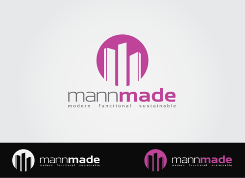
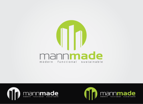
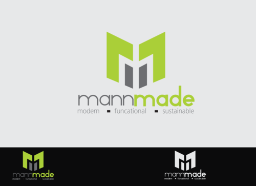
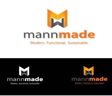
Mann Made Logo
Mann Made Ltd.
Modern, Functional, Sutainable
Yes
We are a design/build interior contractor. We are a team of leading edge innovators; reviving the interiors of residential and commercial spaces. With modern design (green), we create tailor made functional spaces for our clients. We sustainably build with the best possible materials and finishes; while adhering to the budget. We're about quality, not quantity and striving to achieve the greatest finished product!
Construction
Logo Type
![]()
Symbolic
![]()
Abstract Mark
![]()
Initials
![]()
Cutting-Edge
Unique/Creative
Clean/Simple
Corporate
Modern
Fun
Serious
Modern Coloring: Browns, Purples, Greys, Greens, Blue (aqua), black and white
not sure
The tag line is optional. I would like to see a logo with and without.
Related Contests


