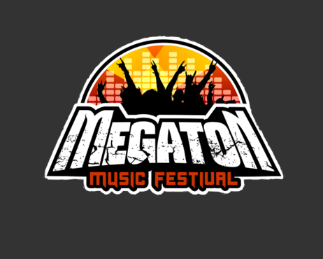
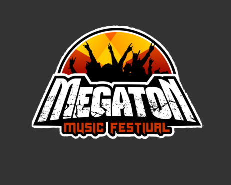
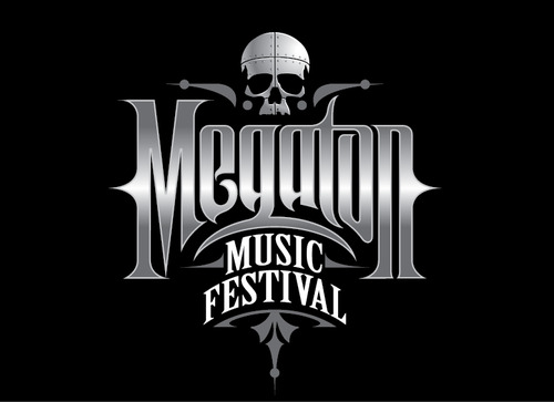
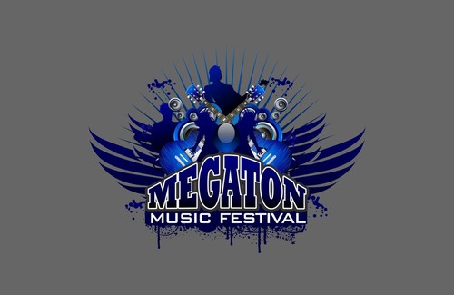
Megaton Music Festival
Megaton Music Festival
|
Contest Holder
sickdis
?
Last Logged in : 3692days5hrs ago |
Concepts Submitted
123 |
Prize Money
400
|
Winner(s) | A Logo, Monogram, or Icon |
|
Live Project
Deciding
Project Finalized


Creative Brief
Megaton Music Festival
Megaton Music Festival
No
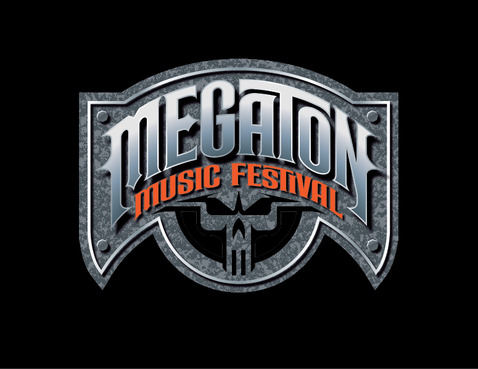
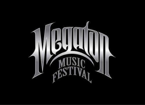
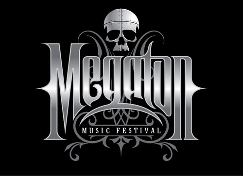
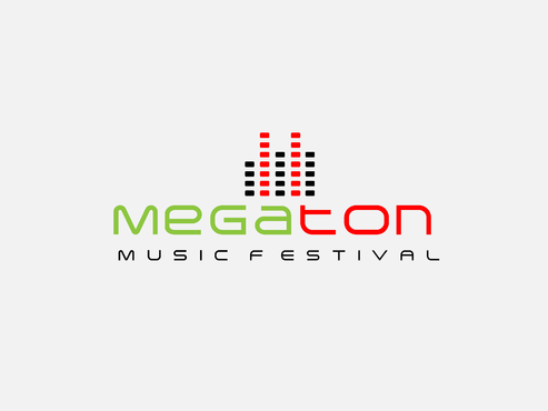
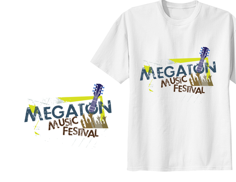
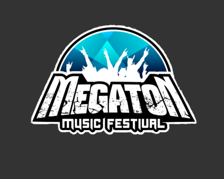
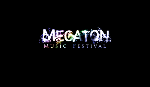
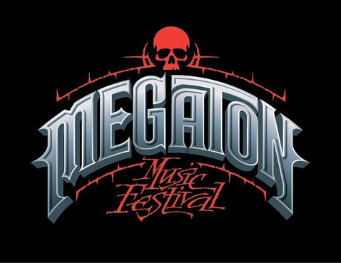
This is the logo for an annual rock/metal music festival. It should be edgy, grungy, and hardcore. Check out popular music fest logos such as Carnival of Madness, Uproar Festival, Mayhem Festival, Rock on the Range, etc....
Music
Illustrative
![]()
Masculine
Modern
Cutting-edge
Elaborate
Show us a range of color designs. Should be colorful and attractive while maintaining that edgy feel!
3
"Megaton" probably should be really big and "Music Festival" in smaller text below the large text.
Want an attractive design that can be printed on any color shirts with no modifications.
Would like some details to this design and maybe something awesome to go with the logo. Think modern rock designs.
Related Contests