SALES / SUPPORT : +1-877-525-5646   |  


Mifflin Soaring Assoc Logo

Mifflin Soaring Association (or abbreviation MSA)

Contest Holder janine ?

Last Logged in : 4743days16hrs ago

Concepts Submitted

195

Guaranteed Prize
300
Winner(s)

1

A Logo, Monogram, or Icon veildAll design entries can be viewed by other designers. Featured Featured Contest
tick_gray

Live Project

tick_gray

Deciding

tick_blue

Project Finalized


Project: Mifflin Soaring Assoc Logo
Industry: Sports Logo
Contest Launched: Feb 27, 2011
Selected: 1 winning design from 195 concepts
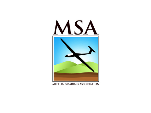
Winning Design by: raindesign
Close Date: Mar 06, 2011


Mifflin Soaring Assoc Logo - Sports


Awarded as a winner
Project Report    

Sort by:


#48

#45

#39

#37

#195

#194

#192

#191

#189

#188

#187

#186

#185

#184

#179

#174

#171

#166

#155

#154

#150

#148

#147

#134

#132

#130

#128

#125


Creative Brief


Mifflin Soaring Assoc Logo

Mifflin Soaring Association (or abbreviation MSA)

Yes

Mifflin Soaring Association is a soaring (or glider) club based in Mifflin County in Central Pennsylvania, USA.

Sports

Symbolic
Symbolic


Unique/Creative
Clean/Simple
Sophisticated
Illustrative

Blue and white to represent the clouds. Variations of green and maybe brown to represent the ground/ridges.

3

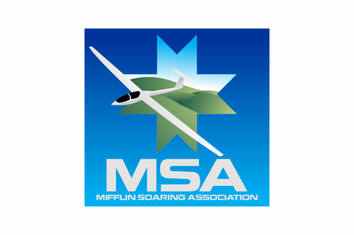
General Comments: [1] We would like to see the concept of a glider flying along the ridges(mountains) of central Pennsylvania. [2] The local area has a large Amish population and we want to include some symbol of that (see document for Amish Quilt Star idea) in the background of the logo. [3] For the glider: we do not need complete realism; rather, just to make sure glider is proportioned and shaped correctly.

For logos/ideas we like and pictures of gliders and the local geography, please download the file http://www.ssaregion2.org/logo/msalogoreference.doc

Related Contests


Logo for Golf Fitness program
$200
Prize Money
113
Concepts
Logo for sports website & apparel
$300
Prize Money
53
Concepts
Hip Logo for Running Website
$200
Prize Money
98
Concepts
Logo for boys soccer team
$199
Prize Money
114
Concepts

Discussion


Comments

  • March 19, 2011 5:03 AM
    janine janine
      Project Holder
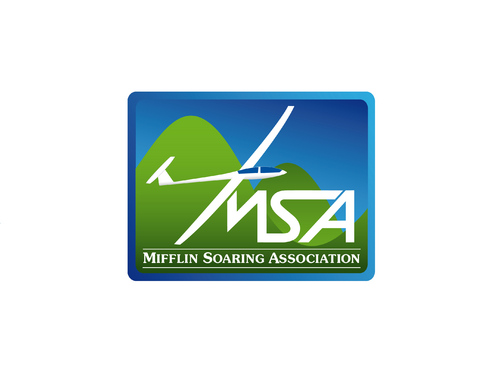
    Hello Designers, It was a very close contest between four designers, but in the end our group chose 192 as the winning design. Thank you again for all your efforts. Janine

    Like Icon 0   DislikeIcon 0
  • March 07, 2011 12:24 PM
    admin admin
     
    The waiting period has been extended till 2 weeks as per the requirements from Janine. Thanks.

    Like Icon 0   DislikeIcon 0
  • March 07, 2011 12:17 PM
    janine janine
      Project Holder
    The waiting period has been extended till 2 weeks as per the requirements from Janine. Thanks.

    Like Icon 0   DislikeIcon 0
  • March 06, 2011 8:41 PM
    janine janine
      Project Holder
    To All Designers: Thank you for all your ideas, work, and countless revisions. A glider is not an easy subject to illustrate. We will be taking 4 drafts back to the larger group for a vote.

    Like Icon 0   DislikeIcon 0
  • March 06, 2011 7:31 AM
    SiteAdmin SiteAdmin
     
    Drafts #29, #64 and #71 by uzumaki have been enabled on Contest Holder's request. --- Vincent

    Like Icon 0   DislikeIcon 0
  • March 05, 2011 8:18 AM
    janine janine
      Project Holder
    Hello Designers, We really need some of you to work on the gliders. vector5 and jtscreative have the best gliders so far. Drafts 39 and 48 are the best as far as overall shape and the lines of the glider. Please take a look at the design brief again. Also, you can google for "sailplane" and look at the images. We want a glider like the white ones with thin, long wings and body.

    Like Icon 0   DislikeIcon 0
  • March 05, 2011 7:25 AM
    janine janine
      Project Holder
    Draft #104 is a nice design, but really more suitable for a glider club in the western US. The colors and mountains are more evocative of the Rockies, not the Appalachians.

    Like Icon 0   DislikeIcon 0
  • March 04, 2011 7:23 AM
    janine janine
      Project Holder
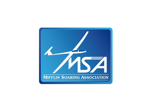
    We like the use of gradient colors in 45, 54, 72. Would be interested in seeing similar in square shape (name/MSA above/below) or rectangle (wider side along the bottom, name below).

    Like Icon 0   DislikeIcon 0
  • March 04, 2011 6:36 AM
    janine janine
      Project Holder
    Drafts #75-76: Interesting, but not the direction we want to go in. Additionally, the airplane in the logo is a power plane (with engine) not a glider. Our brief shows pictures of gliders.

    Like Icon 0   DislikeIcon 0
  • March 04, 2011 1:28 AM
    SiteAdmin SiteAdmin
     
    Draft #29, #64 and #71 by uzumaki are derivative of #3, #6 and #18 by raindesign, therefore have been taken down.

    Like Icon 0   DislikeIcon 0
  • March 03, 2011 11:55 AM
    janine janine
      Project Holder
    Thanks for all the drafts! We are working on eliminating and rating them, and will provide general and specific comments as soon as we can.

    Like Icon 0   DislikeIcon 0
  • March 02, 2011 10:57 PM
    janine janine
      Project Holder
    We like the use of color gradients for the sky and ground (as in drafts 7, 18, 29). We like the serif font for the full club name (as in drafts 28-30).

    Like Icon 0   DislikeIcon 0
  • March 02, 2011 12:23 PM
    janine janine
      Project Holder
    Our suggestions for Draft #7: (1) Remove winglets (on end of the wings). (2) Wings are not long enough in proportion to the glider body. (3) Can we see different text positions? (4) Can you remove shadow effect? (5) Would like to see variations without road (white line) in picture. (6) Could we see different blue for sky?

    Like Icon 0   DislikeIcon 0
  • March 02, 2011 8:00 AM
    janine janine
      Project Holder
    Sorry, please disregard that last comment about using "Mifflin" only on the logo.

    Like Icon 0   DislikeIcon 0
  • March 01, 2011 8:44 PM
    janine janine
      Project Holder
    Also, instead of using the text "MSA" or "Mifflin Soaring Association", feel free to try using just "Mifflin".

    Like Icon 0   DislikeIcon 0
  • March 01, 2011 8:29 PM
    janine janine
      Project Holder
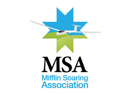
    Hello Designers: Thank you all for your efforts so far. Our team definitely wants to have all three elements (glider, ridges, amish quilt star) in the logo. We encourage you to come up with other creative ways to incorporate these. The star does not have to be the most prominent element.

    Like Icon 0   DislikeIcon 0
  • March 01, 2011 4:33 PM
    janine janine
      Project Holder
    Draft #21: Nice, but very neutral and non-specific. We want to incorporate glider, ridges, amish quilt star in logo.

    Like Icon 0   DislikeIcon 0
  • February 28, 2011 11:57 AM
    janine janine
      Project Holder
    Regarding glider: Please do not add the "winglets" (little things sticking up on the end of the wings).

    Like Icon 0   DislikeIcon 0
  • February 28, 2011 11:48 AM
    janine janine
      Project Holder
    Regarding mountains: They should be rolling as in #7-8, not rugged or jagged. That makes them look more like the Rocky Mountains as opposed to the Appalachian Mountains we live in.

    Like Icon 0   DislikeIcon 0
  • February 28, 2011 11:36 AM
    janine janine
      Project Holder
    Regarding colors: We like the colors in #3 and the muted tones used in #7-10. Bright or aqua blue for sky is not what we are looking for.

    Like Icon 0   DislikeIcon 0
  • February 28, 2011 11:30 AM
    janine janine
      Project Holder
    Draft #15: Another very interesting take for our logo, but not a direction we want to pursue.

    Like Icon 0   DislikeIcon 0
  • February 28, 2011 6:49 AM
    janine janine
      Project Holder
    Draft #2: Interesting concept, but not the direction we want to go in. The colors and depiction of mountains reminds us more of the Western part of the US and not Pennsylvania countryside.

    Like Icon 0   DislikeIcon 0
  • February 28, 2011 6:46 AM
    janine janine
      Project Holder
    Draft #1: Good first try. Background is a little too busy. Need simpler, cleaner concept of clouds, ridges. Black around star may be too much (makes it too prominent). We like the idea of both club name fully spelled out and MSA abbreviation there together.

    Like Icon 0   DislikeIcon 0
  • February 27, 2011 8:19 PM
    janine janine
      Project Holder
    I removed the URL for the reference doc since I could upload it directly into the project area.

    Like Icon 0   DislikeIcon 0