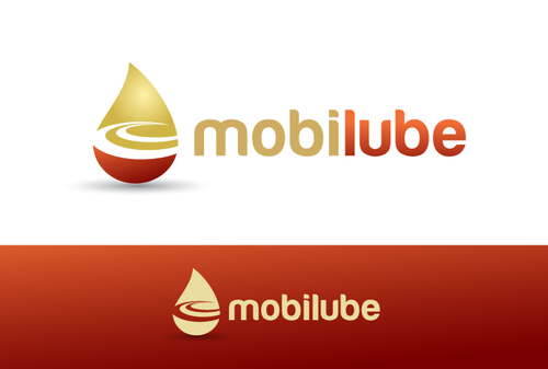
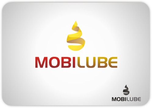
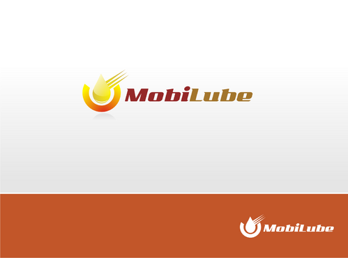
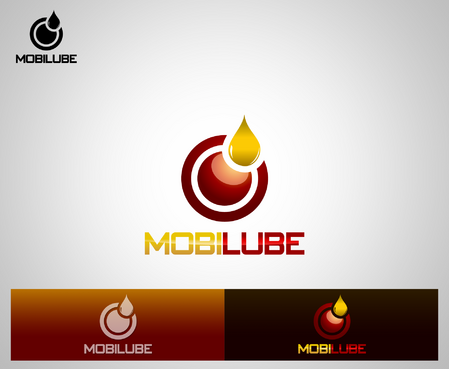
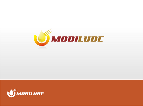
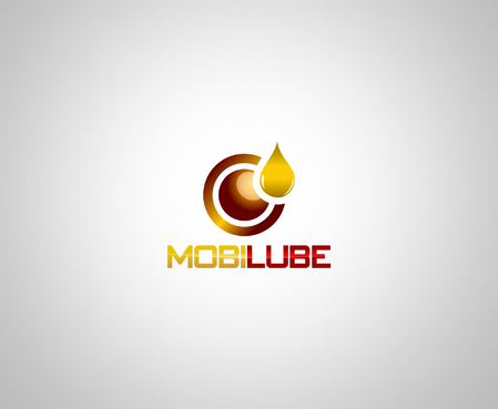
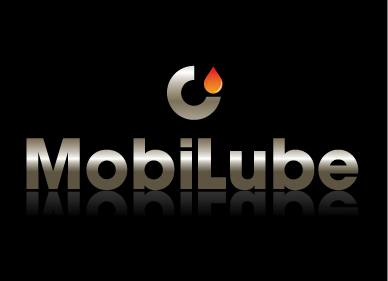
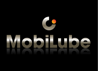
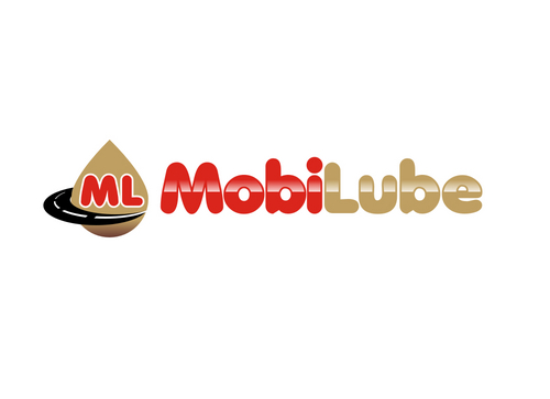
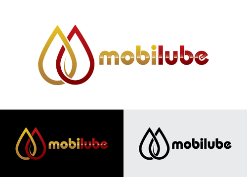
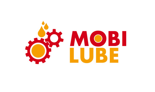
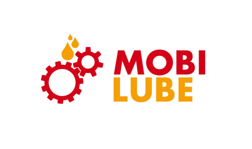
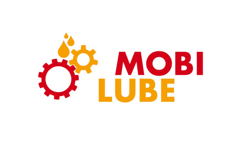
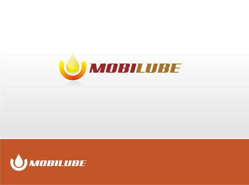
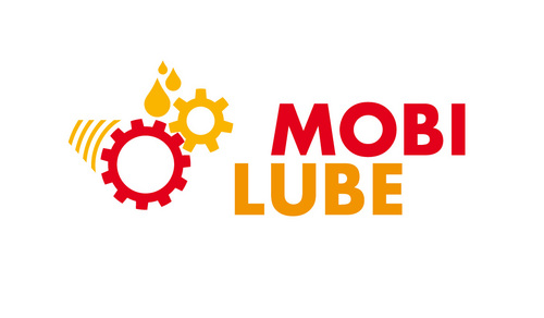
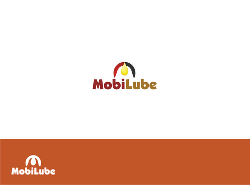
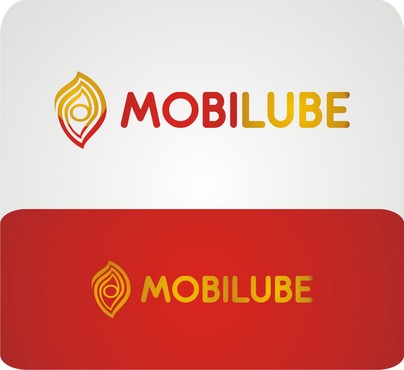
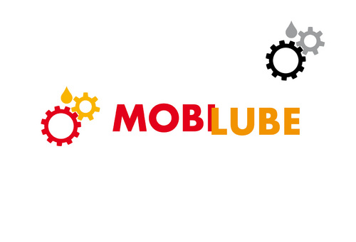
SALES / SUPPORT : +1-877-525-5646   |  


mobi-lube

Mobi Lube

Contest Holder mobilube ?

Last Logged in : 1890days15hrs ago

Concepts Submitted

379

Guaranteed Prize
550
Winner(s)

1

A Logo, Monogram, or Icon veildAll design entries can be viewed by other designers. Featured Featured Contest
tick_gray

Live Project

tick_gray

Deciding

tick_blue

Project Finalized


Project: mobi-lube
Contest Launched: Feb 21, 2011
Selected: 1 winning design from 379 concepts
Winning Design by: myhands
Close Date: Mar 03, 2011


mobi-lube - Corporate Services


Awarded as a winner
Project Report    

Sort by:


#16

#96

#94

#379

#378

#377

#376

#375

#374

#371

#370

#369

#368

#367

#366

#365

#364

#363

#362

#361

#360

#359

#358

#357

#356

#355

#354

#353


Creative Brief


mobi-lube

Mobi Lube

No

Company : we are mobile oil change service company.
Product: Oil changing service for cars and mobile equipments on spot.

Corporate Services

Logo Type
Logo Type

Abstract Mark
Abstract Mark


Unique/Creative
Clean/Simple
Corporate
Modern
Industry Oriented
Serious

- Gold - Red

3

we are mobile service company that change oil on spot or were the client are.

Related Contests


Logo for Financial Investment Company
$199
Prize Money
156
Concepts
Professional, elegant logo for insurance company
$200
Prize Money
175
Concepts
profession logo for a company
$200
Prize Money
266
Concepts
Professional Certification Logo Pair Design Project
$250
Prize Money
85
Concepts

Discussion


Comments

  • November 05, 2011 10:49 PM
    RichardB RichardB
     
    Check out www.DesignCage.net its pretty awesome,you can win more contests.

    Like Icon 0   DislikeIcon 0
  • March 02, 2011 2:21 AM
    SiteAdmin SiteAdmin
     
    Source: http://www.pixelbrushstudios.com/wp-content/uploads/2009/07/Regen-Oil_01.gif Draft #152 and #239 by iDesign have been taken down.

    Like Icon 0   DislikeIcon 0
  • March 01, 2011 1:15 PM
    iCinr iCinr
     
    Here is a similar logo..... http://www.google.com/imgres?imgurl=http://www.pixelbrushstudios.com/wp-content/uploads/2009/10/regen_oil.gif&imgrefurl=http://www.pixelbrushstudios.com/regen-recycled-oil-is-ready-to-show-off-the-new-look&usg=__bOGMt2CXHeR0E_s8hnyuEZuXgTo=&h=200&w=200&sz=3&hl=en&start=0&zoom=1&tbnid=YmtisEzTLmljYM:&tbnh=126&tbnw=125&ei=c0VtTe-9PIa8sAODkcy_BQ&prev=/images%3Fq%3Dre-gen%2Boil%2Blogo%26hl%3Den%26client%3Dsafari%26rls%3Den%26biw%3D2560%26bih%3D1224%26tbs%3Disch:1&itbs=1&iact=rc&dur=339&oei=V0VtTcjJCIaCvgOY59G-BA&page=1&ndsp=99&ved=1t:429,r:51,s:0&tx=74&ty=44

    Like Icon 0   DislikeIcon 0
  • February 28, 2011 1:45 PM
    mobilube mobilube
      Project Holder
    (Draft #166) we liked your design but can we suggest more ideas like can you change the circle to drop shape and changing the Text or font with more clear font. thanks

    Like Icon 0   DislikeIcon 0
  • February 28, 2011 1:43 PM
    mobilube mobilube
      Project Holder
    (Draft #156) thanks for your effort can we see some changes in text shape or font thanks

    Like Icon 0   DislikeIcon 0
  • February 28, 2011 1:37 PM
    mobilube mobilube
      Project Holder
    (Draft #152) it is very elegant design and really we liked it, and we would see more from you. we will suggest more ideas and suggestion trying to find out if there any chances to add more designs. 1-will you change the color of the Text from Black to any other color 2-enlarging the design or Logo shape much more thanks

    Like Icon 0   DislikeIcon 0
  • February 28, 2011 1:30 PM
    mobilube mobilube
      Project Holder
    (Draft #140) thank you for such a design it is representative for our business, we would like to add more comments and they are: 1-can you change the arrow in between the Gear and drop to Orbit shape or Orbit 2- changing the arrow again to a road shape or road symbol thanks

    Like Icon 0   DislikeIcon 0
  • February 28, 2011 1:27 PM
    mobilube mobilube
      Project Holder
    (Draft #96) this design is representing almost a lot of ideas like, the drop, the road inside the drop, the word mobilube and representing colors we would ask for more designs from you and here are some of our suggestions: 1-trying to relocate the word MobiLube above or below the drop, different locations 2- different colors thanks

    Like Icon 0   DislikeIcon 0
  • February 28, 2011 1:22 PM
    mobilube mobilube
      Project Holder
    (Draft #92) very creative thank you, we would like to see more improvement like 1-changing the Text (font) to be as same as font in draft 94

    Like Icon 0   DislikeIcon 0
  • February 28, 2011 1:19 PM
    mobilube mobilube
      Project Holder
    (Draft #62) kindly will you try the following: 1-minimizing the drop size (not to much) 2-the colors are very shiny will you decrease the brightness thanks

    Like Icon 0   DislikeIcon 0
  • February 28, 2011 1:16 PM
    mobilube mobilube
      Project Holder
    (Draft #34) again thank you for a professional design, we would suggest more ideas and they are: 1-the tip or the end of the drop is very pointed can you smooth it more please 2-the word (Lube) can you change the color of it with different colors. thank you

    Like Icon 0   DislikeIcon 0
  • February 28, 2011 1:12 PM
    mobilube mobilube
      Project Holder
    (Draft # 7) thank you for such a nice design we liked yours but can we suggest some more ideas to find out if there any potentials and they are: 1- try to change the colors of the design 2- can you add more shapes or ideas to the original design. thanks again

    Like Icon 0   DislikeIcon 0
  • February 27, 2011 8:22 AM
    SiteAdmin SiteAdmin
     
    Draft #180 and variation by mayID are derivative of #178 by sihem, therefore have been taken down.

    Like Icon 0   DislikeIcon 0
  • February 26, 2011 12:31 AM
    mobilube mobilube
      Project Holder
    Dear Designers Hello to all, we are waiting for your new drafts and imagination creativity. please be informed that we took out the 4,3 and 2 star to encourage the others to create different designs and not to be constrained to the highest ranked, this step to ensure the competency for all designers. and Again please do not be constrained to Gold and Red use as much as you can and bring out your best designs. best of Luck

    Like Icon 0   DislikeIcon 0
  • February 23, 2011 8:24 PM
    thayeeb thayeeb
     
    Dear mobilube, Thank you for your comment for draft#64. I really appreciate it. As you can see, red and yellow intersect and between them there's white as a result for those intersection, it simply describe MobiLube product and service : oil changing. And yes, you may see those intersection as a M letter, this is the gestalt. M is for the initial of MobiLube of course. For the logotype i chose a type that represent Velocity and Reliabilty at the same time.

    Like Icon 0   DislikeIcon 0
  • February 23, 2011 1:10 PM
    mobilube mobilube
      Project Holder
    Again to all designers dear designers kindly be noticed that 1- the colors are not restricted any more to Gold and Red, and you can use any colors you would feel it is better. 2- that we chooses our logo to be serious and now we don't want any more. that decisions have been made to increase the creativity and ideas. best of luck to all

    Like Icon 0   DislikeIcon 0
  • February 23, 2011 1:02 PM
    mobilube mobilube
      Project Holder
    (draft# 53) Can you make the white drop inside a red drop i mean will you please try to make the red drop on behind more dropy shape lol and the white drop inside it. also please try to make another copy or design with a gold drop inside the red one thanks

    Like Icon 0   DislikeIcon 0
  • February 23, 2011 12:52 PM
    mobilube mobilube
      Project Holder
    (draft# 58) thanks for your design but can you do the following changes -change the black background with white color -change the tilted Gear with better one (realistic) -MobiLube word, can you write it with another clear font -please dont forget to include the oil drop on gear or from it as you like be creative. thanks

    Like Icon 0   DislikeIcon 0
  • February 23, 2011 12:45 PM
    mobilube mobilube
      Project Holder
    (draft# 73) will you please change the simple car with two drops with a cartoonish car with drops also as a tire as you did or more cars (professional) thanks

    Like Icon 0   DislikeIcon 0
  • February 23, 2011 12:43 PM
    mobilube mobilube
      Project Holder
    (draft# 64) Thank you for your simplicity and professionalism i would say simply i liked your design, can i know what is the meaning of the red and Yellow color inside the box because i though it is representing the oil factor. please come back to me with your comments and can we see more designs from your side or modifications for the same design. thanks

    Like Icon 0   DislikeIcon 0
  • February 23, 2011 12:37 PM
    mobilube mobilube
      Project Holder
    (draft# 62) the idea is creative it looks like Explorer sign (logo) i liked it can you please modify more ideas and colors according to that design i will be waiting for your ideas thanks

    Like Icon 0   DislikeIcon 0
  • February 23, 2011 12:33 PM
    mobilube mobilube
      Project Holder
    (draft# 60 & 61) very nice but can you make it more dynamic like adding a moving factor on another design similar to that one of course.

    Like Icon 0   DislikeIcon 0
  • February 23, 2011 12:29 PM
    mobilube mobilube
      Project Holder
    (draft# 57 & 59) both of them nice but can we close the letter O to be complete circle in my humble opinion, is the Logo on the right the magnified one have to be not complete or can we include it as a whole logo inside the Big Picture thanks

    Like Icon 0   DislikeIcon 0
  • February 23, 2011 12:18 PM
    mobilube mobilube
      Project Holder
    (draft#48) the design hide some potential -can you please change the M letter since it's remind me with Batman lol, -however i would like also to see the white arrow with another color -can you also change the black orbit around the drop with another colors and try different colors logos to find out the best one. thanks

    Like Icon 0   DislikeIcon 0
  • February 23, 2011 12:15 PM
    mobilube mobilube
      Project Holder
    (draft#34) your design is one of my best and it is the most attractable i really liked it and i believed it does not need any changes but why not trying more improvement to find out where we will reach. as i told i liked your design i hope you don's take it out and add more colors from the same design to compare with. also can you add golden color to the lower part of the drop with it orbit to find out how it will look. thanks alot

    Like Icon 0   DislikeIcon 0