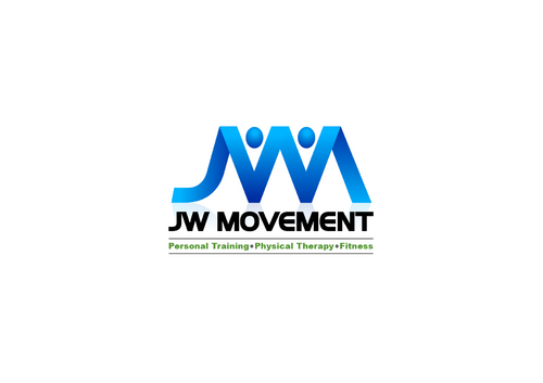
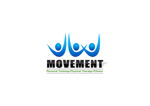
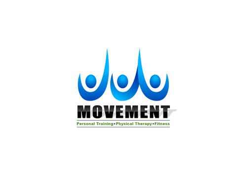
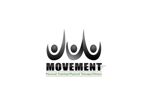
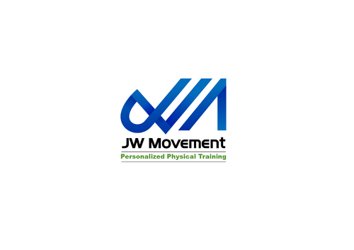
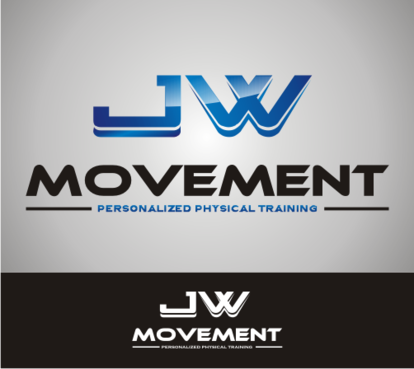
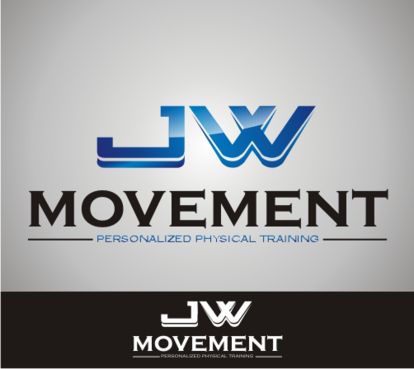
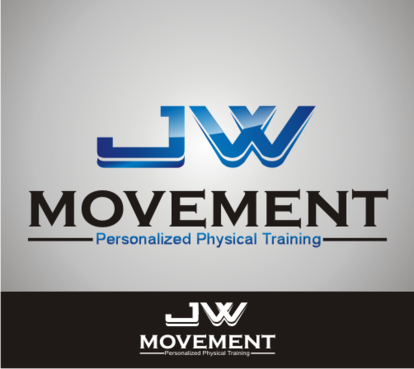
Modern logo for Physical Therapy Fitness Company
JW Movement
|
Contest Holder
jasonwongdpt
?
Last Logged in : 4480days16hrs ago |
Concepts Submitted
100 |
Guaranteed Prize
200 |
Winner(s) | A Logo, Monogram, or Icon |
|
Live Project
Deciding
Project Finalized


Creative Brief
Modern logo for Physical Therapy Fitness Company
JW Movement
Personalized Physical Training
Yes
It's melding the traditional concept of physical therapy with personal training. A logo that can relate to not only traditional rehab, but even minor injuries or preventative rehab, i.e. my back hurts once in a while when I lift, but I don't want to see a PT for it. I modern concept with a solid athletic look and feel.
Health
Symbolic
![]()
Initials
![]()
Illustrative
![]()
Masculine
Modern
Cutting-edge
Youthful
Professional
I like Blues,Midnight blue in particular but open to any blues to highlight, Black. I'm also open to Warm Yellows and Greens.
not sure
Saw a logo during a movie which where integrated/interlocked initials with block lettering and shadow behind it which I thought was very cool looking. I want to stray away from traditional medicine logos. I want this to be on the forefront of preventative medicine.
Related Contests


