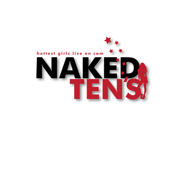
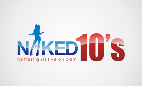
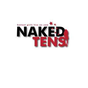
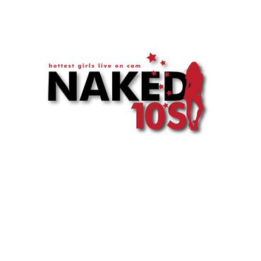
SALES / SUPPORT : +1-877-525-5646   |  


Naked 10's

Naked 10's

Contest Holder bkonia ?

Last Logged in : 4380days15hrs ago

Concepts Submitted

64

Guaranteed Prize
199
Winner(s)

1

A Logo, Monogram, or Icon veildAll design entries can be viewed by other designers.
tick_gray

Live Project

tick_gray

Deciding

tick_blue

Project Finalized


Project: Naked 10's
Industry: Entertainment Logo
Contest Launched: Sep 03, 2011
Selected: 1 winning design from 64 concepts
Winning Design by: vable
Close Date: Sep 13, 2011


Naked 10's - Entertainment


Awarded as a winner
Project Report    

Sort by:


#49

#48

#64

#63

#62

#61

#58

#55

#54


Creative Brief


Naked 10's

Naked 10's

Yes

This is a logo for an adult webcam site featuring naked girls, live on cam.

Entertainment

Logo Type
Logo Type

Symbolic
Symbolic

Abstract Mark
Abstract Mark

Web 2.0
Web 2.0


Cutting-Edge
Modern
Industry Oriented
Fun

not sure

Some of our competitors:

cams.com
naked.com
modelscope.com

Related Contests


Logo for our motion and special FX cinemas
$250
Prize Money
49
Concepts
Logo for an Entertainment Company
$200
Prize Money
243
Concepts
Logo for a female pop/dance music recording artist. Fun, flirty, modern, pretty, eye catching!
$199
Prize Money
42
Concepts
Expedite Project: Roots on the Red
$300
Prize Money
110
Concepts

Discussion


Comments

  • September 13, 2011 6:55 PM
    donnajane donnajane
     
    thanks, i was trying to keep on this one before it closed. thanks for the input and the ratings - donna

    Like Icon 0   DislikeIcon 0
  • September 13, 2011 6:53 PM
    bkonia bkonia
      Project Holder
    Donna, the new designs look good, but the problem with the 10's is that there's no apostrophe, so it looks like 10S, which could be kind of confusing to people, especially at first glance. I understand you were trying to use the stars as an apostrophe and I like the stars, but I think it needs an actual apostrophe to make it readable.

    Like Icon 0   DislikeIcon 0
  • September 13, 2011 4:54 PM
    bkonia bkonia
      Project Holder
    Vable, I'm liking your designs a lot...

    Like Icon 0   DislikeIcon 0
  • September 13, 2011 4:14 PM
    bkonia bkonia
      Project Holder
    donnajane, Could you please show some more variations on your #33 design. I like that one the best so far. Perhaps some different color combinations, etc... Also, it should be "TENS", not "TEN". I would like to see variations in which the 10's is written as numbers as well.

    Like Icon 0   DislikeIcon 0
  • September 09, 2011 2:49 PM
    SiteAdmin SiteAdmin
     
    Contest has been extended for 3 days. Good Luck!

    Like Icon 0   DislikeIcon 0
  • September 09, 2011 2:17 PM
    bkonia bkonia
      Project Holder
    So far, I haven't seen anything that really grabs me. It seems like every logo that's submitted looks pretty much the same as every other one. Not seeing much in the way of creativity and for some reason, you guys are obsessed with pink. I want something with a more contemporary "Web 2.0" look. How about some outside-the-box thinking here?

    Like Icon 0   DislikeIcon 0
  • September 08, 2011 9:07 AM
    bkonia bkonia
      Project Holder
    Here are some general comments about the logos so far: 1. Many of them are virtually unreadable. 2. Many seem to be blatant ripoffs of the naked.com logo. 3. In some of them, the word is NAKED is emphasized to such an extent that the 10's part is barely noticeable.

    Like Icon 0   DislikeIcon 0