SALES / SUPPORT : +1-877-525-5646   |  


New Identity for Home Equity Business

Equity Experts

Contest Holder Malcolm ?

Last Logged in : 4404days21hrs ago

Concepts Submitted

123

Guaranteed Prize
200
Winner(s)

1

A Logo, Monogram, or Icon veildAll design entries can be viewed by other designers. Featured Featured Contest
tick_gray

Live Project

tick_gray

Deciding

tick_blue

Project Finalized


Project: New Identity for Home Equity Busi ...
Contest Launched: Nov 08, 2010
Selected: 1 winning design from 123 concepts
Winning Design by: alcoman
Close Date: Nov 15, 2010


New Identity for Home Equity Business - Financial Services


Awarded as a winner
Project Report    

Sort by:


#81

#71

#67

#123

#114

#113

#93

#92

#86

#80

#73

#68

#66

#65

#34

#14

#13

#91

#90

#83

#79

#63

#49

#48


Creative Brief


New Identity for Home Equity Business

Equity Experts

No

Home equity companies are a dime a dozen these days and we are looking for a logo that will help us stand out from the pack and lay a foundation for an overall new corporate identity. We serve Baltimore-Washington, DC metro/suburban areas and focus on customer service and custom financial solutions for homeowners and small businesses.

Financial Services

Logo Type
Logo Type

Symbolic
Symbolic

Abstract Mark
Abstract Mark


Unique/Creative
Sophisticated
Corporate
Industry Oriented
Serious
Illustrative
Masculine

Green is good and red is almost always bad when it comes to financial services, but maybe there is a tone that might make sense. We are not set on green if you have other ideas.

not sure

We are not art directors but I have toyed with the idea of using silhouettes without gradient colors. We would eventually like to use this logo on collateral pieces and so a limited color palette might make sense, but please do not let my comments hinder your creativity.

Related Contests


New Logo for a new financial company
$200
Prize Money
117
Concepts
health insurance website for business professionals
$200
Prize Money
138
Concepts
Logo design for a financial broker
$240
Prize Money
123
Concepts
Diversiphi Logo Contest
$200
Prize Money
115
Concepts

Discussion


Comments

  • November 16, 2010 7:59 AM
    Malcolm Malcolm
      Project Holder
    Thanks again to all the designers for all the amazing submissions. We are very impressed.

    Like Icon 0   DislikeIcon 0
  • November 15, 2010 2:46 PM
    Malcolm Malcolm
      Project Holder
    I am going to attempt to re-grade all the remaining images to give you a better feel for our thoughts so far.

    Like Icon 0   DislikeIcon 0
  • November 15, 2010 2:42 PM
    Malcolm Malcolm
      Project Holder
    Designers... again you work has really impressed me. I am trying to make comments to you directly were possible but really want to complement the overall quality of the submissions. Making this decision wont be easy but I will be very satisfied with the final design for sure.

    Like Icon 0   DislikeIcon 0
  • November 15, 2010 6:48 AM
    Malcolm Malcolm
      Project Holder
    Thank you to all the designers. Your submissions have really been fantastic. We have not made a final decision and continue to be amazed with your submissions. We are trying to eliminate a few designs that while are very good are just not what we are looking for.

    Like Icon 0   DislikeIcon 0
  • November 14, 2010 1:25 PM
    Malcolm Malcolm
      Project Holder
    Draft #25 is very good as well. We would like to see it in a darker green and darker blue.

    Like Icon 0   DislikeIcon 0
  • November 14, 2010 1:18 PM
    Malcolm Malcolm
      Project Holder
    Draft #28 We like how clean and simple the design is but would like to see a darker green and maybe a the dark blue if possible.

    Like Icon 0   DislikeIcon 0
  • November 14, 2010 1:18 PM
    Malcolm Malcolm
      Project Holder
    Draft #28 We like how clean and simple the design is but would like to see a darker green and maybe a the dark blue if possible.

    Like Icon 0   DislikeIcon 0
  • November 14, 2010 7:27 AM
    Malcolm Malcolm
      Project Holder
    We would like to see a few more designs incorporating elements of a house or similar features. Overall, the submissions have been outstanding. Thanks for your efforts.

    Like Icon 0   DislikeIcon 0
  • November 14, 2010 7:23 AM
    Malcolm Malcolm
      Project Holder
    design #21 is nice but we are not sure if you think we should rename ourselves or equity experts was simply misspelled. Either way thanks for the submission but were going to stick with equity experts.

    Like Icon 0   DislikeIcon 0
  • November 14, 2010 7:05 AM
    Malcolm Malcolm
      Project Holder
    Draft #17 is nice but it doesn't have the impact we are looking for.

    Like Icon 0   DislikeIcon 0
  • November 14, 2010 7:00 AM
    Malcolm Malcolm
      Project Holder
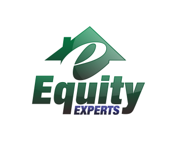
    We like how you incorporated the image of a home in design #14.

    Like Icon 0   DislikeIcon 0
  • November 14, 2010 6:58 AM
    Malcolm Malcolm
      Project Holder
    Drafts #14 and #15 both look great.

    Like Icon 0   DislikeIcon 0
  • November 14, 2010 6:57 AM
    Malcolm Malcolm
      Project Holder
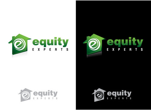
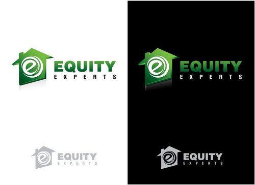
    Draft #13 is very good, could we see the words equity experts stacked and offset if needed.

    Like Icon 0   DislikeIcon 0
  • November 12, 2010 12:01 PM
    Malcolm Malcolm
      Project Holder
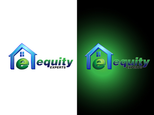
    Draft #12 looks great. We prefer a darker blue and green more similar to #4 and maybe a little darker. Could you have the green part of the "e" rotate a bit further toward the blue part so the points are closer together and possible do a shadow under it like #10 and #9. Draft #10 has better proportions than #9, could you use a darker green and blue.

    Like Icon 0   DislikeIcon 0
  • November 12, 2010 9:27 AM
    Malcolm Malcolm
      Project Holder
    Draft #6 is a solid design and we like the balance between the image and the text.

    Like Icon 0   DislikeIcon 0
  • November 12, 2010 9:19 AM
    Malcolm Malcolm
      Project Holder
    Draft #9 have a very nice 3D image, we like see this in green and blue with the image a bit smaller and the text a bit bolder Draft #8 is nice but we like your draft #9 much better. Draft #7 is very well done as well.

    Like Icon 0   DislikeIcon 0
  • November 11, 2010 1:19 PM
    Malcolm Malcolm
      Project Holder
    Draft #2 is very clean and professional, but we immediately thought of La Quinta hotel chain. Draft #1 just doesnt have the same impact as some of your other designs.

    Like Icon 0   DislikeIcon 0
  • November 11, 2010 1:15 PM
    Malcolm Malcolm
      Project Holder
    Draft #5 We like the shadowing under the image, maybe you could incorporate some green into your design. We are lenders and like the color of money.

    Like Icon 0   DislikeIcon 0
  • November 11, 2010 1:12 PM
    Malcolm Malcolm
      Project Holder
    Draft #4 has a nice bold look, was wondering what it would look like if the circle was replaced with an image of the world. The reversed out image below is also very strong. Draft #3 also is quite nice, we think the font could be better, could you substitute a few fonts to compare.

    Like Icon 0   DislikeIcon 0