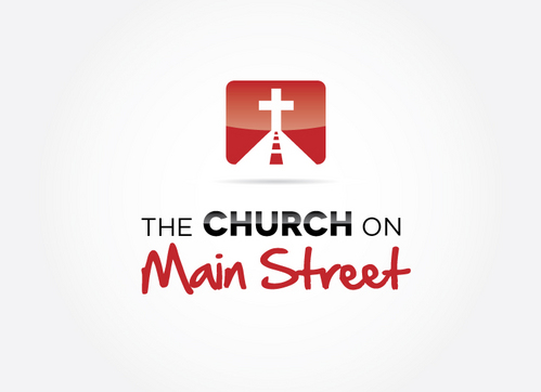
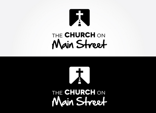
New logo for "the Church on Main Street"
the church on main street
|
Contest Holder
tcoms
?
Last Logged in : 5144days2hrs ago |
Concepts Submitted
225 |
Guaranteed Prize
250 |
Winner(s) | A Logo, Monogram, or Icon |
|
Live Project
Deciding
Project Finalized


Creative Brief
New logo for "the Church on Main Street"
the church on main street
No
It is for a modern Christian church called 'the church on main street'. It is not tied into any traditional Christian denomination.
Religion and Spirituality
Logo Type
![]()
Symbolic
![]()
Abstract Mark
![]()
Initials
![]()
Web 2.0
![]()
Cutting-Edge
Unique/Creative
Modern
Abstract
We want colours that are t modern, inviting, creative. Colours and fonts that don't look flat on a page.
not sure
1. the words 'the' and 'on' should be smaller than the words 'Church' and 'Main Street', maybe even in a different font.
2. the words 'Main Street' should be done in a more handwritten type font, while the word 'Church' could be done in a more Contemporary font. Please see the following websites regarding what I mean:
http://www.thespringschurch.com/
http://www.fellowshipchurch.com/
http://www.tscnyc.org/
http://northrocksa.com/
http://www.elevationchurch.org/
The font style for the word 'Church' could be similar to that used in www.thefellowshipchurch.com or www.tscnyc.org. While the style of font used for the words 'Main Street' could be similar to that used in www.thespringschurch.com.
Related Contests