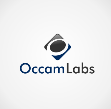
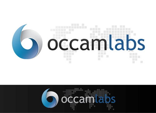
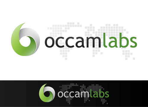
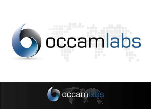
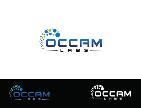
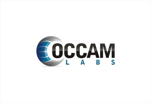
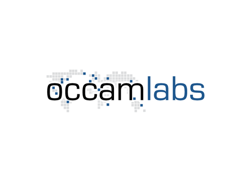
Occam Labs Business Logo
Occam Labs
|
Contest Holder
occamlabs
?
Last Logged in : 5252days13hrs ago |
Concepts Submitted
480 |
Guaranteed Prize
500 |
Winner(s) | A Logo, Monogram, or Icon |
|
Live Project
Deciding
Project Finalized

Creative Brief
Occam Labs Business Logo
Occam Labs
Yes
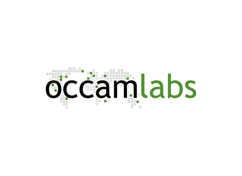
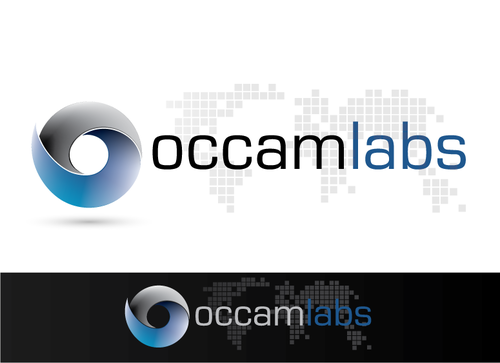
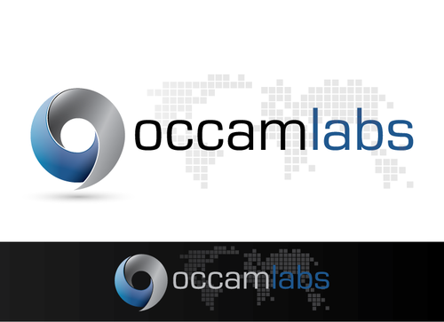
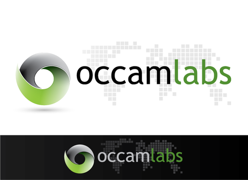
This is a business logo for our new company. We're developing GIS software (geospatial information systems).
The name of our company comes from Occam's Razor (http://en.wikipedia.org/wiki/Occam%27s_razor), a scientific principle. We're also inspired by Einsteins famous quote: "Everything should be made as simple as possible, but not simpler.".
It would be nice if one could find these two principles within the logo, but it's not a must.
Software
Symbolic
![]()
Abstract Mark
![]()
Initials
![]()
Cutting-Edge
Clean/Simple
High Tech
we'd prefer darker/subtle colours
not sure
We want a
business logo which we can use for business cards, the website,
letters etc.
Related Contests