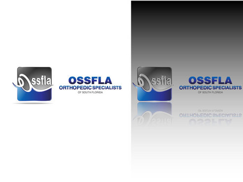
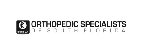
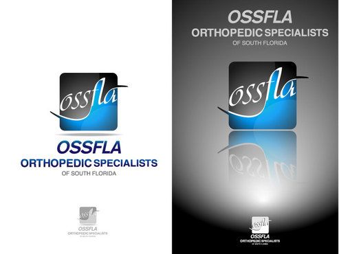
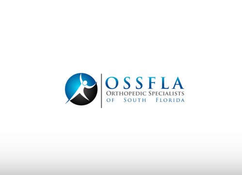
SALES / SUPPORT : +1-877-525-5646   |  


Orthopedics Logo

Orthopedic Specialists of South Florida

Contest Holder Cameron ?

Last Logged in : 4578days17hrs ago

Concepts Submitted

240

Prize Money
199
Winner(s)

1

A Logo, Monogram, or Icon veildAll design entries can be viewed by other designers. Featured Featured Contest Expedite Expedite Contest
tick_gray

Live Project

tick_gray

Deciding

tick_blue

Project Finalized


Project: Orthopedics Logo
Industry: Health Logo
Contest Launched: Jan 08, 2011
Selected: 1 winning design from 240 concepts
Winning Design by: ACEdesign
Close Date: Jan 20, 2011


Orthopedics Logo - Health


Awarded as a winner
Project Report    

Sort by:


#233

#223

#220

#217

#212

#210

#192

#131

#130

#118

#110

#96

#72

#71

#234

#219

#218

#211

#209

#206

#204

#202

#201

#177

#161

#144

#143

#142

#90


Creative Brief


Orthopedics Logo

Orthopedic Specialists of South Florida

Yes

A multi-physician orthopedics group offering full orthopedic medical treatments and surgeries.

Health

Logo Type
Logo Type

Web 2.0
Web 2.0


Unique/Creative
Clean/Simple
Sophisticated
Corporate
Serious

Blues and cyans are good for medical, but we're leaving that open for the designers' judgment. Logo can also have more than 2 colors if it's something we like.

2

We're looking for something that is very professional and symbolizes orthopedics in some way. I have in mind an icon and the practice name. Orthopedic Specialists will be the two larger words in the logo. "of South Florida" can be smaller, underneath the OS. Beside the text will be some type of icon. That's just my vision - I am also quite open-minded about alternate ideas

Related Contests


Logo for new Rehab company
$275
Prize Money
223
Concepts
RockIt Fitness
$300
Prize Money
202
Concepts
 logo for re-branding new nursing facility
$400
Prize Money
184
Concepts
Logo for a chiropractic health clinic
$199
Prize Money
63
Concepts

Discussion


Comments

  • January 19, 2011 3:08 AM
    SiteAdmin SiteAdmin
     
    Draft #185 and variation by alcoman is the designer's own winning design, http://www.mycroburst.com/drafts/display/contest/27346/draft/239054, therefore have been taken down.

    Like Icon 0   DislikeIcon 0
  • January 19, 2011 1:19 AM
    SiteAdmin SiteAdmin
     
    Draft #115 and #148 by alcoman are replica logos from a similar contest site, therefore have been taken down.

    Like Icon 0   DislikeIcon 0
  • January 18, 2011 11:29 AM
    SiteAdmin SiteAdmin
     
    Designers: Report all rip-off claims at report@mycroburst.com

    Like Icon 0   DislikeIcon 0
  • January 17, 2011 4:20 PM
    Cameron Cameron
      Project Holder
    To all designers, Our logo contest has been extended. My client likes what has been submitted but would like to see some additional designs. Please submit some designs incorporating OSSFLA -- maybe into the icon somehow. Would still like to see some different color variations and some more original ideas. Many of the lovely designs I have received are also very similar to each other. Thank you.

    Like Icon 0   DislikeIcon 0
  • January 17, 2011 11:23 AM
    SiteAdmin SiteAdmin
     
    Designers: Report all rip-off claims at report@mycrobust.com

    Like Icon 0   DislikeIcon 0
  • January 14, 2011 10:51 AM
    Cameron Cameron
      Project Holder
    To all designers: I would like to see some DIFFERENT color combinations. Even if you're using blues, try some different hues and shades to make it more interesting. Thank you

    Like Icon 0   DislikeIcon 0
  • January 13, 2011 4:15 PM
    Cameron Cameron
      Project Holder
    To all designers: I seem to have many good logos with people figures. Please submit any new ideas you have - looking for some different ideas. Thanks!

    Like Icon 0   DislikeIcon 0
  • January 13, 2011 7:58 AM
    Cameron Cameron
      Project Holder
    Interesting submission by Robby - draft #23. I like the concept of including a palm tree.

    Like Icon 0   DislikeIcon 0