SALES / SUPPORT : +1-877-525-5646   |  


Pampering Professionals Logo

Pampering Professionals

Contest Holder trued85 ?

Last Logged in : 4567days5hrs ago

Concepts Submitted

81

Guaranteed Prize
200
Winner(s)

1

A Logo, Monogram, or Icon veildAll design entries can be viewed by other designers. Featured Featured Contest
tick_gray

Live Project

tick_gray

Deciding

tick_blue

Project Finalized


Project: Pampering Professionals Logo
Contest Launched: Aug 26, 2011
Selected: 1 winning design from 81 concepts
Winning Design by: djfavor
Close Date: Sep 08, 2011


Pampering Professionals Logo - Massage Therapy


Awarded as a winner
Project Report    

Sort by:


#40

#44

#27

#81

#77

#67

#66

#60

#59

#47

#46

#45

#28

#19

#6


Creative Brief


Pampering Professionals Logo

Pampering Professionals

For the Massage Connoisseur

Yes

This is for a massage website.
www.Pamperingprofessionals.com

I'm hoping for a unique classy but upscale design. Somewhat zen like. Not interested in hands. Not the typical massage therapy designs. More towards a spa feel. Open to all ideas.
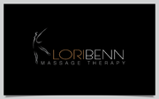
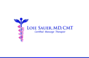
Massage Therapy

Symbolic
Symbolic

Abstract Mark
Abstract Mark


Cutting-Edge
Unique/Creative
Clean/Simple
Sophisticated
Modern
Feminine

black, light lavender, soft greens, soft hues. Not sure really. Open to interpretation. I'll be using this for my website, business cards, stationary etc. Please visit my website to get a feel for the color scheme. I would like for it to have the feel of luxury.

not sure

Related Contests


Logo for manufacturing co. making medical cannabis massage oils
$200
Prize Money
144
Concepts
Logo for wellness treatment
$200
Prize Money
217
Concepts
Logo design needed for Massage Therapy Company
$199
Prize Money
134
Concepts
Logo for massage therapy office
$200
Prize Money
64
Concepts

Discussion


Comments

  • September 06, 2011 4:08 AM
    trued85 trued85
      Project Holder
    Draft #53 Could you try a different font for the Pampering word, and a different green for the Professionals? Also, any other design you can come up with for the art? Not sure about the circle. Thank you.

    Like Icon 0   DislikeIcon 0
  • September 06, 2011 4:06 AM
    trued85 trued85
      Project Holder
    Draft #12, I like the entangled hands idea, could you change the colors to be more sage green and lavender and try a different font? Maybe put the hands on the side? Not liking the way the "for the massage connosieur" is looking on the bottom. Looks too messy. Hard to explain.

    Like Icon 0   DislikeIcon 0
  • September 06, 2011 4:03 AM
    trued85 trued85
      Project Holder
    Draft #27 I like the color you used along with the two different fonts. I'm not sold on circle art itself. Also, could you put "for the massage connosieur" on there somewhere? Thank you.

    Like Icon 0   DislikeIcon 0
  • September 06, 2011 4:01 AM
    trued85 trued85
      Project Holder
    #39 Liking the lady figure, not the color of her. Too pink. Also, not sure about the font for the pampering professionals, and change the font for the 'for the massage connoiseur' and the color. Thank you.

    Like Icon 0   DislikeIcon 0
  • September 06, 2011 3:58 AM
    trued85 trued85
      Project Holder
    Draft #40 I like the font you used, and the general simplicity of your design. Not sure about the professionals being in gray. Love the leaf as the dot on the I. And as for the art on there, is there anything else we might try?

    Like Icon 0   DislikeIcon 0
  • September 06, 2011 3:54 AM
    trued85 trued85
      Project Holder
    #44 I really like the leaf being used as the O. My only issue is with the rectangle clip art, is there anything else you might be able to use? Also the color choices are a bit off. It's not going to blend well with the site itself. I'd like the green to be more sage, and the burgundy to be more lavender. Or something more in that color scheme. But all in all, I like the direction you're going.

    Like Icon 0   DislikeIcon 0
  • August 28, 2011 12:41 AM
    trued85 trued85
      Project Holder
    Draft #2, I like where you're going with the lettering. Not sure about the orange Pampering. And don't really like the tree. But I like that idea. Draft #1 the flower and lavender colors I'm not too keen on. But I think you're on the right track.

    Like Icon 0   DislikeIcon 0
  • August 28, 2011 12:38 AM
    trued85 trued85
      Project Holder
    draft #3 I like the clean lines and the hands are a neat idea, just not completely sold on it. Maybe if it's not on top?

    Like Icon 0   DislikeIcon 0