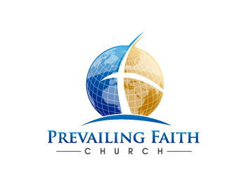
Prevailing Faith Church
Prevailing Faith Church
|
Contest Holder
pfclogo1
?
Last Logged in : 4921days12hrs ago |
Concepts Submitted
212 |
Guaranteed Prize
300 |
Winner(s) | A Logo, Monogram, or Icon |
|
Live Project
Deciding
Project Finalized

Creative Brief
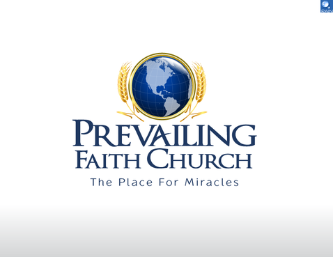
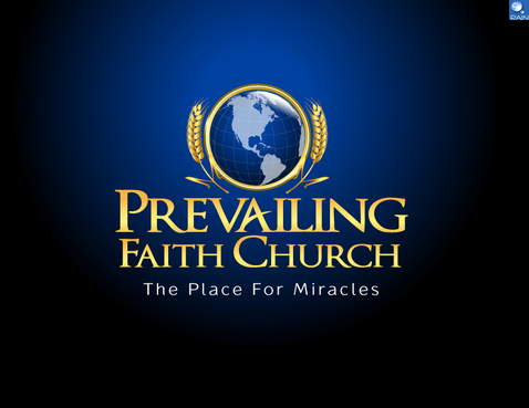
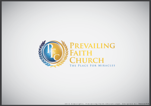
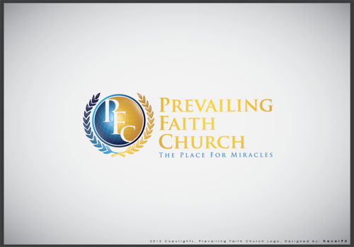
Prevailing Faith Church
Prevailing Faith Church
The Place For Miracles
Yes
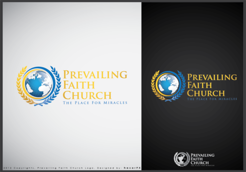
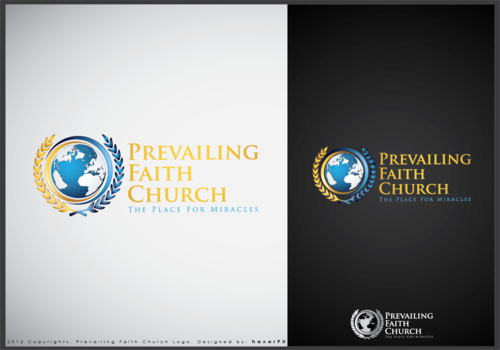
A Global image (GLOBE) with wheat stalks on each side symbolizing the world harvest. We are open to a completely different approach and new ideas other than the Global.
Religion and Spirituality
Symbolic
![]()
Character
![]()
Cutting-edge
Sophisticated
Professional
High Tech
blue and gold
not sure
Related Contests