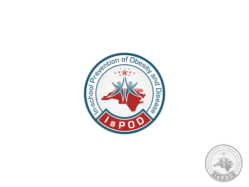
Program Logo - In-school Prevention of Obesity and Disease
IsPOD
|
Contest Holder
ISPOD
?
Last Logged in : 4964days1hr ago |
Concepts Submitted
274 |
Guaranteed Prize
500 |
Winner(s) | A Logo, Monogram, or Icon |
|
Live Project
Deciding
Project Finalized


Creative Brief
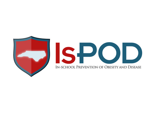
Program Logo - In-school Prevention of Obesity and Disease
IsPOD
No
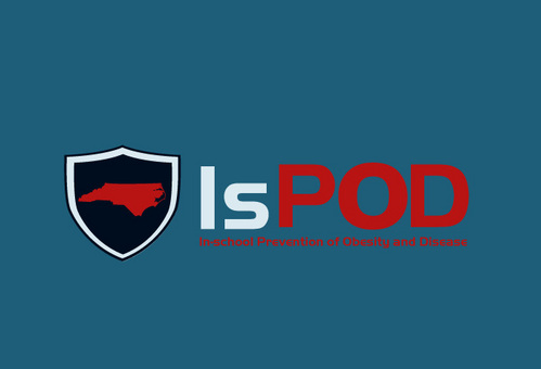
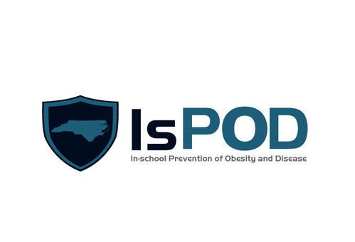
The IsPOD program was created to fight obesity in children in North Carolina. It has three main components - Education, Evaluation, and Advocation. Visit our website for more information: www.ispod.info
Education
Logo Type
![]()
Symbolic
![]()
Abstract Mark
![]()
Illustrative
![]()
Web 2.0
![]()
Cutting-Edge
Unique/Creative
Clean/Simple
Sophisticated
Modern
Abstract
Geometric
Blue, Grey - similar to our website (www.ispod.info) OR possibly bright colors? Not sure. We want a more professional look rather than a kid-like look.
not sure
We would like that logo to be compatible for print, to be created into a stitched logo for polo t-shirts, and to be used digitally.
Related Contests