PublishGreen.com
PublishGreen.com
|
Contest Holder
markl
?
Last Logged in : 5138days16hrs ago |
Concepts Submitted
73 |
Guaranteed Prize
149 |
Winner(s) | A Logo, Monogram, or Icon |
|
Live Project
Deciding
Project Finalized


Creative Brief
PublishGreen.com
PublishGreen.com
Yes
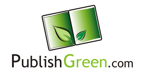
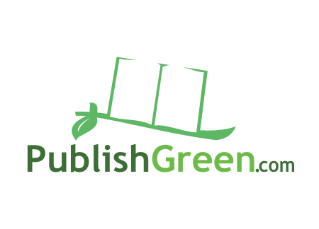
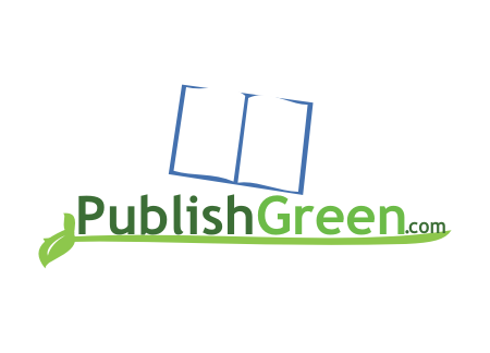
PublishGreen.com is an ebook publishing company.
both
![]()
Unique/Creative
Clean/Simple
Industry Oriented
Outdoors/Natural
One color palette is the following CMYK colors: 49-11-100-0 (word "Green" should be in this"),34-0-25-0, 17-0-23-0, 66-55-72-52, and white. However, we encourage designers to come up with others.
3
Here are some ideas from pictures we've seen in our istock account. THESE ARE ONLY IDEAS. You can click on them and read our accompanying notes. PLEASE NOTE, WE ONLY LIKE CERTAIN ELEMENTS OF EACH. THESE SHOULD BE SEEN AS A STARTING POINT.
http://www.istockphoto.com/stock-video-2708832-green-energy-hd.php -- the tree that appears in this link is a good sample of what a logo that contains a tree may look like (no lightbulb!!!)
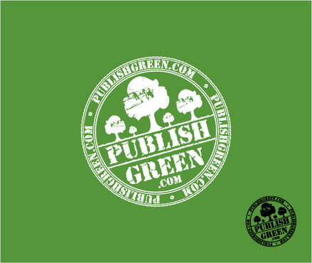
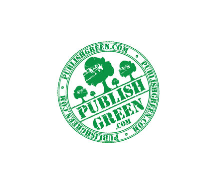
http://www.istockphoto.com/stock-photo-10525240-round-stamp-with-text-100-eco-friendly.php -- this grungy looking stamp is a good logo concept for this.
http://www.istockphoto.com/stock-illustration-10331363-rustic-recycling-and-nature-icons.php -the simplicity of some of these icons would work for a simple logo where the name of the company is to the right of the logo.
--