SALES / SUPPORT : +1-877-525-5646   |  


Quite Possibly Your Favorite Project

Website for Life Coach

Contest Holder muleperry ?

Last Logged in : 4263days16mins ago

Concepts Submitted

43

Guaranteed Prize
375
Winner(s)

1

Web Design veildAll design entries are veiled from other designers till the end of the contest.
tick_gray

Live Project

tick_gray

Deciding

tick_blue

Project Finalized


Project: Quite Possibly Your Favorite Proj ...
Industry: Personal Care Logo
Contest Launched: Jun 27, 2012
Selected: 1 winning design from 43 concepts
Winning Design by: smartinfo
Close Date: Jul 15, 2012


Quite Possibly Your Favorite Project - Personal Care


Awarded as a winner
Project Report    

Sort by:


#42

#43

#38

#32

#28

#24

#22

#19

#15

#10

#8

#5

#2

#27

#25

#18

#17

#16


Creative Brief


Quite Possibly Your Favorite Project

Website for Life Coach

Personal Care

www.myfavoriteday.com

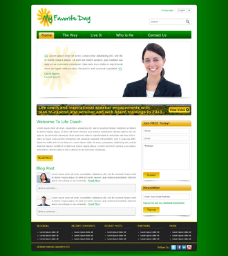
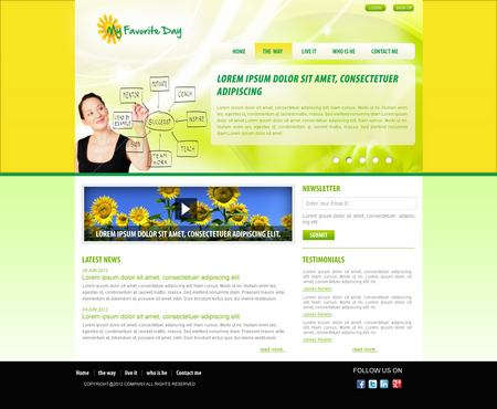
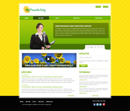
Website design for inspirational and motivational training company. Initial focus of the website is to promote trainer for life coach and inspirational speaker engagements with plan to expend into seminar and web based trainings in 2013.

General feel to be very upbeat, happy, feel good, simple and easy to navigate. !!When referring to the holding page of My favorite Day (which I think looks crap) please note the writing in the Logo of the name should be in Black!!

Friendly

Inspirational

Colorful

Yellow

Green

Black

left side

http://www.harveker.com/

http://www.drterry.com/

http://www.lisa-nichols.com/

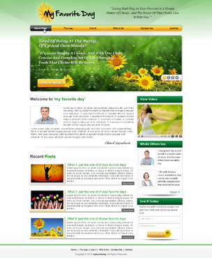
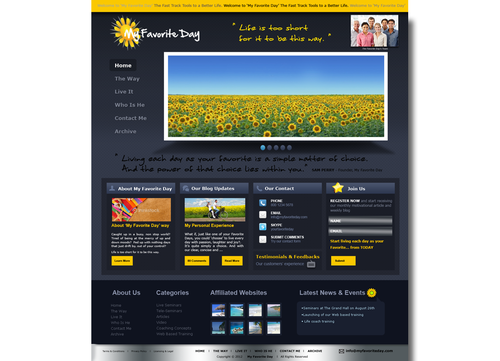
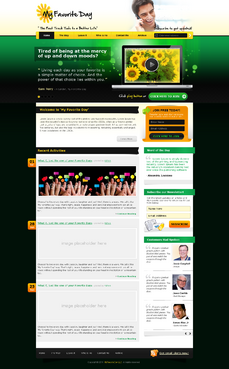
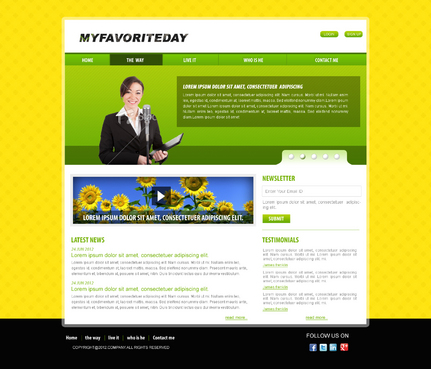
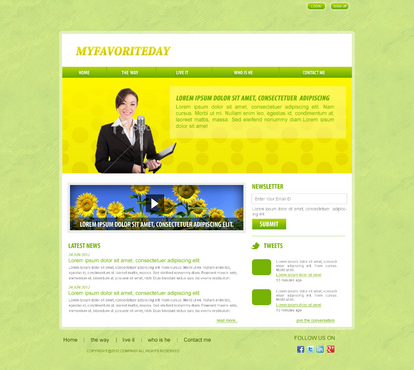
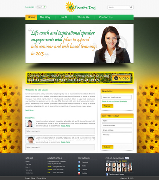
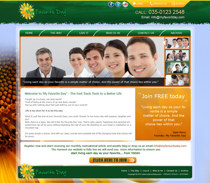
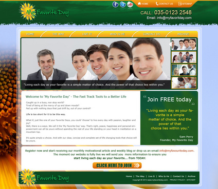
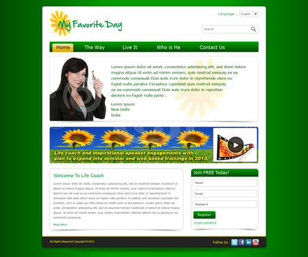
Home page to include areas for the following: Top banner showing logo, quote and small picture of face of company. Below this a thicker banner with sunflower field picture (in future to be a video link) and beside it text of an inspirational quote that will change on a regular basis. This to also include an opt in button where they can provide email address to be contacted or receive blogs and articles direct to their account. Links to other pages: home, the way, live it, who is he, contact me, archive Home page to also include a Short text intro to what my favourite day is all about with a picture of face of company again. Below this Space for most recent blog or article in full (to be changed on a regular basis) Opt in button at bottom of page Links at bottom of page to affiliated websites The opt in button to be at top and bottom of all pages with affiliate web links at bottom of all pages. Additional pages: The Way: A page describing the lifestyle being coached and it's different sections. There are 6 text sections in total on this page, each with a matching inspirational image to it. Live It: Introducing the concept of coaching. Images and text again with one testimonial at the top and a list of testimonials at the bottom Who Is He: A simply text and images page for bio information Contact: listing of ways in which to contact me. Also a space where they can fill out name, contact, and question or request. The submit button will automatically send this to an email. Archive: a simple listing of previous blogs and articles. These to be listed at top with a click on link to where they are further down the page

Related Contests


Modern webpage for beauty/fitness site
$400
Prize Money
223
Concepts
Webpage for skin and hair care company
$350
Prize Money
159
Concepts
Product Page Template
$351
Prize Money
33
Concepts

Discussion


Comments

  • July 13, 2012 7:05 AM
    muleperry muleperry
      Project Holder
    A huge thank you to everyone for their great creativity and effort. It has been very difficult to choose which direction to go into with this web page. There have been so many great ideas. Again...thank you all so much

    Like Icon 0   DislikeIcon 0
  • July 10, 2012 5:43 PM
    muleperry muleperry
      Project Holder
    My gratitude again to all of your for your submissions so far. There is such a wide range of ideas here. Much to think about in choosing.

    Like Icon 0   DislikeIcon 0
  • July 06, 2012 12:47 PM
    muleperry muleperry
      Project Holder
    Hi guys, Thanks so much for the new entries. All are looking amazing and giving me much to think about. I have time off tomorrow so will give some serious thought to all and give some firm feedback. Really grateful for your time and attention so far. Looks truly amazing. Thanks Sam

    Like Icon 0   DislikeIcon 0
  • July 03, 2012 1:12 PM
    muleperry muleperry
      Project Holder
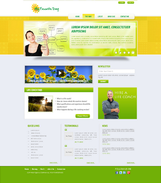
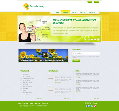
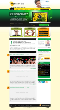
    Hi guys, Thanks so much for the submissions. Sorry have not commented until now but I have just returned to the country so I am focussed on it now. # 1 - I love the rich use of colours. Really got the right idea. And thanks for using the logo. Love the bright yellow on the top banner. (Leave It would be Live It though) Could you perhaps try and few things. I think replacing the cream background with black or a gradient of green might bring out the middle a little more. Also I will be keeping this website launch very simple with no twitter or facebook links at first. I like the idea of customers comments on the side and will use more of them than one I think. I would also suggest losing the Who is He and Community boxes and shifting up the welcome to MFD information for now #2 - I love the simplicity of this. I really want to keep the initial launch of the website very simple but to stand out. Could you try it with richer colours such as a richer leafy green, add in some black and a deeper yellow too. Also as I wont be tweeting (shame on me) I would think to add customer feedback and a more appealing opt in down the right column. Though both very different, very much on the right track in different ways. Will give more focus tomorrow Thanks so much again

    Like Icon 0   DislikeIcon 0
  • July 03, 2012 9:39 AM
    suvra4ever suvra4ever
     
    Sir, i just want to know that how many sub pages has to be created??

    Like Icon 0   DislikeIcon 0
  • June 27, 2012 1:52 PM
    SiteAdmin SiteAdmin
     
    Attention Designers, Our policy for stock photos has changed and is effective immediately. MycroBurst does not recommend the use of stock images. However, if you are submitting a design that uses a stock image (ex: website design) it is mandatory to provide the source of the image. Please provide the source in the comment section when uploading. Logos and stationery should NEVER use stock and/or clipart images. Any draft not following these guidelines will be withdrawn. Thanks, MB/LDG Team

    Like Icon 0   DislikeIcon 0