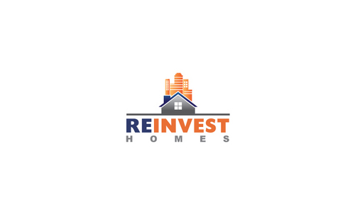
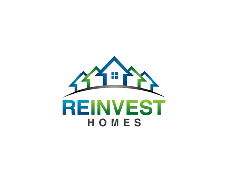
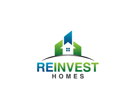
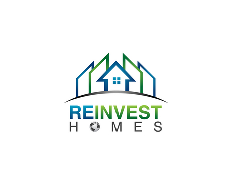
SALES / SUPPORT : +1-877-525-5646   |  


REInvest Homes Logo

REInvest Homes

Contest Holder homes ?

Last Logged in : 4626days8hrs ago

Concepts Submitted

144

Guaranteed Prize
250
Winner(s)

1

A Logo, Monogram, or Icon veildAll design entries can be viewed by other designers. Featured Featured Contest
tick_gray

Live Project

tick_gray

Deciding

tick_blue

Project Finalized


Project: REInvest Homes Logo
Industry: Real Estate Logo
Contest Launched: Apr 12, 2011
Selected: 1 winning design from 144 concepts
Winning Design by: ACEdesign
Close Date: Apr 19, 2011


REInvest Homes Logo - Real Estate


Awarded as a winner
Project Report    

Sort by:


#140

#138

#133

#129

#124

#72

#66

#63

#59

#41

#23

#22

#139

#137

#130

#114

#112

#104

#103

#102

#101

#95

#93

#88

#87


Creative Brief


REInvest Homes Logo

REInvest Homes

No

We are a Real Estate investment company focused on buying distressed properties and rehabbing/fixing them up to resale for a profit. Mostly focused on homes now but will be moving into commercial in the future. Located in California, but wish to keep a national brand in case we expand in future. We buy, fixup and sell. our target customer is motivated sellers wanting to sell their property quickly. Typically all cash. We then make the property really nice. The brand is most important to the Person we buy properties from. For selling the property after its fixed, we will use a different realty company instead. this particular logo will be used mostly for Marketing to motivated home sellers through online/offline marketing methods such as signs, direct mail campaigns, postcards, door hangers, websites, google ad words, facebook ads.

Real Estate

Abstract Mark
Abstract Mark


Cutting-Edge
Unique/Creative
Industry Oriented
Fun

I would like to leave this creative part up to designer based on knowledge, however I do like blues, blacks, silver/gray, red, oranges more than green, brown, white, yellow. However the logo colors should be impactful and have meaning based on the color definition charts and not be similar to too many of the other simlar home buying businesses.

not sure

I will be using the logo on all forms of advertising to promote my business including:
* Print (Business cards, letterheads, brochures etc)
* Online (Website, online advertising, banner ads etc)
* Merchandise (Mugs, T-shirts etc)
* Signs (Including shops, billboards etc)
* Television/screen


Related Contests


Classy and sophisticated logo for residential real estate company.
$501
Prize Money
672
Concepts
Logo for Mobile Home Park Owner
$210
Prize Money
46
Concepts
Logo for Maryland Real Estate Brokerage
$199
Prize Money
162
Concepts
Logo for real estate company
$200
Prize Money
251
Concepts

Discussion


Comments

  • April 19, 2011 2:44 PM
    homes homes
      Project Holder
    I know there is limited time left, but anyone want to try their design with a unique font for REINVEST HOMES? one thing I think some of the logos are missing is unique text like many companies use. their name is basically its own unique font. Any cool ideas here on a unique font for REINVEST HOMES? thanks

    Like Icon 0   DislikeIcon 0
  • April 19, 2011 1:18 PM
    homes homes
      Project Holder
    #138 and #140. Thank you for the great changes. Can you try tweaking it and make the Globe blue/green instead of gray/black? Also, the buildings seem to overshadow the home in the middle. Anyway to make the buildings smaller like the previous houses were, and then have the house still be the biggest piece in the logo? How about adding a few small windows to make them look more like buildings. Not a lot, just a few like some of the other designs show? Great concept. One of my favorites.

    Like Icon 0   DislikeIcon 0
  • April 19, 2011 7:56 AM
    mIx03 mIx03
     
    thanks CH i will make the changes. mIx03

    Like Icon 0   DislikeIcon 0
  • April 19, 2011 6:02 AM
    homes homes
      Project Holder
    #22 and #23, really like your design. Can you try making HOMES bigger, or more balanced with REINVEST? Just seems too hard to ready. Also, would be great to see a GLobe replace the O in homes like some of the other designs. Could you also make a version of #23 with two buildings to the left and right of the HOME in the center? That would be something I would like to see. Thank you

    Like Icon 0   DislikeIcon 0
  • April 19, 2011 6:00 AM
    homes homes
      Project Holder
    #91 and #92, can you make the globe in replace of the O in Homes smaller so its not crowding and overlapping REINVEST? thanks

    Like Icon 0   DislikeIcon 0
  • April 19, 2011 5:59 AM
    homes homes
      Project Holder
    #96, #86, #85, please make the font bigger for HOMES. It can be longer as well. Just so it fits and is viewable better. Would leave the versions you have, but would like to see the words below bigger. Also, if you could try substituting the O with a Globe as well to see how that looks. would be great. thanks

    Like Icon 0   DislikeIcon 0
  • April 19, 2011 5:57 AM
    homes homes
      Project Holder
    #99 and #77, please create the same design but instead of Orange, please use Green. I would like to see that version. Also, can you please make the font bigger for the HOMES. So the words can be ready clearly? Also, would like to see the O replaced with a globe like some of the others. If you have time, that would be great. Beautiful designs.

    Like Icon 0   DislikeIcon 0
  • April 19, 2011 5:53 AM
    homes homes
      Project Holder
    Thank You all for the great designs. I know there is only a few hours left. really appreciate all the creativity and variations. I tried to keep up with ranking. I plan to have some of my friends vote as well so please keep them up and I definitely see a winner in whats been posted so far.

    Like Icon 0   DislikeIcon 0
  • April 16, 2011 7:29 PM
    homes homes
      Project Holder
    $52 and #54, could you try another versions with the TEXT in a bit smaller font where it fits in alignment with the edges of the house on the left and right? Basically, the words fit in the box of the house below it. See an example here: https://www.facebook.com/#!/pages/Realty-National-Inc/211414145536077 Also, would be cool to see some of the logos with a GLOBE/WORLD in place of the O in HOMES like it shows here https://www.facebook.com/#!/pages/Realty-National-Inc/211414145536077 Thanks Thanks Ted

    Like Icon 0   DislikeIcon 0
  • April 16, 2011 7:23 PM
    homes homes
      Project Holder
    #20 and #23. I also like your concept here and center logo. Can you try another version that instead of having three houses, make the two smaller houses on the left and right of the center house buildings instead like commercial looking buildings but the house still in the center? I like the sizes your using. Lets see how that looks. Also for design #21 and #22, can you substitute Green with a dark Grey to see how that looks? Thanks

    Like Icon 0   DislikeIcon 0
  • April 16, 2011 7:04 PM
    homes homes
      Project Holder
    #42 and #43. great job on this concept. Like the colors and arrows. Can you try a version of this without the arrows? Maybe something else in place? Also, can you try a version of #43 that has HOMEBUYERS and PROPERTIES in place of HOMES to see how it fits? also make it aligned? Also, would like to see #43 with the chimney reversed so the building chimney is on the right instead of left. The arrows are great, but I am starting to think home buyers might take it wrong like I am trying to buy their home and then make it go up in value and take all the profit. if you get what I am saying. Really like the concept but wondering what else we could have instead of the arrows that would fit this concept? Thanks

    Like Icon 0   DislikeIcon 0
  • April 16, 2011 6:59 PM
    homes homes
      Project Holder
    #50. I like this centered design. One of my favorites as its aligned perfectly. Can you publish a version without the arrow on the roof? Would like to see it without it. Also, try using a commercial city type building instead of the third house on the right to see how that looks. Obviously you want it to fit and not screw things up, but I think it might look cool if you had two houses, and the third looked like a building but it went from small to large like you have it. That way it has the residential and commercial feel to it. I will let you play with it, but thats what I am thinking with your design. Also HOMES needs to be a larger font, so maybe make REINVEST a little smaller and HOMES much larger so they are in alignment like some of the other logos show with larger spaces in between H O M E S. Thanks

    Like Icon 0   DislikeIcon 0
  • April 16, 2011 6:54 PM
    homes homes
      Project Holder
    #58 and #59, really like your concept. Especially with the building. The buildings to the right might be a tad too tall. Just need to be flush where the Text starts on top. Can you try trimming them down a bit from top of building? Also, can you substitute HOMES with HOMEBUYERS and PROPERTIES so I can see how those words fit as well? FYI to all designers. I am going to be using the same logo for my three different company names of REINVEST HOMES, REINVEST HOMEBUYERS and REINVEST PROPERTIES so this is why I am asking. Thanks

    Like Icon 0   DislikeIcon 0
  • April 16, 2011 6:52 PM
    homes homes
      Project Holder
    #62. like your design. Great concept. Can you move the swirl to the left side, then move the Text closer to the logo so its not spaced away so much? Also make HOMES a bit larger? Can you also post a version that shows HOMEBUYERS in place of HOMES? Thanks

    Like Icon 0   DislikeIcon 0
  • April 16, 2011 6:48 PM
    homes homes
      Project Holder
    #60 Like where your going with the design. very simple. Only a few colors so easy to print and unique. Can you try a version without the arrow but instead maybe a building or some type of commercial building in place of the arrow. I don't care if its diagnol either. Just a variation of it? also, can you try your current version with HOMES being bigger and aligned with the REINVEST above it? Could you also post versions with HOMEBUYERS and PROPERTIES in place of HOMES to see if they will fit? TX-Ted

    Like Icon 0   DislikeIcon 0
  • April 16, 2011 4:48 PM
    homes homes
      Project Holder
    Hello all designers thanks for the great submissions. We are getting some great designs and I appreciate your hard work. To all designers: Thank you so much for your hard work, creativity and commitment on my project. There are many great designs. I really appreciate it. I am also looking forward to some new submissions and variations. since you are all pros and many have a great design/graphic advertising background. What will stick in someones mind when they see a sign that says WE BUY HOUSES or a logo on a big van driving by? If your a person that needs to sell your house, which company would you call when you see advertising and their logo? should it be fun and cartoonish like PETSMART, or more serious like WALMART, or a symbol thats memorable like Nike, or facebook. with the F. Any ideas on how to incorporate RH in the logo as a symbol like Facebook does with the F so that my webpage has a clear letter symbol that ties to my company name Reinvest Homes and Reinvest Properties? I am still looking forward to be surprised and amazed by new designs I have never thought of. If you are new to my project and thinking of submitting your designs, please see the following elements that is required to my logo: -company name should be "REINVEST HOMES", also with ability to substitute HOMES with "HOMEBUYERS" and "PROPERTIES" -I like the Black/Gray/BLUE/GREEN/ color schemes I am seeing in the logos. Red and Orange is ok as well but has to be impactful. -Please do not use Brown, Yellow. -fashion forward yet simple, memorable, and cutting-edge logo design ( i.e. Picasa, Petsmart, ESPN, NIKE, GUCCI, REMAX) I will start posting individual design feedback in separate posts now.

    Like Icon 0   DislikeIcon 0
  • April 15, 2011 2:41 AM
    homes homes
      Project Holder
    Anyone want to attempt a logo with the HOUSE as a focal point but also small buildings incorporated in the logo so it looks like Home/Commercial logo all in one? See some examples of uploads of other logos I found on the web that I like a bit, but not perfect enough to buy them. Thanks

    Like Icon 0   DislikeIcon 0
  • April 15, 2011 2:30 AM
    homes homes
      Project Holder
    #11 and #15, could you please also try the same logo but with a different FONT like GOTHAM or Helvetica? Also, can you try a variation with those fonts with REINVEST in all caps? Thanks Ted

    Like Icon 0   DislikeIcon 0
  • April 15, 2011 2:28 AM
    homes homes
      Project Holder
    Thanks for the great designs so far. Keep them coming. I am looking for some different type of log designs. Some creative placement of the TEXT along with a cool logo symbol that will stand out and people will say "cool" when they see it. Not too complex though as I have to print on a lot of media including my vehicle wrap.

    Like Icon 0   DislikeIcon 0
  • April 13, 2011 11:48 PM
    homes homes
      Project Holder
    Thanks for the submissions so far. #3 is close right now with the Font changes. I would like RE to be emphasized as a different color from INVEST. Also, can someone try different variations of REINVEST, like all capps: REINVEST, or ReInvest, REinvest, reINVEST, or reinvest, etc? I would like to see some designs with different variations of caps or no caps. Basically, go ahead and get creative. I like the font used in #1 however. No Italics please. Also, would like to see some logo examples where REInvest is above HOMES so two lines of text next to the logo. Also, feel free to submit it where the text is also embedded with the logo. Lets do something different here. Please alsk remember, I plan to put this on a vehicle wrap around all my vehicles so being cool and noticeable is a requirement!

    Like Icon 0   DislikeIcon 0
  • April 13, 2011 4:56 PM
    homes homes
      Project Holder
    Forgot to mention. My plan is to pick a logo and then move to creating business cards, stationary, brochures, door hangers, facebook business page, twitter page, website, so a lot of graphic work for my business in the near future. The winning designer will get first chance to bid on these projects. I am a firm believer of establishing a long term relationship with a design team that becomes familiar with our brand and business model on a long term basis.

    Like Icon 0   DislikeIcon 0