Restaurant Logo - Lot of freedom to be creative
Spice Junction
|
Contest Holder
SpiceJunction
?
Last Logged in : 4997days10hrs ago |
Concepts Submitted
76 |
Prize Money
175
|
Winner(s) | A Logo, Monogram, or Icon |
|
Live Project
Deciding
Project Finalized


Creative Brief
Restaurant Logo - Lot of freedom to be creative
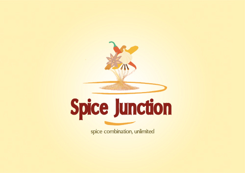
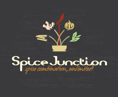
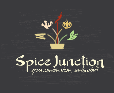
Spice Junction
Spice combinations, unlimited
Yes
Spice Junction is an upscale Indian Restaurant coming up in the Columbia, South Carolina, USA region. The restaurant will serve clean, tasty and healthy Indian food prepared using traditional and authentic Indian spices. The restaurant will target customers of diverse ethnicity living in this region.
Food
Logo Type
![]()
Symbolic
![]()
Clean/Simple
Traditional
We don't have anything particular in mind, it is left up to your creativity.
not sure
The main focus should be on "Spice" and their mixing/coming together/meeting ("Junction"). Keep it simple, eye catching and mouth watering!
Related Contests


