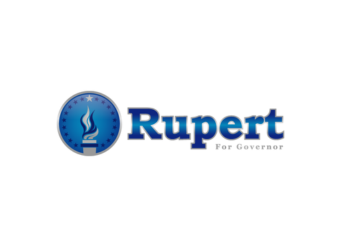
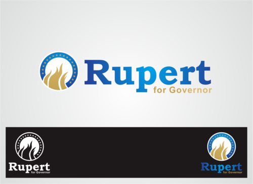
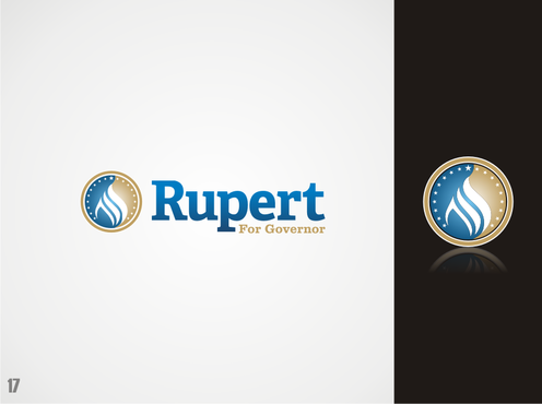
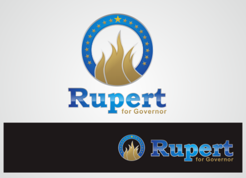
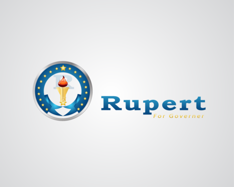
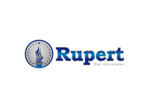
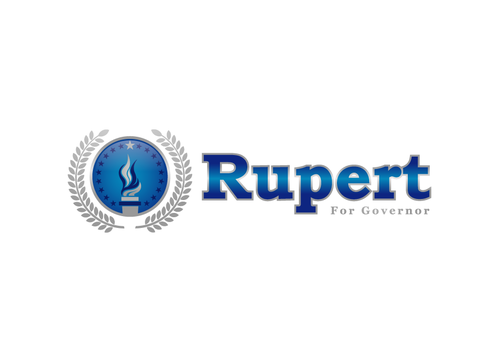
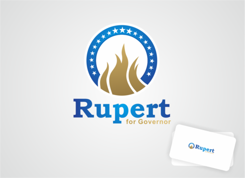
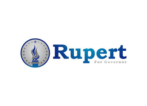
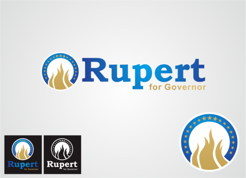
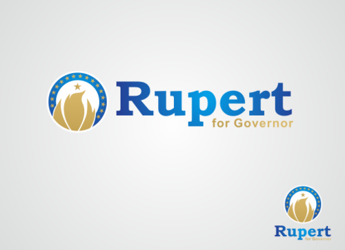
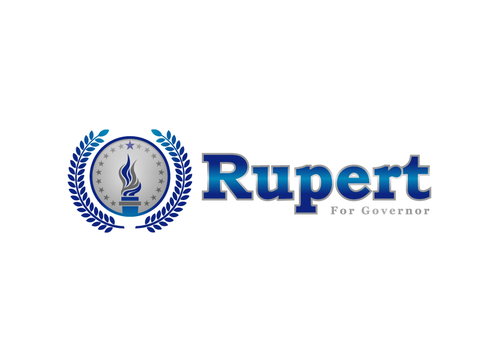
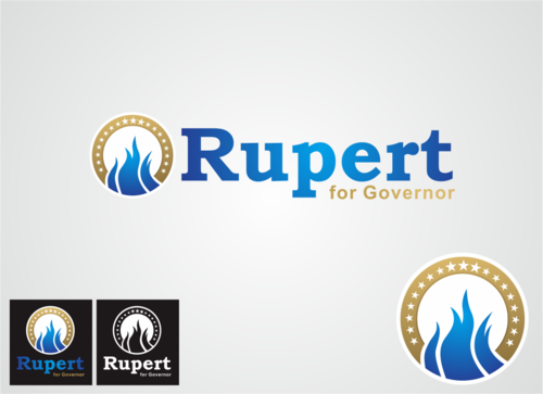
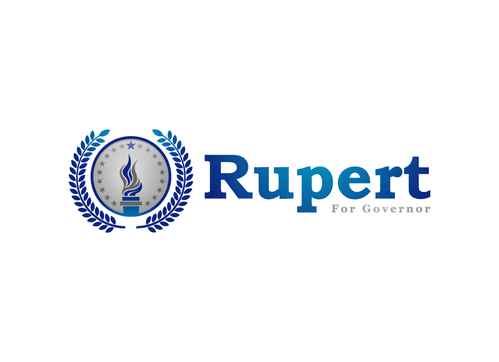
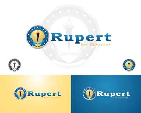
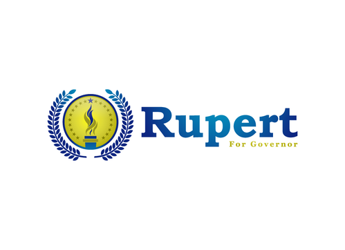
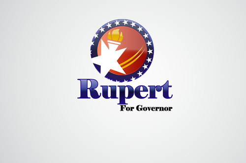
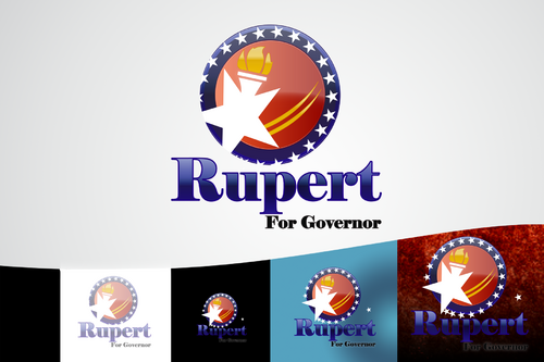
Rupert for Governor: Logo.
Rupert
|
Contest Holder
emcmahon
?
Last Logged in : 2162days11hrs ago |
Concepts Submitted
126 |
Guaranteed Prize
200 |
Winner(s) | A Logo, Monogram, or Icon |
|
Live Project
Deciding
Project Finalized


Creative Brief
Rupert for Governor: Logo.
Rupert
For Governor
Yes
Rupert (from Survivor) is considering running for Governor of Indiana. Should he decide to run, this would be his campaign logo and stationary.
To get a better understanding of Rupert visit the following:
rupertforgovernor.com -announcement page
rupertskids.org - Rupert's charity org
http://en.wikipedia.org/wiki/Rupert_Boneham
To better understand Libertarian ideas, please visit:
LPIN.org (Indiana state party)
LP.org (National party)
Government
Symbolic
![]()
Illustrative
![]()
Cutting-Edge
Unique/Creative
Sophisticated
Industry Oriented
Outdoors/Natural
Traditional
Retro
Serious
Blue, Gold and White.
3
Dark to light gradients. Rupert should be blue w/ gray-white border. For Governor should be gold with same border as Rupert. There should be NO text within the Icon. We will be using the Icon and Logo in a very similar way to President Obama's campaign. The symbol on a light blue background with the tag line moved around in different places. Just look at all the different "Hope", "Change", "Organizing for America" and "Yes We Can" materials.
Related Contests