SALES / SUPPORT : +1-877-525-5646   |  


Ryan

RK or rk

Contest Holder doreta ?

Last Logged in : 4427days14hrs ago

Concepts Submitted

84

Guaranteed Prize
199
Winner(s)

1

A Logo, Monogram, or Icon veildAll design entries are veiled from other designers till the end of the contest.
tick_gray

Live Project

tick_gray

Deciding

tick_blue

Project Finalized


Project: Ryan
Industry: Personal Logo
Contest Launched: Feb 22, 2012
Selected: 1 winning design from 84 concepts
Winning Design by: benben
Close Date: Mar 09, 2012


Ryan - Personal


Awarded as a winner
Project Report    

Sort by:


#77

#76

#49

#19

#18

#11

#6

#80

#79

#75

#74

#73

#72

#67

#66

#65

#59

#20


Creative Brief


Ryan

RK or rk

No

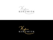
This is a logo of my name initials. I would like to use it, to personalise items eg have it embroided or stamped on clothes, hats etc and personal stationery. Be able to engrave it or stamp it onto pens and lighters or even as a stand-alone shape for a keychain.

Personal


Unique/Creative
Sophisticated
Serious

The color that I would like it to be is a silver-metal-chrome like color.

2

I saw a video on youtube (Logo Design-Project Runway (Seth Aaron) - www.youtube.com/watch?v=ChAuBHb6-4g that I liked the approach to the initials, as well as here on Mycroburst under Personal the winning logo for David Glover by eagle919 and for the same logo designs #85 and #84 by madiha.

Related Contests


Logo for a consumer services firm
$400
Prize Money
164
Concepts
Logo is for an organizing/decor styling business called Agonized to Organized, LLC
$200
Prize Money
119
Concepts
Doohickey Crest
$500
Prize Money
50
Concepts
LOGO CREATION
$199
Prize Money
166
Concepts

Discussion


Comments

  • March 09, 2012 11:41 AM
    doreta doreta
      Project Holder
    I finally chose a winner! Thank you all for all your great designs. The choise was not easy. Its been a pleasure!!!

    Like Icon 0   DislikeIcon 0
  • March 02, 2012 3:39 AM
    doreta doreta
      Project Holder
    drafts#52, #53, #54, #55 Unfortunately, as previously mentioned, I still see them more like one letter rather than two.

    Like Icon 0   DislikeIcon 0
  • March 01, 2012 8:43 AM
    doreta doreta
      Project Holder
    draft#40 Unfortunately, the same comment as previously made for drafts#38 and #39 still applies. Although you removed half of that line, I am really sorry to say this and please do not be offended, but now it looks like the trunk of an elephant to me. Even if you shorten this remaining line will not do it. I would appreciated it if you could connect the two letters in a different way, and please use the color of draft#39 but a bit brighter..

    Like Icon 0   DislikeIcon 0
  • March 01, 2012 6:46 AM
    doreta doreta
      Project Holder
    drafts#22, #23, #24 Draft#22 is on the right track compared to the other two which are nothing close to what I am looking for. Nevertheless, both the design and color do not feel right for me.

    Like Icon 0   DislikeIcon 0
  • March 01, 2012 6:26 AM
    doreta doreta
      Project Holder
    As a general comment, I would like to say if you could please avoid using frames of any sort as well as puting the letters facing two different directions.

    Like Icon 0   DislikeIcon 0
  • March 01, 2012 6:13 AM
    doreta doreta
      Project Holder
    drafts #33 and #35 When I look at them, although on the right track, I get the feeling, especially from a distance, that it only portays the letter 'R'. I would like it to be clearly visible that there are two letters in the design. With regards to the color is blueish instead of metalic. Your work on 'JC Services' has an excellent metalic effect. This is exactly what I am looking for.

    Like Icon 0   DislikeIcon 0
  • March 01, 2012 5:55 AM
    doreta doreta
      Project Holder
    drafts #38 and #39 The color effect is great on both, really like the real thing. The designs though not too much.I would like them to be more combined/interconnected and certainly no to the line that goes through them, which to me looks more like the hornes of a bull.You are on the right track though. Thank you.

    Like Icon 0   DislikeIcon 0
  • February 27, 2012 7:57 AM
    doreta doreta
      Project Holder
    Not a problem with the misunderstanding. What I meant with 'pretty in the eye', and although I know this is subjective (different people have different tastes and what I consider nice and pretty you may think the opposite) is that I would like the end design when looking at it to be able to say that it is not just two letters, but now that they are combined together, they create a nice design /shape on its own. This is why in the brief I mentioned the video on youtube as well as the winning design here in Mycroburst, so that designers will have an idea of what I consider 'prety' and 'nice' shape design on its own. Hopefully, this could be of some help.

    Like Icon 0   DislikeIcon 0
  • February 27, 2012 7:32 AM
    doreta doreta
      Project Holder
    drafts #16 and #18 I prefer draft #18 (the one without the reflection). But like I mentioned before, there is something in the design that is off and doesn't sit well with me. I cannot pin point it exactly. Maybe the top 'leg' of the 'K' which is of a different style than the bottom 'leg' (which is part of the 'R') the curvy one, which I like by the way. I don't know if I can explain it, but something feels that it doesn't belong there with the rest of the design. Something doesn't feel right to the eye. With regards to the color, I think its quite good.

    Like Icon 0   DislikeIcon 0
  • February 26, 2012 8:15 AM
    doreta doreta
      Project Holder
    drafts #13, #14, #15 Again the approach is exactly what i am looking for, but I still cannot say that I there yet. In terms of the color, the comment remains the same as the one for draft #12. Keep them comimg guys!!!

    Like Icon 0   DislikeIcon 0
  • February 26, 2012 8:03 AM
    doreta doreta
      Project Holder
    By the way, sorry that I was unavailable for a couple of days. I am back on track now.

    Like Icon 0   DislikeIcon 0
  • February 26, 2012 7:52 AM
    doreta doreta
      Project Holder
    draft #12 The approach is the right one, but the design not really. The color has to be bright and really be as close as possible to the effect of chrome/silver/stainless steel material.

    Like Icon 0   DislikeIcon 0
  • February 26, 2012 7:37 AM
    doreta doreta
      Project Holder
    draft #6 Is much closer to what I am looking for, but not quite yet.I think the 'K' looks both like a 'K' and an'R' which is a bit confusing and the 'R' is a bit on its own and not combined in the whole picture. The color is again a lot closer to what I want. Maybe it still needs to be brighter and shinner. drafts #8 and #9 The color is the closest to what I like, but I certainely do not want roses (I'm a guy) or any other shapes/designs, other than the two letters (initials). They also (the initials) MUST be interconnected/combined together somehow, to create one unique shape/design, which will still be clearly understood that it portrays an 'R' and a 'K'. draft#7 too simple.I am looking for something more artistic, but at the same time simple, elegant and sophisticated. The color not to bad, maybe needs to be more bright and shinning. draft #10 Too simple draft #11 Very good compared to draft #10. It is closer to what I am looking for, but I feel it lacks something. With regards to the color, unfortunately is all wrong. I am looking for a shinny, bright chrome/silver like color.

    Like Icon 0   DislikeIcon 0
  • February 23, 2012 4:52 AM
    doreta doreta
      Project Holder
    First of all, I would like to thank you for your designs. Unfortunately I find them all tooo simple for my liking and the color that I am looking for is metal/chrome/silver like color. Please keep them coming!!!

    Like Icon 0   DislikeIcon 0