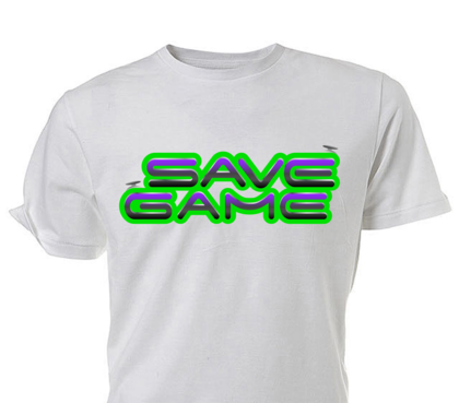
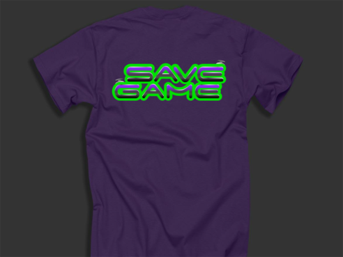
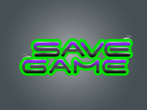
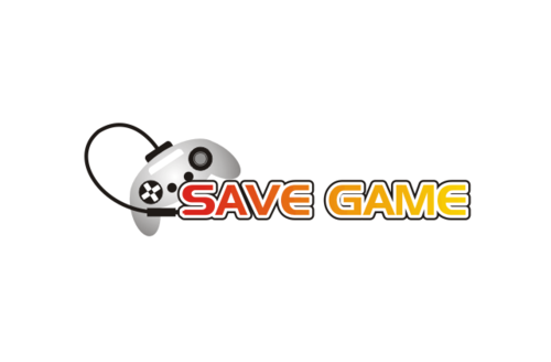
Save Game Logo
Save Game
|
Contest Holder
SaveGame
?
Last Logged in : 5262days4hrs ago |
Concepts Submitted
174 |
Guaranteed Prize
200 |
Winner(s) | A Logo, Monogram, or Icon |
|
Live Project
Deciding
Project Finalized


Creative Brief
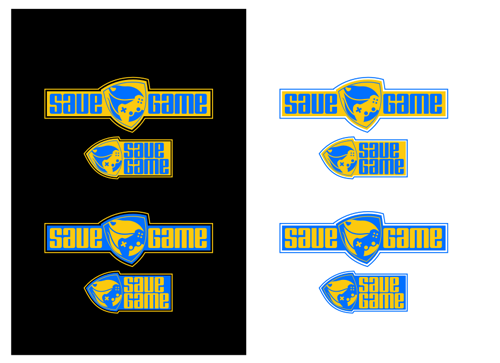
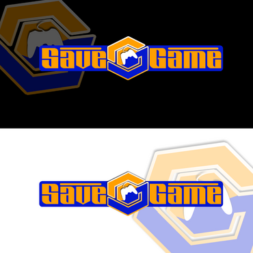
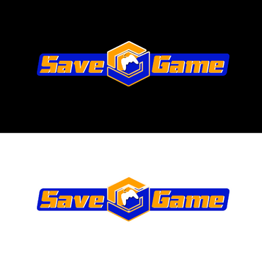
Save Game Logo
Save Game
No
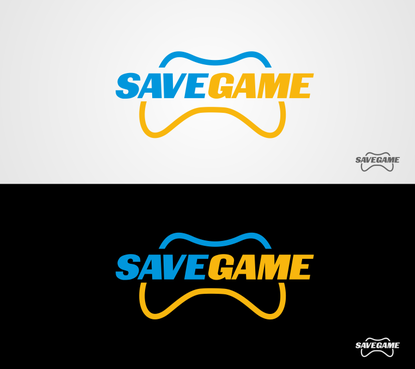
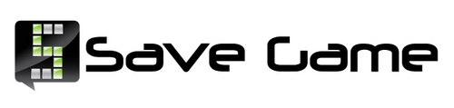
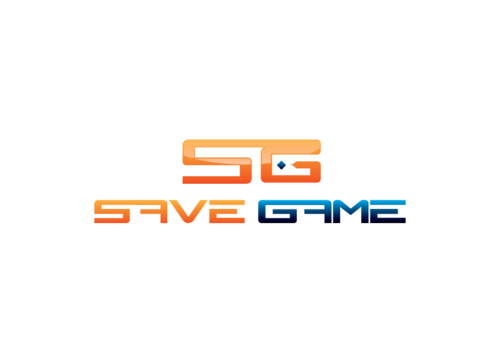
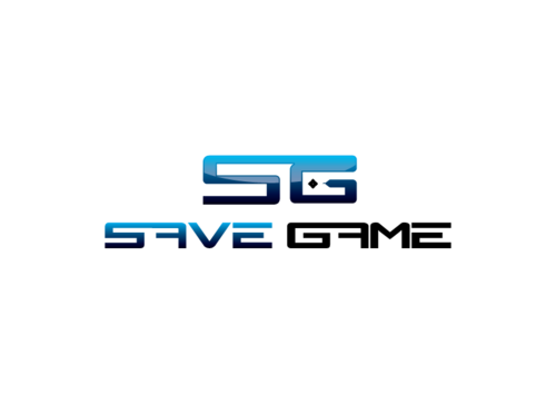
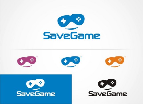
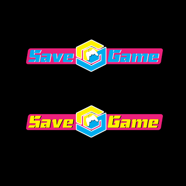
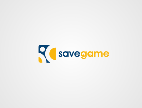
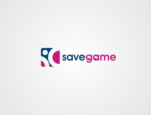
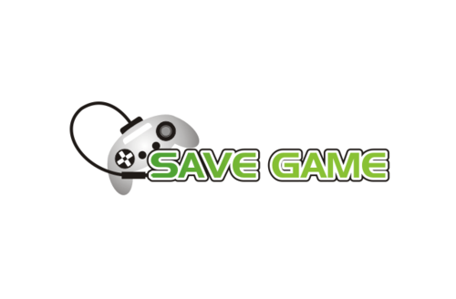
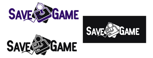
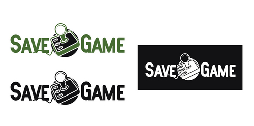
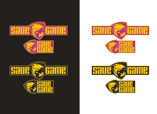
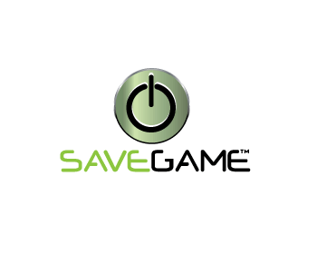
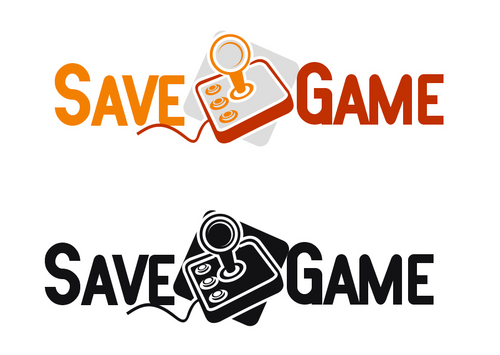
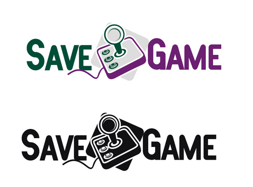
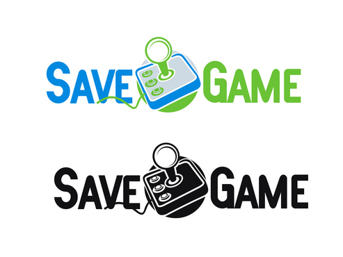
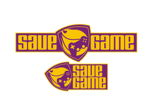
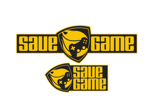
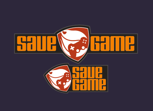
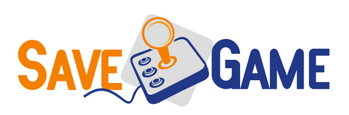
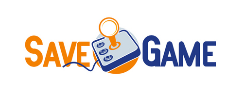
The logo is for a games website called ‘Save Game’. The website will feature news, reviews, opinions and feature articles covering all current video gaming systems. We have a focus on delivering news and reviews to individuals who love and are passionate about gaming, as well as catering to individuals with a more casual interest in games via our opinions and feature articles.
Video Gaming
Logo Type
![]()
Symbolic
![]()
Abstract Mark
![]()
Illustrative
![]()
Web 2.0
![]()
Cutting-Edge
Unique/Creative
Sophisticated
Modern
Industry Oriented
Fun
Illustrative
Playful/Cartoonish
I’m open to colours, but I favour colours that catch the eye – such as oranges, electric purples, blues, cyan’s etc (only one colour as a feature, however – not all at once!). The logo needs to look good against both black and white backgrounds, and I will require the final logo to also be colour reversed.
2
As far as logo’s go – anything that’s related to gaming or gaming culture would be well received. I’d like individuals to know this logo is related to gaming the moment they see it. It needs to be able to be read easily – so no fonts that are hard to read. This site will be something I am very passionate about, and I’d like that to be reflected in the logo design – a logo that is crisp and bold and stays in a person’s mind would be perfect.
Related Contests