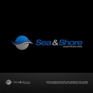
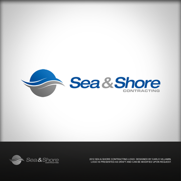
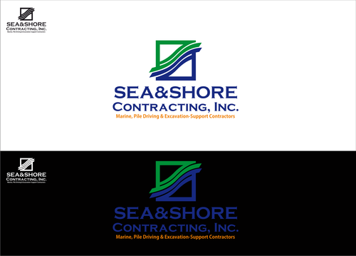
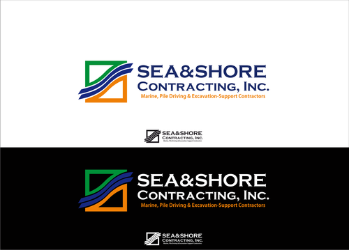
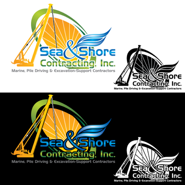
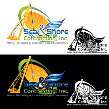
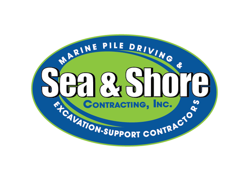
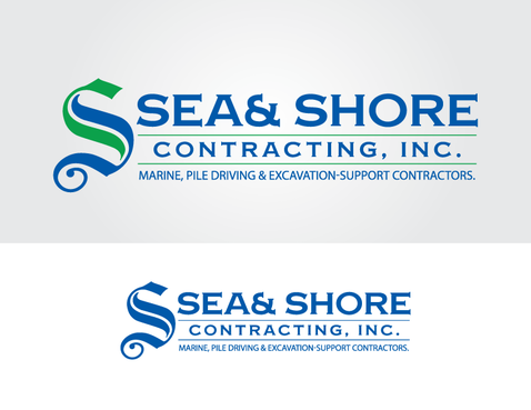
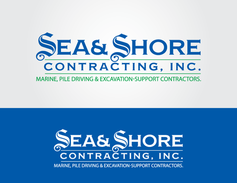
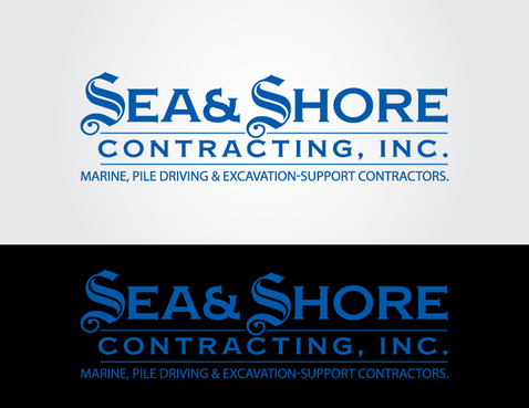
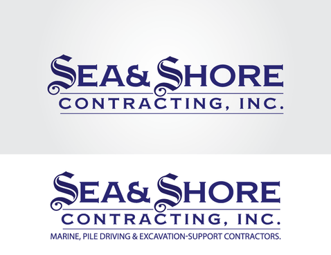
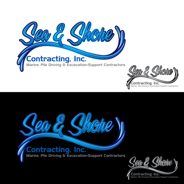
Sea & Shore Logo
Sea & Shore Contracting, Inc.
|
Contest Holder
rhamilton
?
Last Logged in : 3551days24mins ago |
Concepts Submitted
94 |
Guaranteed Prize
300 |
Winner(s) | A Logo, Monogram, or Icon |
|
Live Project
Deciding
Project Finalized


Creative Brief
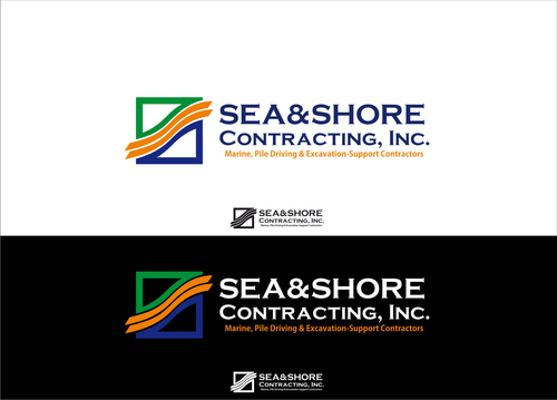
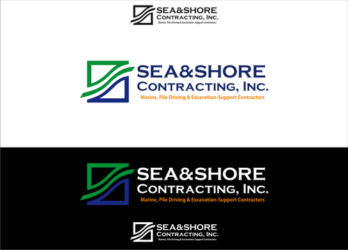
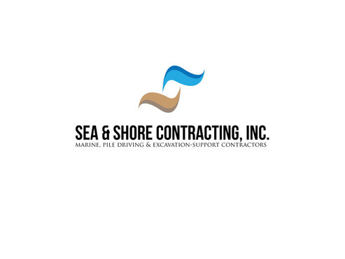
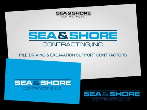
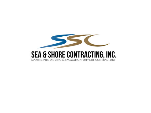
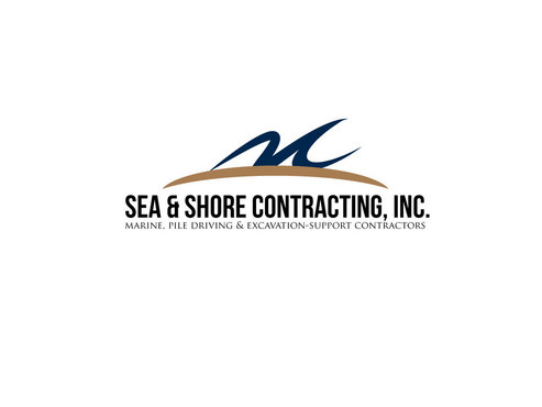
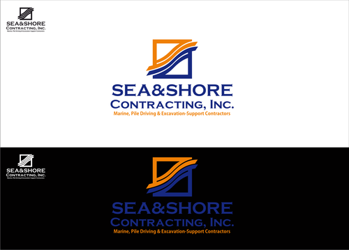
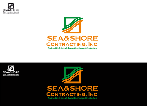
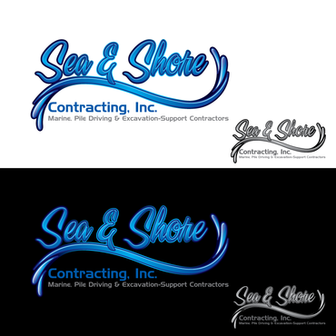
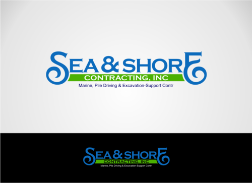
Sea & Shore Logo
Sea & Shore Contracting, Inc.
pile driving & excavation support contractors
Yes
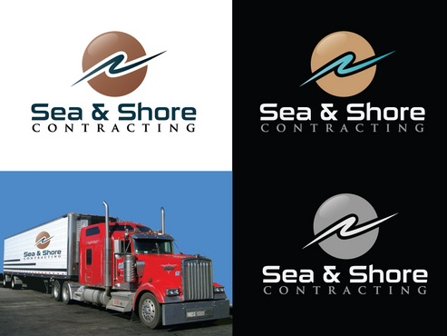
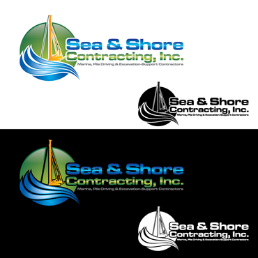
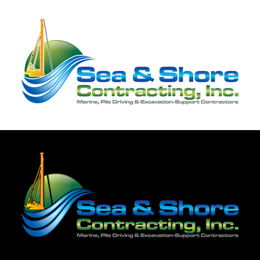
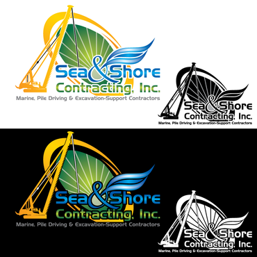
We are a pile driving company with operation on water and land. (www.seaandshorecontracting.com). Est in 2006, the company has never had any branding strategy or logo set in place. I want a logo that works well with the company name and tagline but the logo could also stand alone as a graphical representation of the company . We do operate a barge on the water for marine application but our land work is 80% of the company so i dont want a sea/ocean/beach feel to the logo. I also dont want the typical logo with the crane boom, barge or a logo hanging from a crane. Something simple and proffesional that would look great on the new trucks we are going to purchase and also all our equipment. Nothing to complicated that would be expensive to have lettered on all our vehicles and equipment.
Construction
Logo Type
![]()
Symbolic
![]()
Abstract Mark
![]()
Illustrative
![]()
Cutting-Edge
Clean/Simple
Modern
Illustrative
Dark Blue, not opposed to flourecent colors like green and orange something that stands out.
not sure
once logo is made it should be fleaxable in desing to add in a phone number and town without looking out of place
Related Contests


