SALES / SUPPORT : +1-877-525-5646   |  


Set of icons for an iPad app

Icons to replace existing

Contest Holder mprivat ?

Last Logged in : 4528days6hrs ago

Concepts Submitted

60

Guaranteed Prize
500
Winner(s)

1

Other veildAll design entries can be viewed by other designers.
tick_gray

Live Project

tick_gray

Deciding

tick_blue

Project Finalized


Project: Set of icons for an iPad app
Industry: Software Logo
Contest Launched: Jun 29, 2011
Selected: 1 winning design from 60 concepts
Winning Design by: 4graphicdesigner
Close Date: Jul 13, 2011


Set of icons for an iPad app - Software


Awarded as a winner
Project Report    

Sort by:


#46

#24

#12

#11

#57

#56

#52

#21

#20

#15

#13

#10

#32

#31

#30

#29

#22

#36

#35

#23

#55

#54

#51

#50

#49


Creative Brief


Set of icons for an iPad app

Icons to replace existing

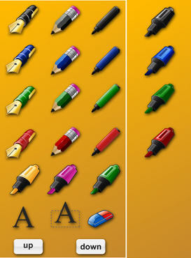
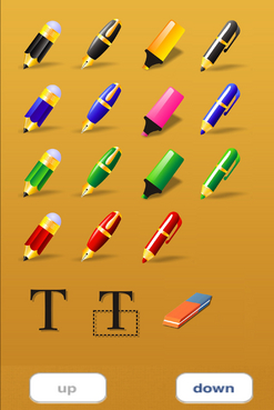
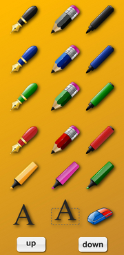
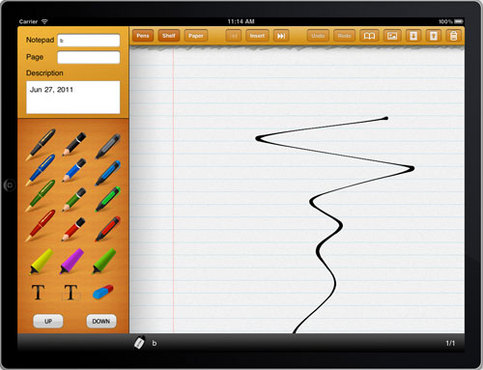
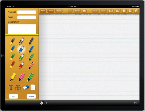
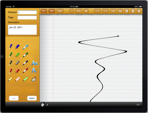
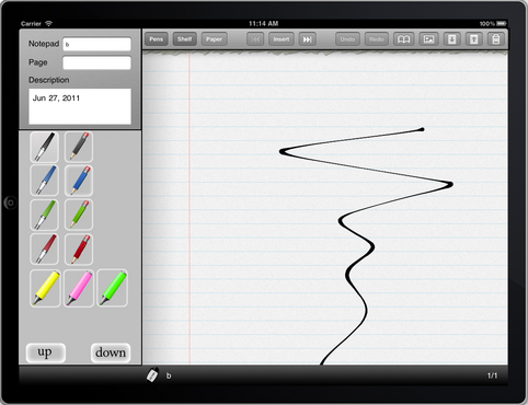
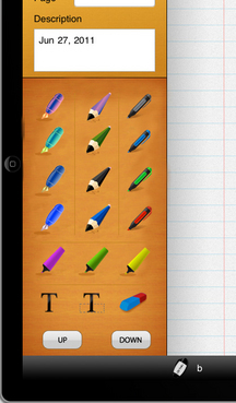
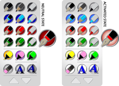
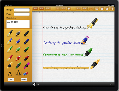
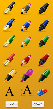
Ghostwriter Notes is an existing iPad app that needs a serious UI face lift. Part of the current UI is a palette of tools. A flattened screenshot of image to replace is located at http://majorspot.com/doc/palette.png I need 18 icons to replace the existing ones with something more professional looking. I generally like the 3D photorealistic look but I'm open to other designs. The orange background all needs to be replaced with something less aggressive to the eye.

Software

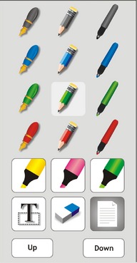
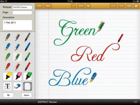
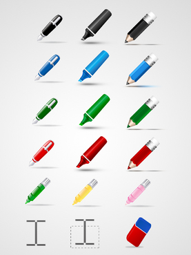
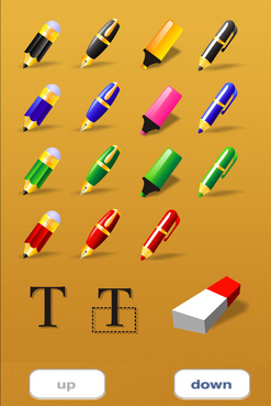
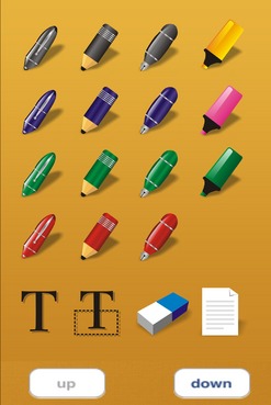
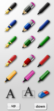
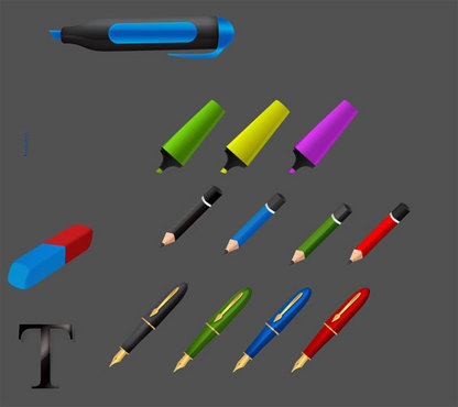
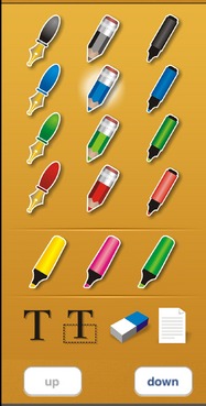
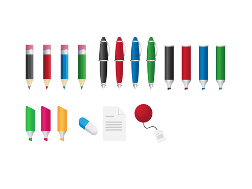
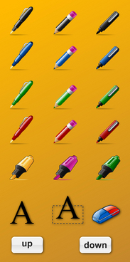
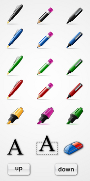
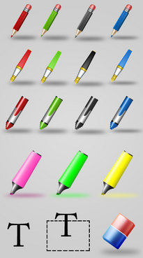
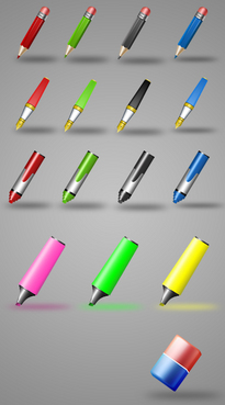
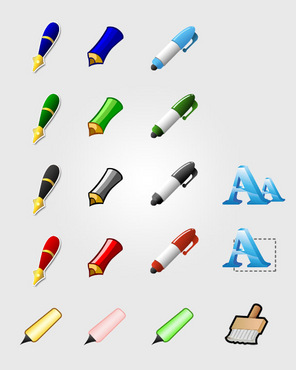
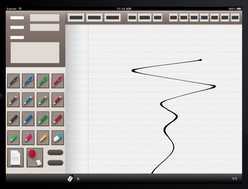
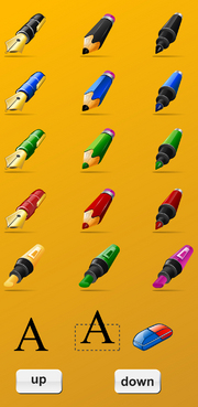
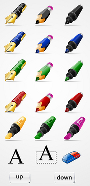
The resulting product should be a new background and 18 icons, all as independent layers so they can be extracted to be put in the app as independent images. Photoshop source required. The icons represent (left to right, top to bottom): - black ink fountain pen - black pencil - black marker - blue ink fountain pen - blue pencil - blue marker - green ink fountain pen - green pencil - green marker - red ink fountain pen - red pencil - red marker - yellow highlighter - pink highlighter - green highlighter - Text notes - Floating text notes (that the user can move around on the page) - Eraser The background should be easier on the eye.

Related Contests


Tank Top Design for Gas Delivery Mobile App
$150
Prize Money
60
Concepts

Discussion


Comments

  • July 08, 2011 8:23 AM
    mprivat mprivat
      Project Holder
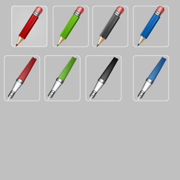
    I like the orientation and the look of the fountain pen in Draft #24, but overall it doesn't work well because the other pens don't have the same orientation

    Like Icon 0   DislikeIcon 0
  • July 06, 2011 12:50 PM
    mprivat mprivat
      Project Holder
    So far, all the designs are similar. Feel free to go out of the beaten path. I'm not necessarily attached to the current look, I just want it to look nice and attractive

    Like Icon 0   DislikeIcon 0