SALES / SUPPORT : +1-877-525-5646   |  


Shift: Cloud Hosting logo

Shift

Contest Holder stoneis ?

Last Logged in : 4130days6hrs ago

Concepts Submitted

332

Guaranteed Prize
250
Winner(s)

1

A Logo, Monogram, or Icon veildAll design entries can be viewed by other designers. Featured Featured Contest
tick_gray

Live Project

tick_gray

Deciding

tick_blue

Project Finalized


Project: Shift: Cloud Hosting logo
Industry: Internet Services Logo
Contest Launched: Jul 06, 2011
Selected: 1 winning design from 332 concepts
Winning Design by: alocelja
Close Date: Jul 16, 2011


Shift: Cloud Hosting logo - Internet Services


Awarded as a winner
Project Report    

Sort by:


#317

#316

#300

#290

#257

#256

#252

#251

#249

#228

#225

#224

#221

#215

#212

#207

#199

#195

#194

#192

#167

#164

#237

#236

#235

#223

#216

#213

#210

#200


Creative Brief


Shift: Cloud Hosting logo

Shift

shift to the cloud

Yes

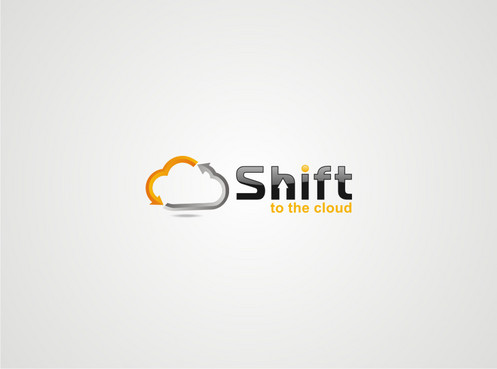
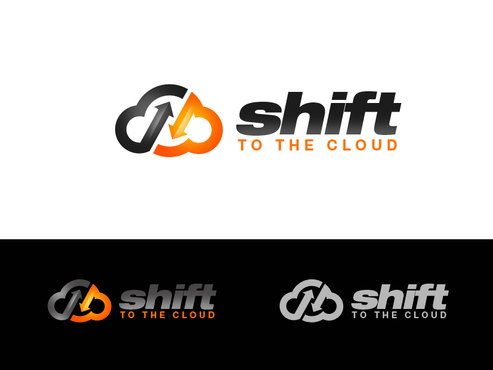
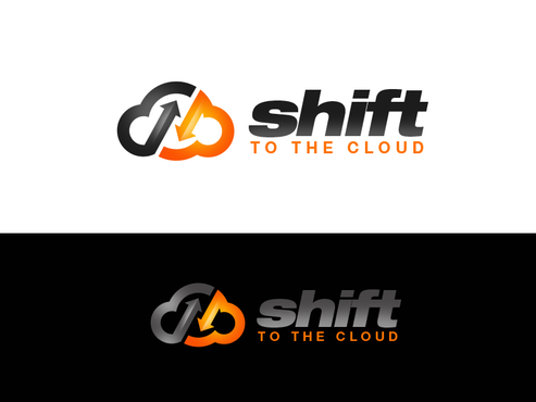
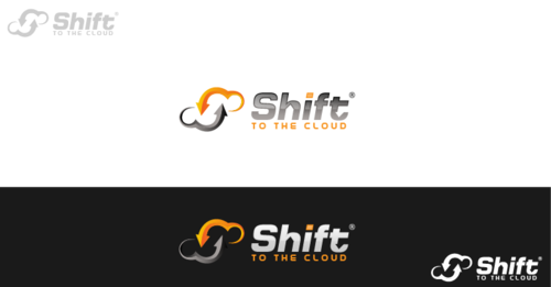
The design is for Stone Internet Services' new cloud hosting product. 'Shift' is our cloud hosting solution for smb's and corporate clients. This is a redundant, flexible and customizable hosting solution for websites, applications and databases.
Shift is used as an analogy for the flexibility and ease of use our Cloud hosting. Clients can easily up- or downgrade their package. Hence the shift (stickshift/gearbox) analogy.

Please take a look at our company's website: www.stone-is.com . The logo will be used on a minisite for this product. It should have a connection with our current site/logo design without being a flagrant copy. Do not feel limited bu our current image, but let it inspire you!

Internet Services

Abstract Mark
Abstract Mark

Web 2.0
Web 2.0


Cutting-Edge
Unique/Creative
Clean/Simple
Corporate
Modern
Industry Oriented
High Tech
Serious
Masculine
Abstract

if possible use a logo that can used with our current company colours (grey + yellow), please use our website as a reference: www.stone-is.com or www.1-eurohost.eu (english). But do not feel limited by these colours.

not sure

An idea could be using the concept of shifting: shift your business to the cloud. Like using a stickshift or gearbox or something like that.
But we love original ideas!

Related Contests


Logo for a domain name registrar
$250
Prize Money
299
Concepts
App for Tracking Patient Health
$200
Prize Money
127
Concepts
Logo for Solid Klik Indonesia
$500
Prize Money
179
Concepts
Logo for website-builder
$200
Prize Money
64
Concepts

Discussion


Comments

  • November 06, 2011 10:59 AM
    RichardB RichardB
     
    Check out www.DesignCage.net its pretty awesome,you can win more contests.

    Like Icon 0   DislikeIcon 0
  • July 19, 2011 8:12 AM
    diangga diangga
     
    congratz to Alocelja

    Like Icon 0   DislikeIcon 0
  • July 19, 2011 2:27 AM
    stoneis stoneis
      Project Holder
    After a lot of comparing and debating we have selected ALOCELJA (#290) as the winner! It was pretty close with 2 others, but finally this design convinced us with being simple but effective in translating our product in the design! THANK YOU ALL! And if you need a hosting solution, go to www.stone-is.com ;-) !

    Like Icon 0   DislikeIcon 0
  • July 16, 2011 2:49 AM
    stoneis stoneis
      Project Holder
    last hours... this is going to be hard deciding a winner!!!

    Like Icon 0   DislikeIcon 0
  • July 15, 2011 9:16 AM
    stoneis stoneis
      Project Holder
    #300, #290 and #257 = GREAT WORK! We love it. For the other designers, we are seeing a lot of good ideas, a lot of skills and a lot of WORK... so it is very hard to give feedback to all of you.

    Like Icon 0   DislikeIcon 0
  • July 14, 2011 3:36 AM
    stoneis stoneis
      Project Holder
    alocelja: could you redo draft #225 using white letters for the bottom right logo? and maybe also with a different font like in eg. # 194? the #225 font makes me think of microsoft... thanks!

    Like Icon 0   DislikeIcon 0
  • July 14, 2011 3:33 AM
    stoneis stoneis
      Project Holder
    Witter #239 etc are not bad, but I prefered the style in your #216 etc style designs.

    Like Icon 0   DislikeIcon 0
  • July 14, 2011 3:33 AM
    parucharu parucharu
     
    many following GNIT logo

    Like Icon 0   DislikeIcon 0
  • July 13, 2011 8:36 AM
    stoneis stoneis
      Project Holder
    Hexart #212 etc: nice designs! however try not to overcomplicate them. sometimes less is more! but they are certainly in front pack of designs!

    Like Icon 0   DislikeIcon 0
  • July 13, 2011 8:32 AM
    stoneis stoneis
      Project Holder
    alocelja #215: could you make your designs on black and white backgrounds like some other designers do? I like it!

    Like Icon 0   DislikeIcon 0
  • July 13, 2011 8:31 AM
    stoneis stoneis
      Project Holder
    WITTER #216: nice, could you try to 'fill up' the logo in the B/W versions? now it has a 'celtic' feel to it when only the borders are colored (in B/W version)

    Like Icon 0   DislikeIcon 0
  • July 12, 2011 3:23 PM
    stoneis stoneis
      Project Holder
    some really good designs are coming through... it will be a hard choice. I will try to give feedback on most of them tommorow. The star rating should already give an indication without being final...

    Like Icon 0   DislikeIcon 0
  • July 12, 2011 12:07 PM
    stoneis stoneis
      Project Holder
    alot of new and good designs, it will take us some time to analyze them all... thank you! feedback will follow later!

    Like Icon 0   DislikeIcon 0
  • July 12, 2011 3:11 AM
    stoneis stoneis
      Project Holder
    these latest designs #165 to #177 have some good ideas and nice interpretations of the shifting (gears/shiftstick) worked into design: great ideas! keep it up!

    Like Icon 0   DislikeIcon 0
  • July 12, 2011 3:11 AM
    stoneis stoneis
      Project Holder
    these latest designs #165 to #177 have some good ideas and nice interpretations of the shifting (gears/shiftstick) worked into design: great ideas! keep it up!

    Like Icon 0   DislikeIcon 0
  • July 12, 2011 12:08 AM
    parucharu parucharu
     
    Sir, will you please give any clue about your concept of gear in cloud . I feel mechanical , heavy, dead (lifeless) ,not related to software/solution for websites, applications and databases, that's why i feel. so sir plz tell me your Idea behind Gear so that we can implement in design creatively

    Like Icon 0   DislikeIcon 0
  • July 11, 2011 3:58 AM
    stoneis stoneis
      Project Holder
    designXtreme #125: simple but powerfull idea. just try to spice it up a bit please? make it a bit more pro please. thanks!

    Like Icon 0   DislikeIcon 0
  • July 11, 2011 3:56 AM
    stoneis stoneis
      Project Holder
    kaitoo #136: i definatly see some potential in this design. nice integration with the stickshifter. however, could you try making it look a bit more professional? it's looks pretty simple now. maybe try some effects of embossing? Thanks!

    Like Icon 0   DislikeIcon 0
  • July 11, 2011 3:53 AM
    stoneis stoneis
      Project Holder
    djormani #145: looks good: can you adjust your tagline please? I should be: to the cloud' thanks!

    Like Icon 0   DislikeIcon 0
  • July 09, 2011 6:17 AM
    stoneis stoneis
      Project Holder
    nobody using the stickshift analogy with the different gears? could be an idea...

    Like Icon 0   DislikeIcon 0
  • July 08, 2011 9:58 AM
    stoneis stoneis
      Project Holder
    #58: try some variations please...

    Like Icon 0   DislikeIcon 0
  • July 08, 2011 9:54 AM
    stoneis stoneis
      Project Holder
    not alot of people using the 'shifting' analogy in their designs.. maybe an idea? #daretoinnovate #beorginal

    Like Icon 0   DislikeIcon 0
  • July 08, 2011 9:54 AM
    stoneis stoneis
      Project Holder
    #80 definatly seeing some potention in this one...

    Like Icon 0   DislikeIcon 0
  • July 08, 2011 9:53 AM
    stoneis stoneis
      Project Holder
    #83, could you replace the red in the logo by some kind web 2.0 blue? as sort of experiment. thanks!

    Like Icon 0   DislikeIcon 0
  • July 08, 2011 6:41 AM
    stoneis stoneis
      Project Holder
    pixdesign #77: it could be something. Please try playing around with the colors and maybe adjusting the font of shift and using smaller font for the tagline? only suggestions...

    Like Icon 0   DislikeIcon 0