SALES / SUPPORT : +1-877-525-5646   |  


Sleep Aid Supplement Label

Energy Drink

Contest Holder paragon ?

Last Logged in : 4291days17hrs ago

Concepts Submitted

18

Guaranteed Prize
350
Winner(s)

1

Other veildAll design entries can be viewed by other designers. Featured Featured Contest
tick_gray

Live Project

tick_gray

Deciding

tick_blue

Project Finalized


Project: Sleep Aid Supplement Label
Industry: Beverages Logo
Contest Launched: Jul 04, 2012
Selected: 1 winning design from 18 concepts
Winning Design by: anujdate
Close Date: Jul 18, 2012


Sleep Aid Supplement Label - Beverages


Awarded as a winner
Project Report    

Sort by:


#15

#12

#18

#17

#16

#14


Creative Brief


Sleep Aid Supplement Label

Energy Drink

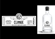
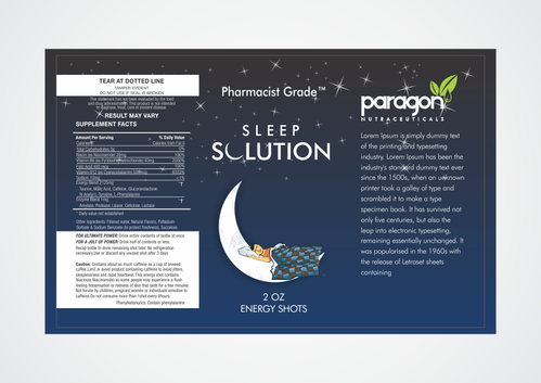
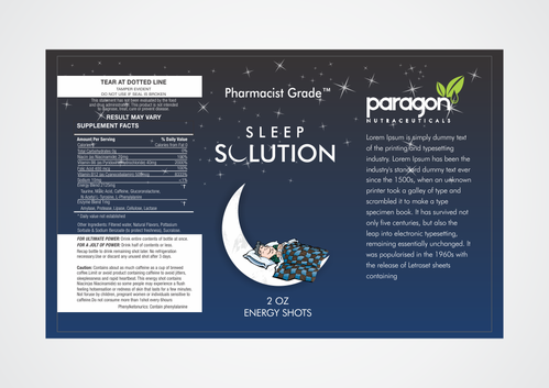
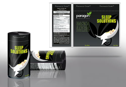
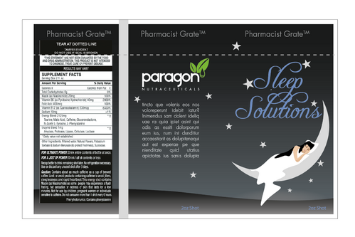
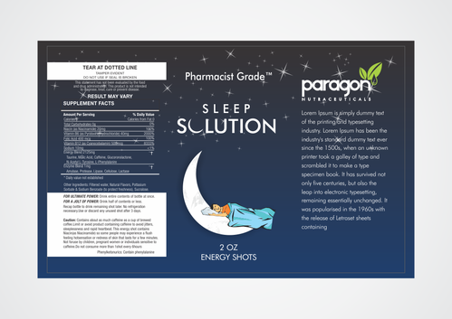
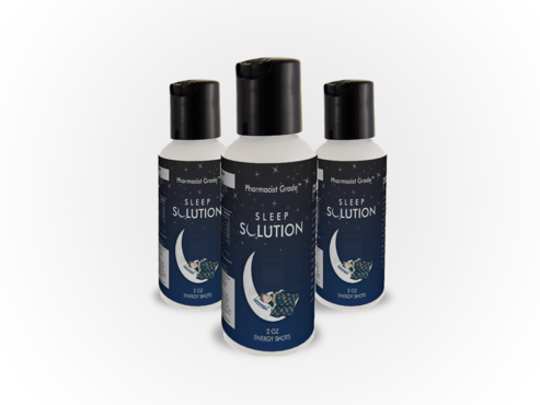
Hello designers, We'd like some help designing a label for our new 2 oz shot size sleep aid supplement. We've linked to two templates below that outline the size requirements for the label. For the sake of simplicity, let’s describe the label as consisting of four quarters. The first two quarters: We'd like to have an all black label with a crescent moon that is tilted up slightly with a person sleeping on it, in its curve. The person has a blanket pulled up to their neck and has their head nestled on a pillow and is sleeping peacefully. See http://images.wikia.com/shipoffools/images/b/ba/Moon1.jpg for an example of a moon that we like. The person can be sleeping in the first 1/3 of the moon where it is relatively flat or along the entire curve. We wish to avoid having the image appear “too cartoonish”. We will provide feedback daily in the comment section. Above the moon is the name of the product "Sleep Solution". Above this, along the very top of the label, where it is heatshrunk over the cap (the neckband), we want our slogan "Pharmacist Grade™". The third quarter: The third quarter comprises of the side of the bottle. Here, we will have our company logo (link provided below to png and vector image). We also want a box of text underneath it that you can fill with lorem ipsum mumbo jumbo for now. The last quarter: This last portion is nearly completely consumed by the “supplement facts” box. For now, please use the supplement facts listed in the template. We will adjust it with our blend after creation. For that, we request two types of vector files for the final submission: one with text intact so that we may edit them readily and one with text saved as outlines or curves. Energy shot label templates: These can help you visualize the format, the takeaway point is that the printing area is 82.5mmx130mm https://docs.google.com/open?id=0B7aFXOXYtBljUWxPS19aRWJPcGM https://docs.google.com/open?id=0B7aFXOXYtBljQ2Zxcjh4dDR1NWM Company name logo: https://docs.google.com/open?id=0BxHzHo6V3IdiUF9jWVI5TTRKRlk https://docs.google.com/open?id=0BxHzHo6V3IdiTG1PU2FCMzlIdk0

Beverages

Age 18-49, College students, young and middle aged professionals.

See above.

Related Contests


Water Bottle Label for Holistic Beverage Company
$150
Prize Money
62
Concepts
Bottle design for Rum bottle
$500
Prize Money
29
Concepts
LABEL for a large LIQUOR/SPIRIT brand.
$400
Prize Money
18
Concepts
Cool/Fun Shirt Design for University of Beer (Beer Bar)
$200
Prize Money
18
Concepts

Discussion


Comments

  • July 14, 2012 5:30 PM
    paragon paragon
      Project Holder
    We starred the two that we're leaning towards, we'd like to work around both of those ideas, keep it up guys good work.

    Like Icon 0   DislikeIcon 0
  • July 10, 2012 7:01 PM
    paragon paragon
      Project Holder
    Thanks for all the contributions. We're really focusing on the moon and design of the name, since the other parts of the label are given. The dark blue is also a nice alternative to the pure black that we originally requested and is an option for us. We like the "Paragon" font of our logo to be white as it's much easier to read on the dark background. Keep it clean and readable and keep up the good work.

    Like Icon 0   DislikeIcon 0
  • July 08, 2012 10:35 AM
    paragon paragon
      Project Holder
    What's the difference between 4 and 5 other than the design on the box going around Sleep Solution. People please don't change up one tiny thing and call it a different design. We're looking for creative and innovative.

    Like Icon 0   DislikeIcon 0
  • July 06, 2012 7:18 PM
    paragon paragon
      Project Holder
    #2 is the direction where we're headed, keep it up guys!

    Like Icon 0   DislikeIcon 0
  • July 05, 2012 8:58 AM
    SiteAdmin SiteAdmin
     
    Attention Designers, Our policy for stock photos has changed and is effective immediately. MycroBurst does not recommend the use of stock images. However, if you are submitting a design that uses a stock image (ex: website design) it is mandatory to provide the source of the image. Please provide the source in the comment section when uploading. Logos and stationery should NEVER use stock and/or clipart images. Any draft not following these guidelines will be withdrawn. Thanks, MB/LDG Team

    Like Icon 0   DislikeIcon 0