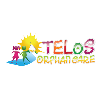
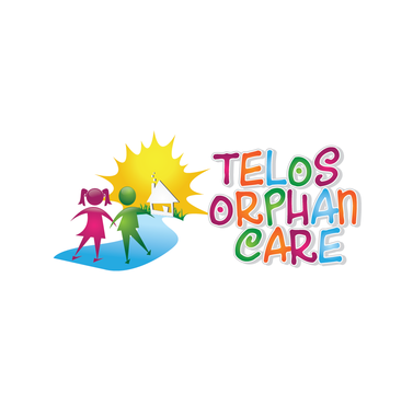
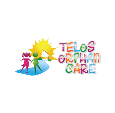
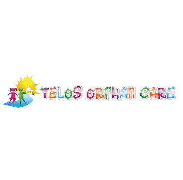
Software Project Logo
Telos
|
Contest Holder
Telos
?
Last Logged in : 4300days15hrs ago |
Concepts Submitted
84 |
Guaranteed Prize
250 |
Winner(s) | A Logo, Monogram, or Icon |
|
Live Project
Deciding
Project Finalized


Creative Brief
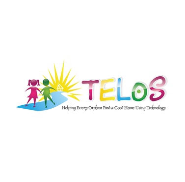
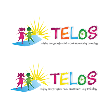
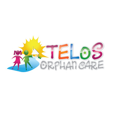
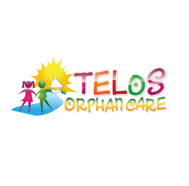
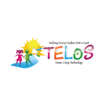
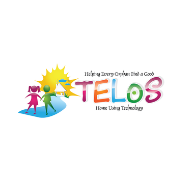
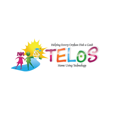
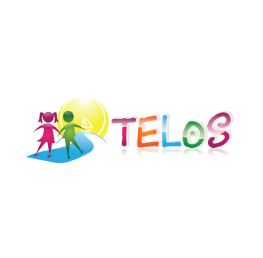
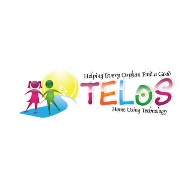
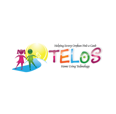
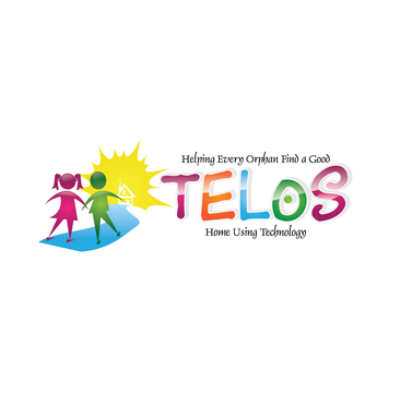
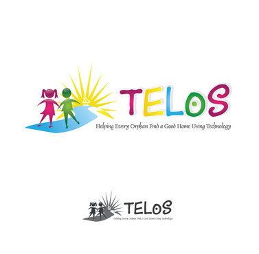
Software Project Logo
Telos
Helping every orphan find a good home using technology
Yes
We are creating a child tracking database that is being built for ministries that provide care for orphans and vulnerable children around the world. This solution is designed to help these organizations raise more funds, provide better care, and reduce the administrative burden encountered now with manual and ad-hoc systems. This software is being built by volunteers and will be provided to organizations for free.
Childcare
Symbolic
![]()
Any are fine that achieve goals above
not sure
We are going to create a nonprofit foundation to build, support and enhance this software. It doesn't exist now, and we don't have a name for the software itself. - Suggestions on both are most welcome
Related Contests


