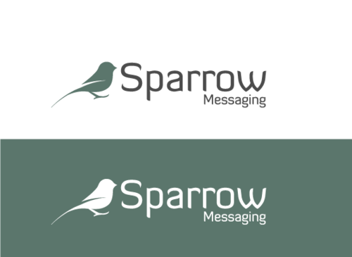
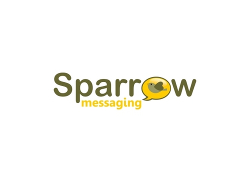
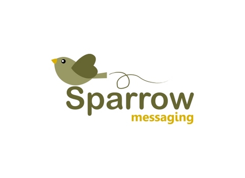
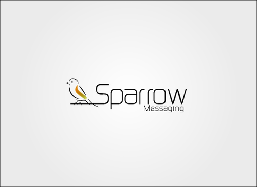
Sparrow
Sparrow Messaging
|
Contest Holder
sparrow
?
Last Logged in : 5147days23hrs ago |
Concepts Submitted
164 |
Prize Money
199
|
Winner(s) | A Logo, Monogram, or Icon |
|
Live Project
Deciding
Project Finalized


Creative Brief
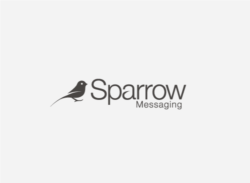
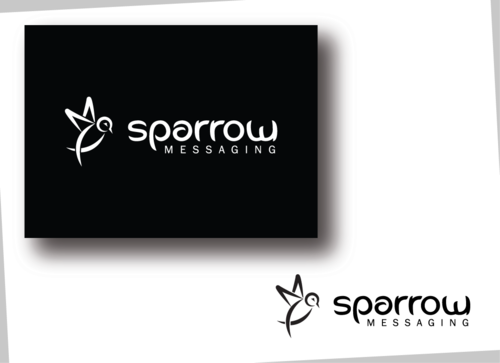
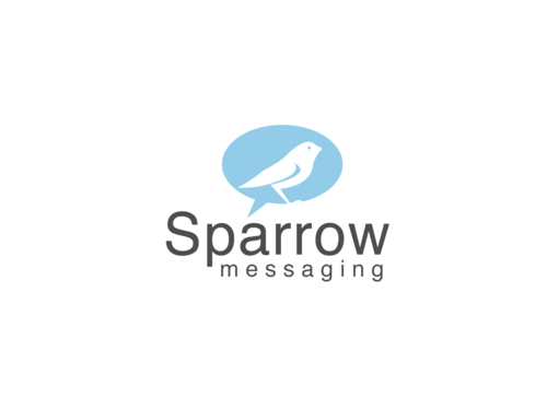
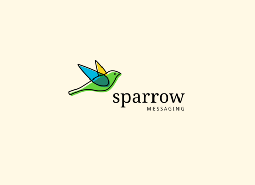
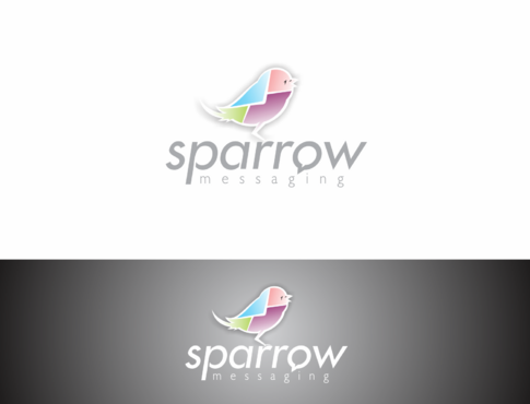
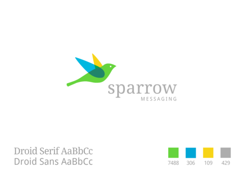
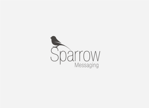
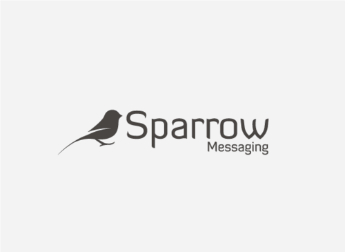
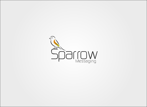
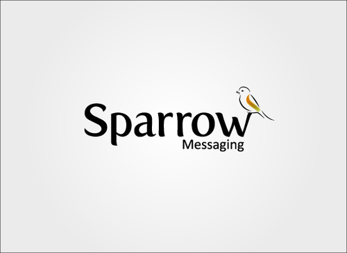
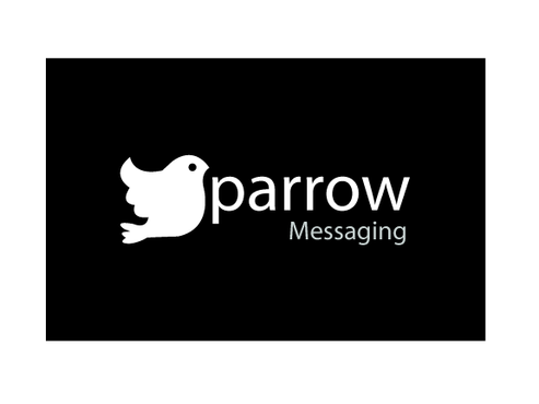
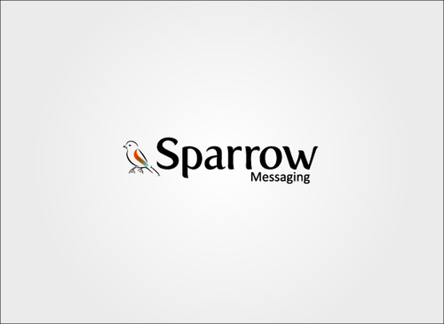
Sparrow
Sparrow Messaging
No
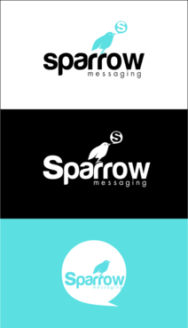
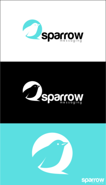
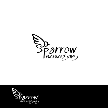
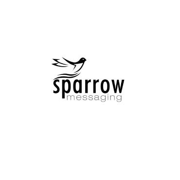
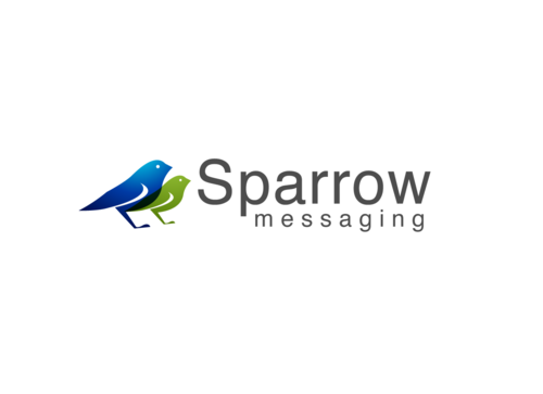
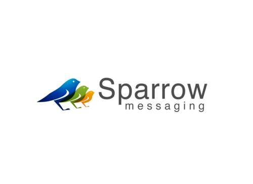
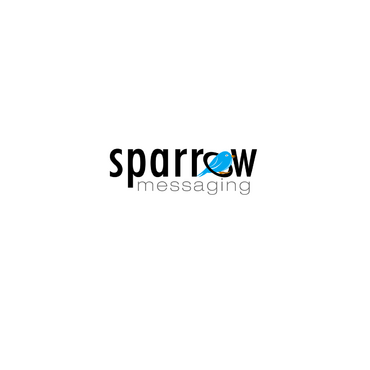
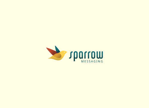
This logo is for a collection of 3 different companies: Sparrow Messaging, Sparrow Healthcare, and Sparrow Med. They are all involved in the healthcare field. Sparrow Healthcare does psychiatric consulting for residential treatment centers and nursing homes. Sparrow Med is an addiction clinic. And Sparrow Messaging is a text message reminder service for clinics. Here are the websites:
Sparrowhealthcare.com
Sparrowmed.com
Sparrowmessaging.com
I'd like the logo to work for all three. You design one logo with an amazing sparrow bird picture and cool sparrow text, and then have 'Messaging' in the logo too, that I will later be able to replace with 'Healthcare' and 'Med' for the sister companies (that have the same ownership)
Health
Logo Type
![]()
Symbolic
![]()
Character
![]()
Cutting-Edge
Unique/Creative
Clean/Simple
Sophisticated
Corporate
Modern
The colors shouldn't matter as much. It should look great in black on white, white on black, or any color on white, or white on any color. I'm thinking of a black, green, blue, or maroon for the main logo though.
2
Here are some sparrow logos I like, for inspiration:
http://www.sothink.com/page/logo-design/images/BlackSparrow.jpg
http://logopond.com/logos/e076521438d3397632abffb4267e9fa1.png
http://madebysparrow.com/Sparrow_Creative/Sparrow___Creative_files/Logo2-1.png
Related Contests


