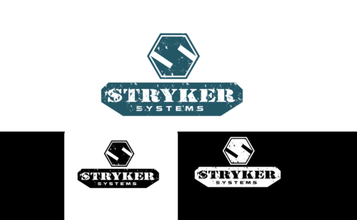
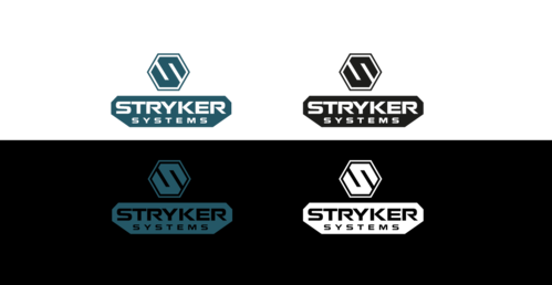
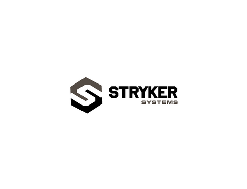
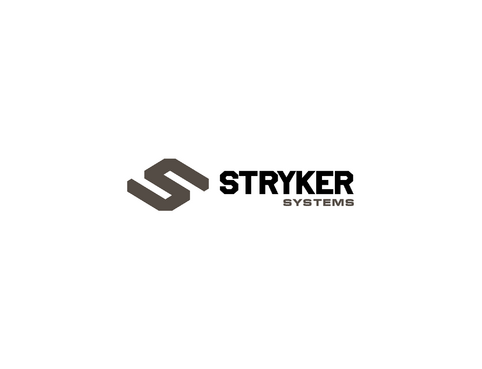
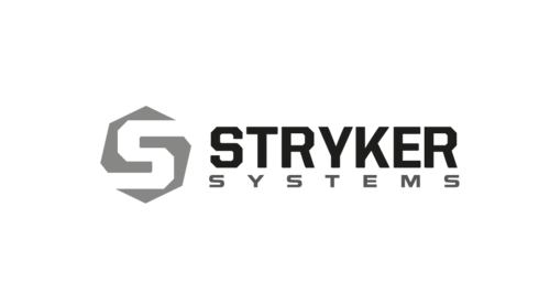
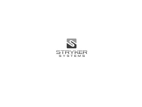
Stryker Systems Logo
Stryker Systems
|
Contest Holder
CNCBO
?
Last Logged in : 4869days16hrs ago |
Concepts Submitted
154 |
Guaranteed Prize
225 |
Winner(s) | A Logo, Monogram, or Icon |
|
Live Project
Deciding
Project Finalized


Creative Brief
Stryker Systems Logo
Stryker Systems
No
We manufacture and sell a product line of welders and plasma cutters.This logo will appear on the side surfaces of our welder/plasma systems.
We are looking for a logo that will convey a message that we build strong, rugged and dependable equipment.
I would like a sophisticated logo that I can use in publications but also extract the unique font and symbol and slap it on the side of our equipment.
I would like the logo to include a font and a symbol. For the font I am thinking of a retro font used on WW2 military aircraft. For the symbol, I would like a boxy geometric design seen on abrams tanks turrets or stealth aircrafts. The "Systems" part of the logo could be smaller if it works better for the design.
The essence of our brand is the WW2 generation is back to build modern machines.
Manufacturing
Symbolic
![]()
Abstract Mark
![]()
Character
![]()
Clean/Simple
Modern
Retro
Masculine
Charcoal grey, white and black
3
Related Contests