Stylish and Professional Logo for Dentist
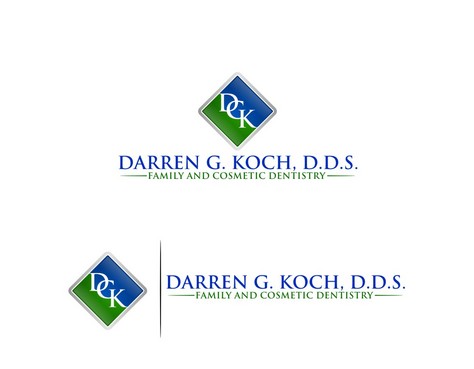
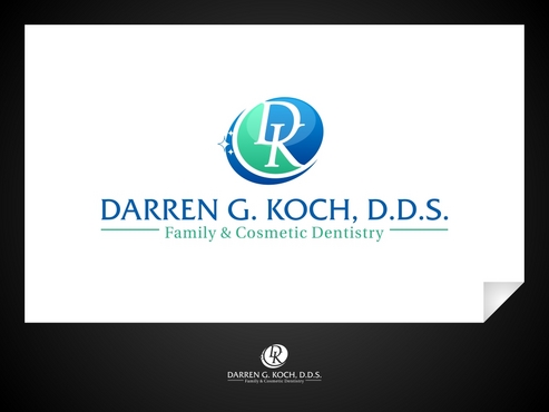
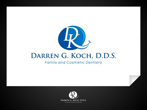
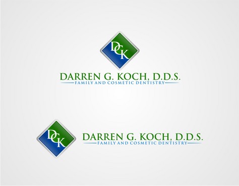
Darren G. Koch, D.D.S.
|
Contest Holder
darrendds
?
Last Logged in : 4084days21hrs ago |
Concepts Submitted
222 |
Guaranteed Prize
350 |
Winner(s) | A Logo, Monogram, or Icon |
|
Live Project
Deciding
Project Finalized


Creative Brief
Stylish and Professional Logo for Dentist
Darren G. Koch, D.D.S.
Family and Cosmetic Dentistry
Yes
Sophisticated. Professionalism. Precision. Modern. High Quality Dental Care.
Health
Symbolic
![]()
Abstract Mark
![]()
Initials
![]()
Modern
Sophisticated
Professional
I'm open to different ideas although I have read that it is best to avoid red which may be symbolic of anger or blood. Certainly Blue and Green are "soothing" colors which would be a nice image to convey. My current logo uses Maroon, Purple, Gold in an attempt to convey a "regal" image. The Gold has always been problematic - in some formats it looks like an ugly pea green and it's difficult to print consistently. I have seen some nice examples of Black and Gold but I'm leery of the gold for the reason just described.
not sure
Please, NO designs with "floating" or "dancing" teeth. In other words, no molars with exposed roots! This is an extracted tooth and NOT the image we want to convey.
My very first logo (~10 years ago) made use of my initials - DK with the "D" as a diagonal smile and the "K" as a person. I liked this concept but it always looked somewhat unrefined and cartoon-ish because of the colors. My current logo is just plain boring and the colors are too dark and were difficult to print consistently. I have uploaded my old logo and current logo for your review.
I have seen many logos with extracted teeth, stick figures, etc. which I don't find very impressive. I'm not convinced that I need an "icon" (tooth, smile, person, etc.) related to dentistry in my new logo, but I'm open to incorporating one or more of these elements if cleverly done. I'm interested to see the creativity of logos with my initials, dental icons, and even abstract images. THANKS!
Related Contests


