Technology embracing law firm logo
Ovalstream
|
Contest Holder
zzeddles
?
Last Logged in : 1972days13hrs ago |
Concepts Submitted
71 |
Guaranteed Prize
350 |
Winner(s) | A Logo, Monogram, or Icon |
|


Creative Brief
Technology embracing law firm logo
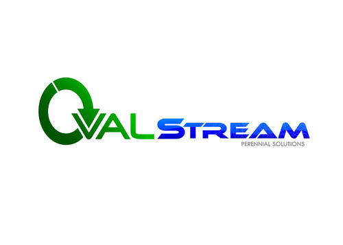
Ovalstream
Perennial Solutions
Yes
I am starting a new law firm which is going to offer legal services remotely and will be heavily based on technology, ie use cloud document storage (www.box.net) , on line accounts (www.freshbooks.com). I am targeting providing legal services for software companies.
I therefore would like the logo design to look fresh.
Law
Logo Type
![]()
Abstract Mark
![]()
Illustrative
![]()
Web 2.0
![]()
Cutting-Edge
Unique/Creative
Clean/Simple
Sophisticated
Modern
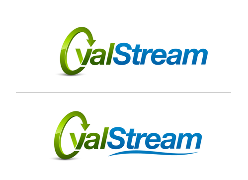
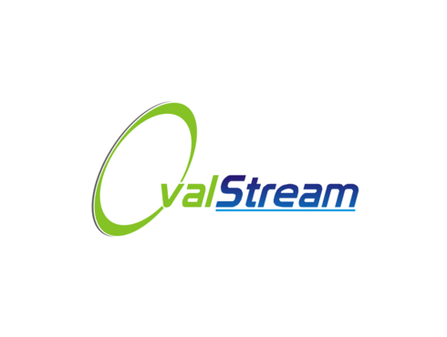
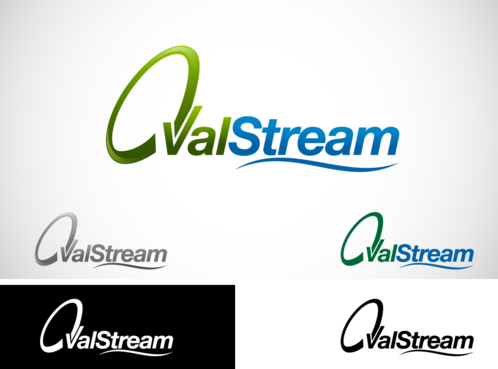
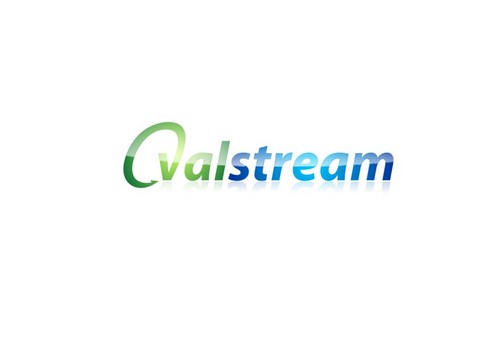
I would like the word 'Oval' to be in green and the word 'stream' to be in blue.
2
I would like the 'O' in Oval to be created by a circular arrow.. a bit like this (but not this look exactly as the 'o' looks too fat for my liking.)
http://www.crestock.com/image/912597-Blue-Refresh-Arrows.aspx
The arrow head could then also double as the 'v' in Oval, so you would have the "O" and the arrow head doubling as the 'v' and then 'alstream'. Hope that makes sense.
It would also be good if the word 'stream' had a watery feel to it, ie maybe a different font to 'oval'?
Anyway that is just my thinking at this stage.
Related Contests