Texas Wild Horse Saloon
Texas Wild Horse Saloon
|
Contest Holder
TXWildHorse
?
Last Logged in : 4429days14hrs ago |
Concepts Submitted
199 |
Guaranteed Prize
400 |
Winner(s) | A Logo, Monogram, or Icon |
|
Live Project
Deciding
Project Finalized


Creative Brief
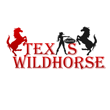
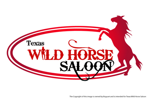
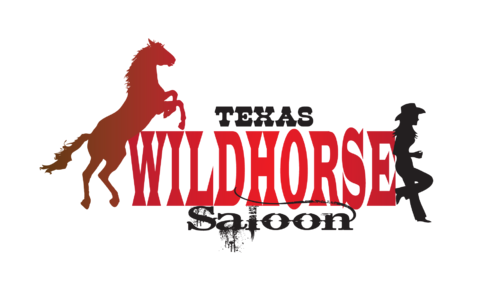
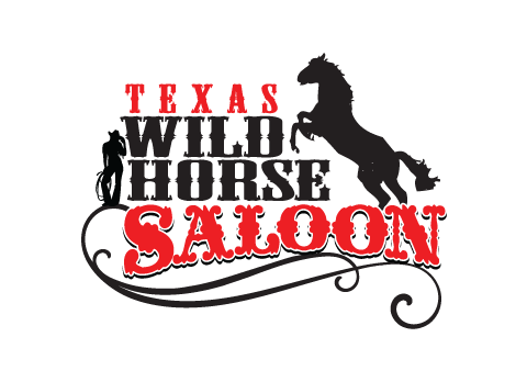
Texas Wild Horse Saloon
Texas Wild Horse Saloon
No
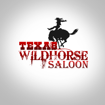
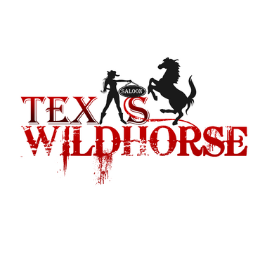
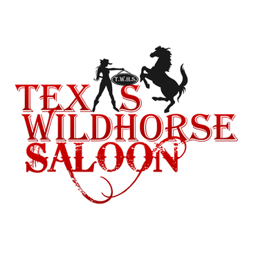
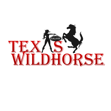
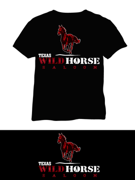
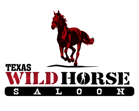
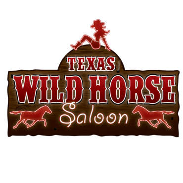
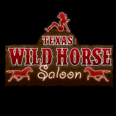
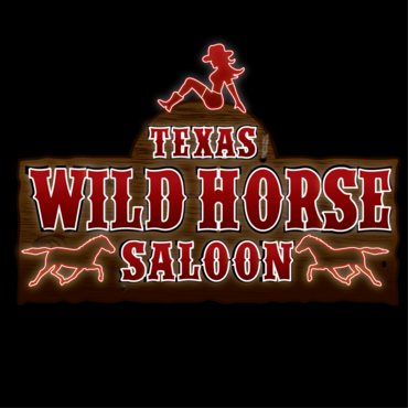
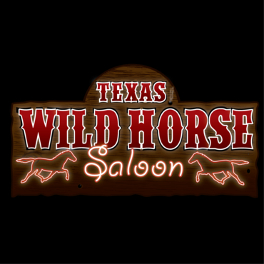
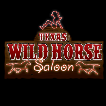
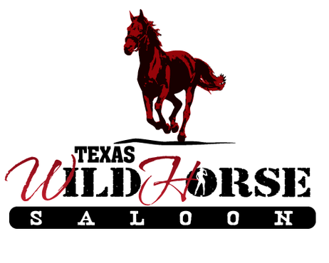
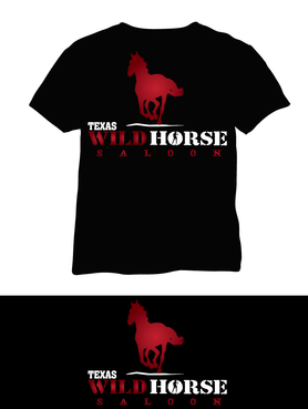
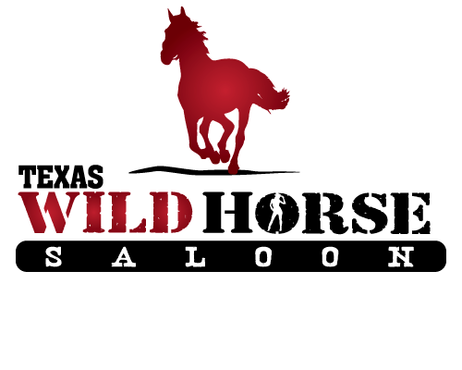
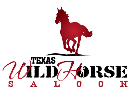
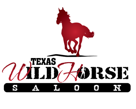
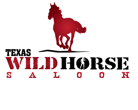
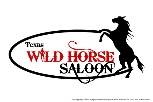
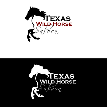
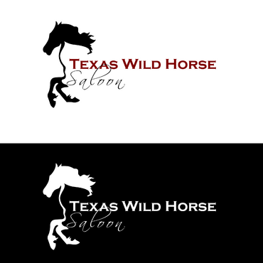
Texas Wild Horse Saloon will be one of the largest "country" nightclubs/dance halls in Houston, Texas. In addition to catering to traditional country patrons, we will also be seeking to attract patrons who might otherwise frequent trendy, "vegas style" nightclubs in the area- by way of expanding musical offerings to include a small percentage of Top 40/Hip-Hop/Electronic music as well as designing the club's decor to not only include traditional country, rustic style ambiance (heavy on wood, animals, beer signs) but also those attractions that are essential to trendy, mega-clubs (metal, glass, LED lighting and screens, etc). Think: country/bar/saloon meets Vegas strip night club.
Entertainment
Character
![]()
Cutting-Edge
Industry Oriented
Would like black and red included if it conceptually fits overall design.
not sure
The word "Texas" is of less importance than "Wild Horse Saloon." It needs to be seen but can be less noticeable or eye-catching. The original name was to be simply Wild Horse Saloon, but we want to slightly differentiate ourselves from any other Wild Horse Saloons in existence.
Related Contests