THE CLOSET - LOGO Design
THE CLOSET
|
Contest Holder
rupeshdesai
?
Last Logged in : 5160days1hr ago |
Concepts Submitted
97 |
Guaranteed Prize
250 |
Winner(s) | A Logo, Monogram, or Icon |
|
Live Project
Deciding
Project Finalized


Creative Brief
THE CLOSET - LOGO Design
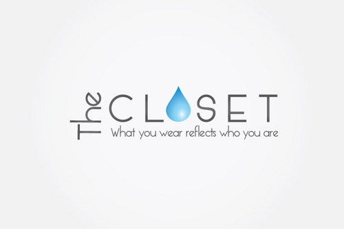
THE CLOSET
What you wear reflects who you are
Yes
The Closet is a brick and mortar retail store for young women. Since it is an apparel store we are not looking for a logo that has obvious design elements such as the hanger or the closet door.
Rather we want something that is fresh, unique and abstract. The store is digitally enhanced with MAC pos and iPads all around for browsing the catalogs, and we intend to soon start the online store where we want to bring the digital experience online. We would like the logo to be clean, with spaced fonts. We want to use this logo on stationary such as price tags, letterheads, invoices etc.
Apparel
Logo Type
![]()
Abstract Mark
![]()
Web 2.0
![]()
Unique/Creative
Clean/Simple
Sophisticated
Serious
Illustrative
Masculine
Youthful
Abstract
No Preference
I want something totally unique, something short and bold, creative and clever. A character, symbol or icon would be great.
Related Contests