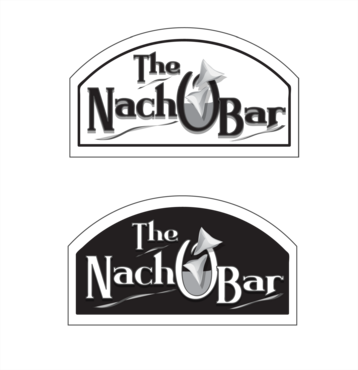
SALES / SUPPORT : +1-877-525-5646   |  


The Nacho Bar

The Nacho Bar

Contest Holder Mikejr74 ?

Last Logged in : 4371days16hrs ago

Concepts Submitted

36

Guaranteed Prize
200
Winner(s)

2

A Logo, Monogram, or Icon veildAll design entries are veiled from other designers till the end of the contest.
tick_gray

Live Project

tick_gray

Deciding

tick_blue

Project Finalized


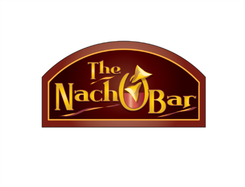
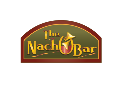
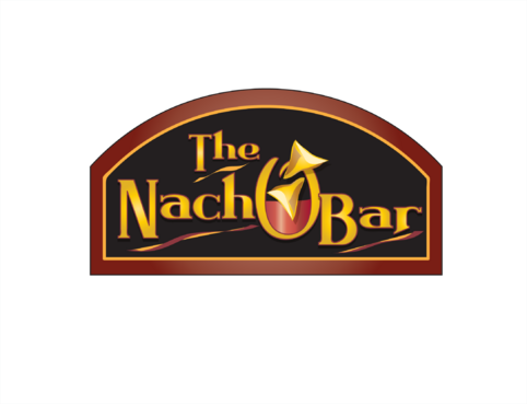
Project: The Nacho Bar
Industry: Food Logo
Contest Launched: Apr 22, 2012
Selected: 2 winning design from 36 concepts
Winning Design by: attidesigns
Close Date: Apr 28, 2012


The Nacho Bar - Food


Awarded as a winner
Project Report    

Sort by:


#34


Creative Brief


The Nacho Bar

The Nacho Bar

No

We are looking for a logo for our nacho bar. The Nacho Bar provides freshly made tortilla chips and with a wide variety of toppings.

Food

Illustrative
Illustrative


Cutting-Edge
Unique/Creative
Clean/Simple

not sure

Related Contests


Logo for a bakery company
$300
Prize Money
139
Concepts
Master Chefs
$390
Prize Money
222
Concepts
Logo for Restaurant
$250
Prize Money
188
Concepts
Logo for a company that produces honey
$200
Prize Money
56
Concepts

Discussion


Comments

  • April 29, 2012 1:34 AM
    auraavatary auraavatary
     
    @fixdesigns: atapz...congratz bro...

    Like Icon 0   DislikeIcon 0
  • April 28, 2012 7:07 PM
    Mikejr74 Mikejr74
      Project Holder
    Thank you to all the designers that participated. Your efforts and designs are appreciated.

    Like Icon 0   DislikeIcon 0
  • April 27, 2012 9:32 AM
    attidesigns attidesigns
     
    Sure, I'll submit later on today

    Like Icon 0   DislikeIcon 0
  • April 26, 2012 11:38 PM
    Mikejr74 Mikejr74
      Project Holder
    attidesigns - We really like your designs. Would you please make one more version? Please add 'Restaurant & Cafe' directly below and centered under 'Nacho Bar' to a copy of #16. It doesn't need to be a large font, maybe half the size of the 'e' in 'The'. Thank you.

    Like Icon 0   DislikeIcon 0
  • April 26, 2012 11:18 PM
    Mikejr74 Mikejr74
      Project Holder
    fixdesign - Thank you for making the various samples. In the end, the just looked too much like an alcohol bar instead of a food bar. Thanks again.

    Like Icon 0   DislikeIcon 0
  • April 26, 2012 10:57 AM
    Mikejr74 Mikejr74
      Project Holder
    fixdesign - can you try one other design, please. Try making the 'chip/glass' play off of the 'O' in Nacho, instaed of it being a separate element. Thank you.

    Like Icon 0   DislikeIcon 0
  • April 26, 2012 10:47 AM
    Mikejr74 Mikejr74
      Project Holder
    Fix design - Very interesting concept. Can you put a stem on the peper, please? Also, is there any way to thicken the lettering to make is a bit more bold? Finally, can you try a design with the same concept, but have a plate (southwestern colors to make the words 'pop') behind the logo - a plate meaning an oblong eclipse that would encompass the words 'The Nacho Bar' and maybe a bit of what could be viewed as the stem of the glass, as if the plate was leaning forward.

    Like Icon 0   DislikeIcon 0
  • April 26, 2012 10:41 AM
    Mikejr74 Mikejr74
      Project Holder
    attidesigns - Excellent, thank you. Can you place a 'black and white' version so that I can see what it would look like in a newspaper advertisement, please?

    Like Icon 0   DislikeIcon 0
  • April 25, 2012 7:28 PM
    Mikejr74 Mikejr74
      Project Holder
    attidesigns - I really like the text format in #10, but the background does make the text 'pop' out. So, will you try the darker background like in #5, please? Also, can you please try to make the 'O' a little bit thicker or bolder?Keep all the other elements of #10 the same. Thank you.

    Like Icon 0   DislikeIcon 0
  • April 25, 2012 3:26 PM
    SiteAdmin SiteAdmin
     
    Attention Designers, MycroBurst permits you to submit unlimited designs with unlimited variations. However, if you show 2 or 3 different color versions of the same logo in one draft, please make sure that if that draft gets finalized, each color version is separated before final files are sent out. Thanks, MB/LDG Team

    Like Icon 0   DislikeIcon 0
  • April 25, 2012 10:56 AM
    Mikejr74 Mikejr74
      Project Holder
    attidesigns - #5 background is a bit too dark and #6 lettering is too much the same as the background that it would be hard to read from any distance. Thank you.

    Like Icon 0   DislikeIcon 0
  • April 23, 2012 9:23 PM
    Mikejr74 Mikejr74
      Project Holder
    NGL83 - Please add the word 'The'. ABVdSIGN/NGL83 - Can you put a frame around your designs so that it is incorporated into the logo design. ABVdSIGN - What if the border was in the shape of a naco chip? NGL83 - What if the border was an oval, like a bowl of salsa or cheese?

    Like Icon 0   DislikeIcon 0