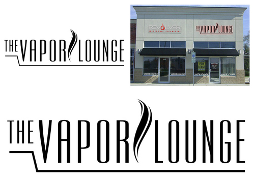
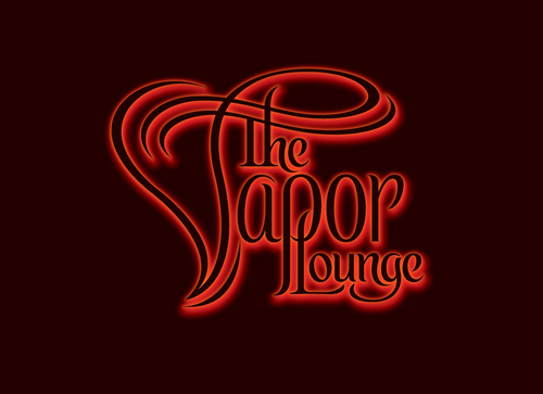
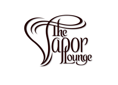
THE VAPOR LOUNGE sign
The Vapor Lounge
|
Contest Holder
sickdis
?
Last Logged in : 3688days19hrs ago |
Concepts Submitted
56 |
Prize Money
350
|
Winner(s) | A Logo, Monogram, or Icon |
|
Live Project
Deciding
Project Finalized


Creative Brief
THE VAPOR LOUNGE sign
The Vapor Lounge
No
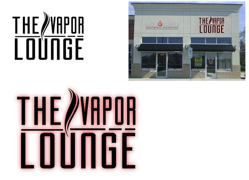
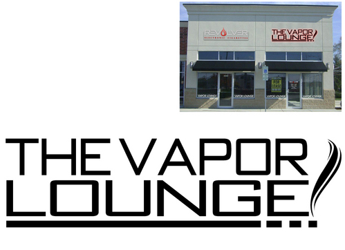
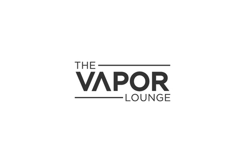
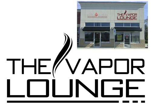
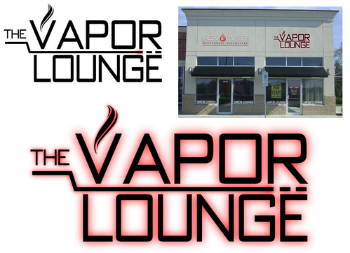
This is the logo for our vapor lounge. We are an electronic cigarette retailer and are opening a lounge within our shop. We want this logo to draw some attention and fit the theme of what we do.
Our website is: http://revolvercig.com/ if you want to see what we are about.
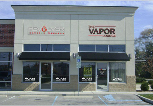
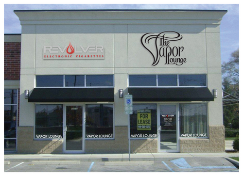
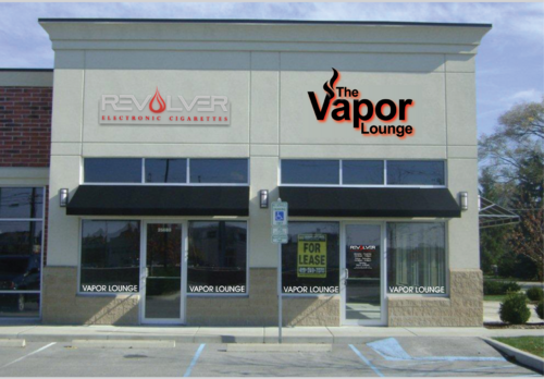
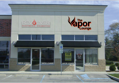
Here is the front of the shop we are putting the sign on. There is already a mock up sign in place to show where we want this. Please do not try to replicate this style of logo, we don't like it.
http://revolvercig.com//1SiteImages/Images/storesign.jpg
The logo MUST be able to be made into a sign.
Entertainment
Logo Type
![]()
Modern
Cutting-edge
High Tech
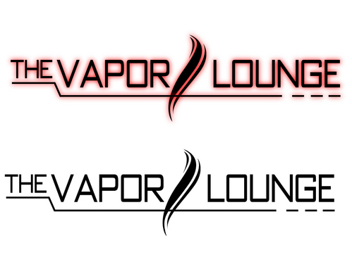
The sign will be black, and have red lighting glow behind it. Here are some examples: http://www.studioafter5.com/sa5wp/wp-content/uploads/2009/04/IMG_5152.jpg http://i01.i.aliimg.com/photo/v2/338559505/Red_Back_lit_LED_Aluminum_Letter_Signs.jpg http://i01.i.aliimg.com/img/pb/254/745/377/377745254_867.jpg
2
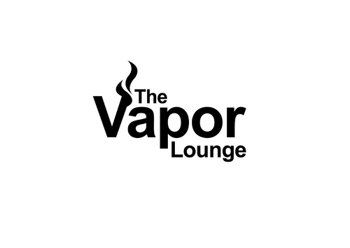
Make it look really modern. I don't know if it is possible, but a vapor cloud would look cool somewhere. Also try to avoid just using a fancy font. We want a logo, not just a nice looking font.
Related Contests