Total Eclipse - Logo Design
Total Eclipse
|
Contest Holder
eclipseproducts
?
Last Logged in : 5045days17hrs ago |
Concepts Submitted
80 |
Guaranteed Prize
250 |
Winner(s) | A Logo, Monogram, or Icon |
|
Live Project
Deciding
Project Finalized

Creative Brief
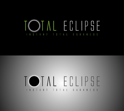
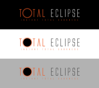
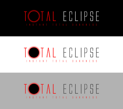
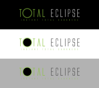
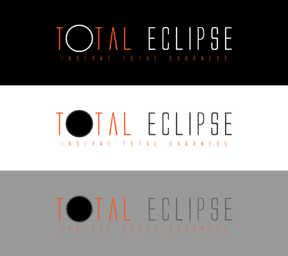
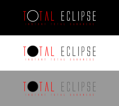
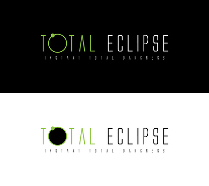
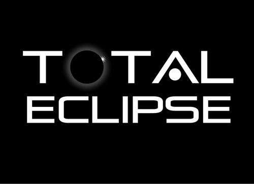
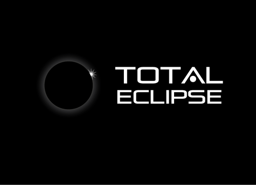
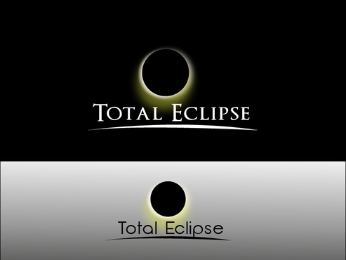
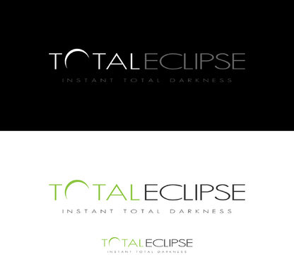
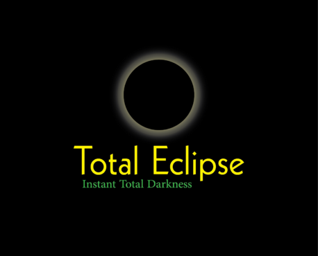
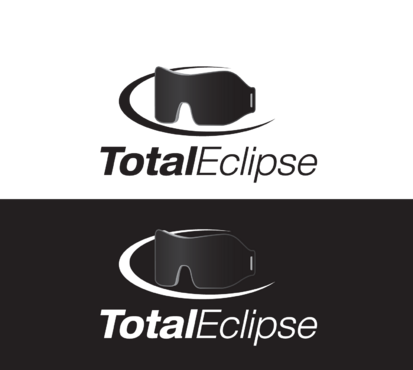
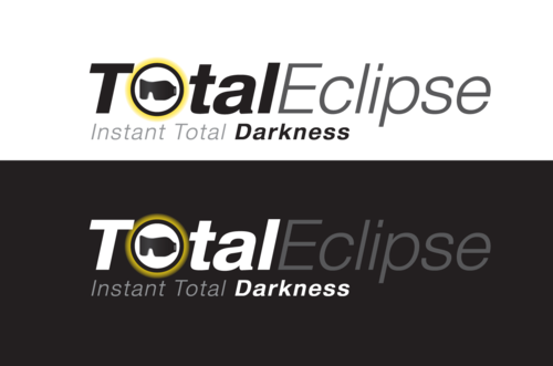
Total Eclipse - Logo Design
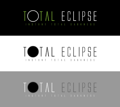
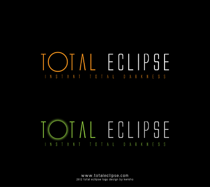
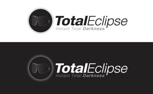
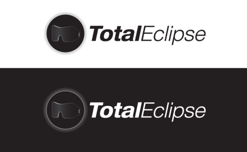
Total Eclipse
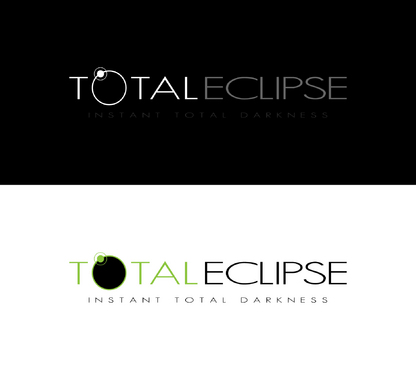
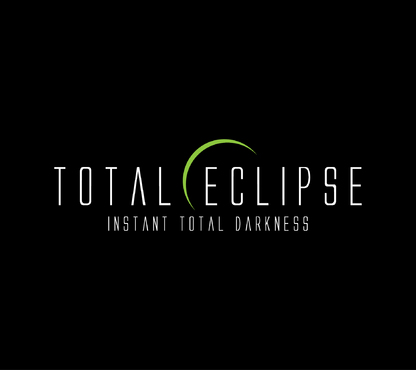
Instant Total Darkness
No
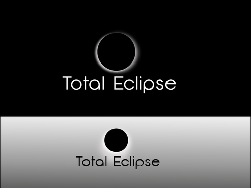
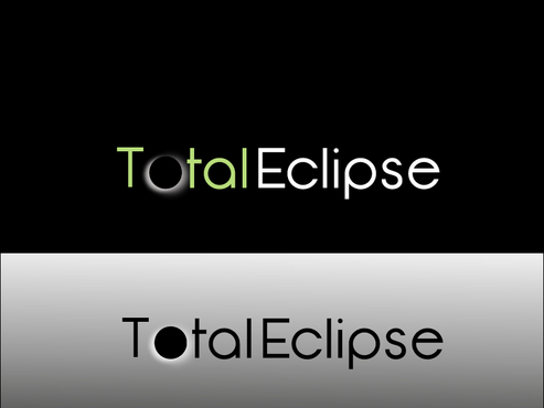
As you may already know, a total eclipse is an astrological event in which the sun is temporarily and entirely blocked by the moon.
My product, the Total Eclipse sleeping mask, is the most functional and customizable sleeping mask on the market.
The brand name "Total Eclipse" is meant to emphasize the product's main function, which is to block light.
The logo will be used for the website, brochures, business cards and on the product itself. When used on the product, the logo will be silk-screened.
Personal Care
Logo Type
![]()
Symbolic
![]()
Abstract Mark
![]()
Cutting-Edge
Clean/Simple
Modern
High Tech
3 colors max: 1) black 2) white 3) your choice (Note: the 3rd color can be different for black vs white background) The logo must look equally good on a white or a black background. I would like all logo submissions to be presented on both a white and a black background.
3
I think that there are some opportunities to consider:
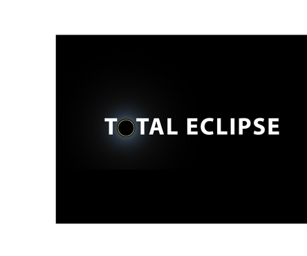
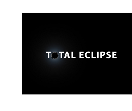
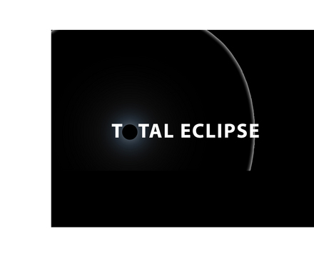
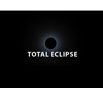
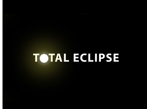
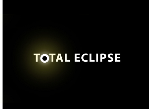
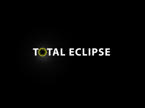
The letter O in TOTAL could be represented with a symbol for a total eclipse.
The letter E in ECLIPSE could be represented with a symbol for a partial eclipse. Note: I would like to avoid partial eclipses if possible.
Related Contests