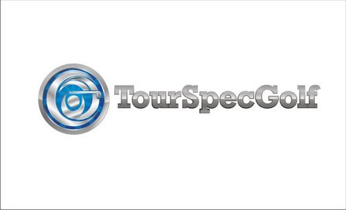
TourSpecGolf / GolfToImpress
TourSpecGolf or GolfToImpress
|
Contest Holder
homebusinesssmart
?
Last Logged in : 4481days22hrs ago |
Concepts Submitted
130 |
Guaranteed Prize
300 |
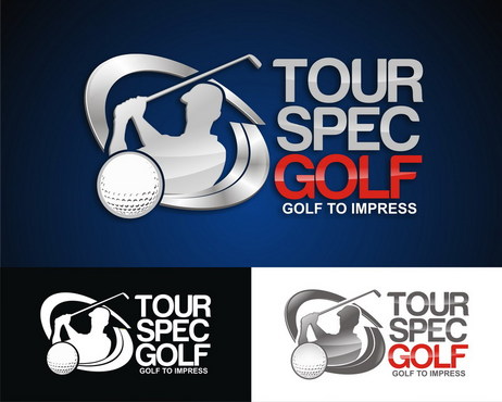
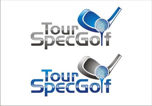
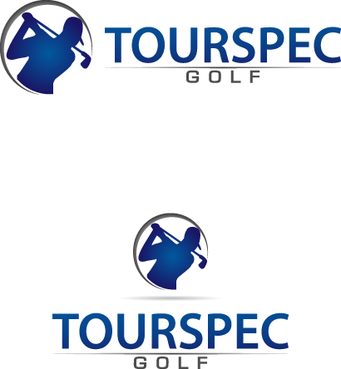
Winner(s) | A Logo, Monogram, or Icon |
|
Live Project
Deciding
Project Finalized


Creative Brief
TourSpecGolf / GolfToImpress
TourSpecGolf or GolfToImpress
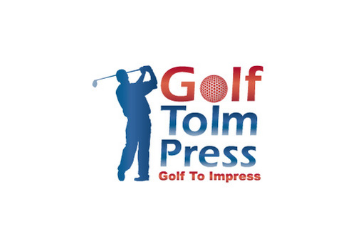
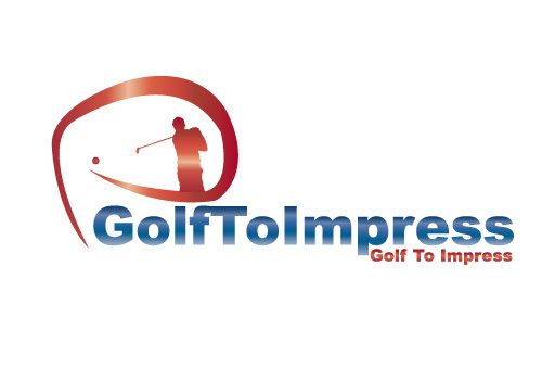
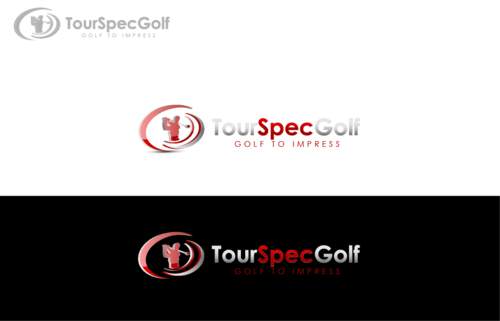
Golf To Impress
Yes
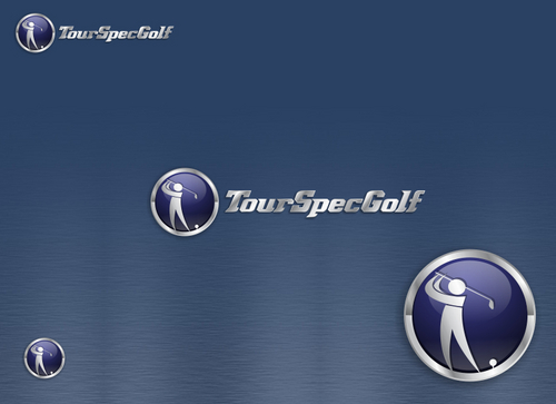
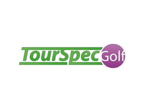
current logo: www.tourspecgolf.com & www.golftoimpress.com
We market, sell, and distribute the highest end technologically advanced JAPANESE Golf Clubs and equipment.
We have thousands of products all expensive and exclusive to the Japan market not seen anywhere else in the world.
We are an internet company, store, blog, forum, and multiple websites with high traffic.
This logo will be seen by many.
Sports
Logo Type
![]()
Symbolic
![]()
Illustrative
![]()
Character
![]()
Web 2.0
![]()
Cutting-Edge
Unique/Creative
Sophisticated
Modern
High Tech
Serious
Masculine
Similar Blue's to the website www.tourspecgolf.com and www.golftoimpress.com both sites will be graphically adjusted but for the most part a very close color scheme used.
not sure
Looking at all ideas really, logo to left and text to right, or logo incorporated, we are open as long as it looks good.
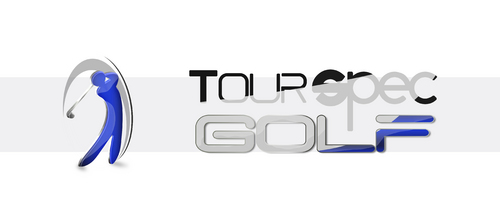
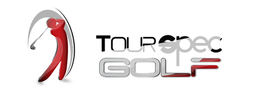
It's the 4th generation of our original logo so it needs to be an upgrade and different than how it
is now. We still like the swing man inside the logo, maybe a varient of that person.
You can try with or without the tagline.
Related Contests