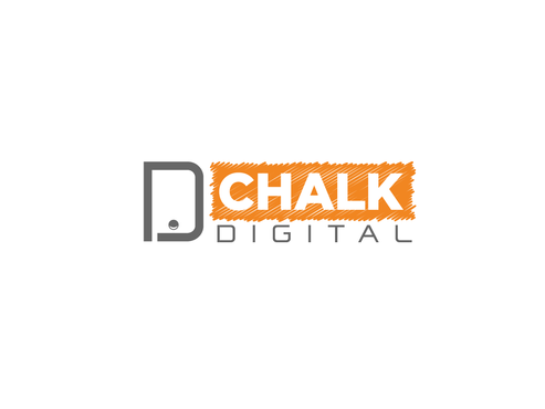
Update our logo, for our Digital Marketing Company.
Chalk Digital
|
Contest Holder
ChalkDigital
?
Last Logged in : 3494days11hrs ago |
Concepts Submitted
75 |
Prize Money
199
|
Winner(s) | A Logo, Monogram, or Icon |
|
Live Project
Deciding
Project Finalized


Creative Brief
Update our logo, for our Digital Marketing Company.
Chalk Digital
No
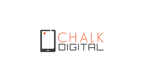
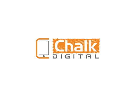
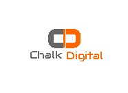
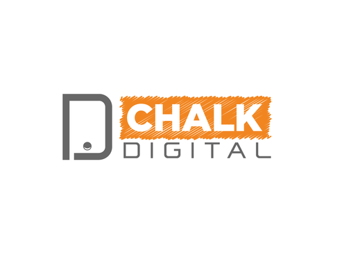
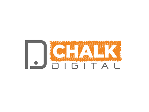
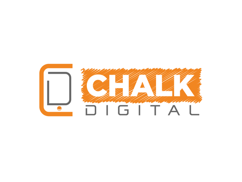
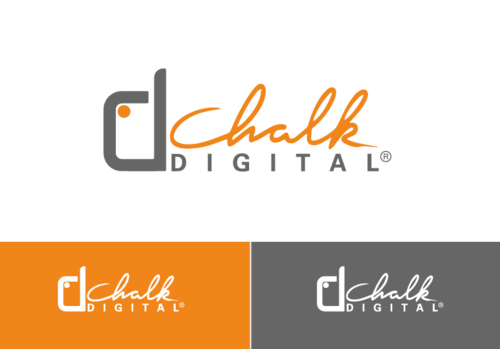
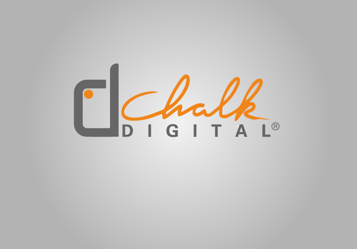
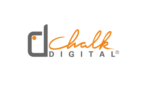
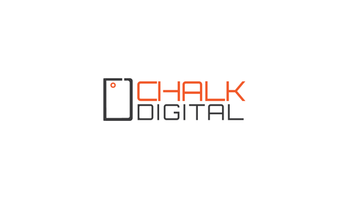
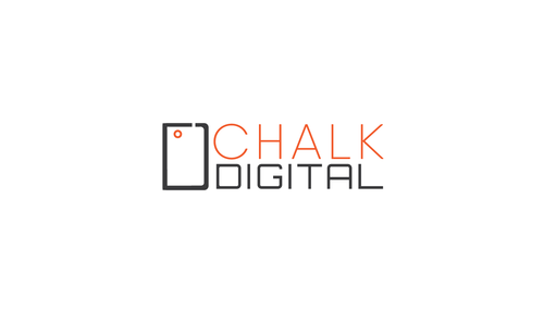
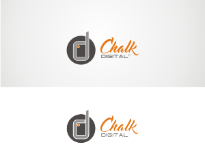
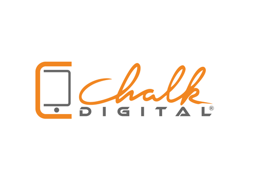
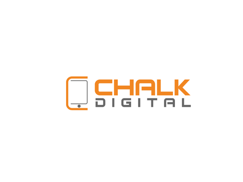
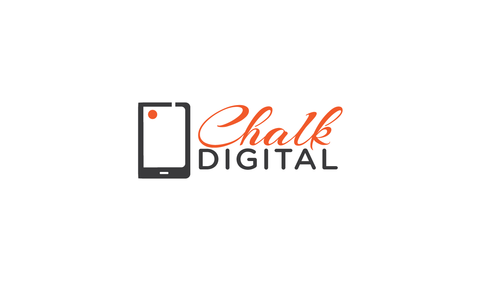
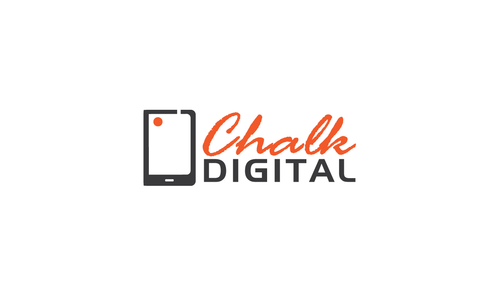
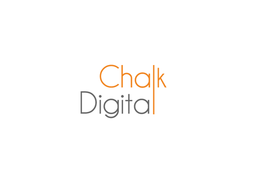
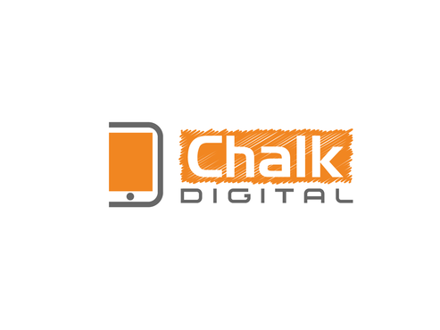
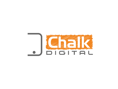
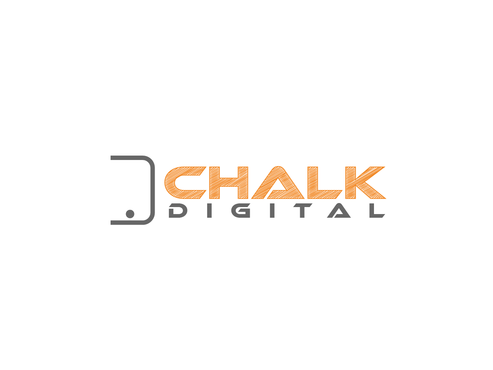
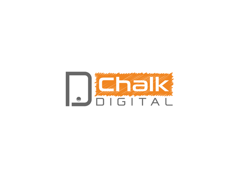
We would like our current logo updated. We need a revamp, version 2.0. We are a technology company, and our logo is a bit outdated. Our company is named Chalk Digital, combining the old and new. We like to think of ourselves as the Digital version of the chalk sandwich board. We would like our updated logo to be sleek and simple and easy to read. We enjoy the contrast of fonts, but they can be updated. We still want to have a mark (the phone/d) and the logo (chalk digital). Please update both.
Advertising
Logo Type
![]()
Symbolic
![]()
Modern
Simple
Professional
Our colors are: Gray: 666666 Orange: F08519
not sure
- 3 D's (phone "d", D in Digital, and Ch - looks like a d.)
- Antenna on phone outdated
- "G" in Digital is non readable
- font size needs to be better proportion
- Chalk font appears "old school" not for a high tech company
These are recommendations we have received, so please take these into consideration. We would still like to have our mark, the phone, and the logo with our name. We would like both to be updated.
Related Contests