SALES / SUPPORT : +1-877-525-5646   |  


Web site template - tight brief supplied

Easy to quickly submit designs with this brief

Contest Holder egene ?

Last Logged in : 4257days18hrs ago

Concepts Submitted

52

Guaranteed Prize
350
Winner(s)

1

Web Design veildAll design entries are veiled from other designers till the end of the contest. Featured Featured Contest Expedite Expedite Contest
tick_gray

Live Project

tick_gray

Deciding

tick_blue

Project Finalized


Project: Web site template - tight brief s ...
Contest Launched: Nov 12, 2011
Selected: 1 winning design from 52 concepts
Winning Design by: MeGaMax3Ds2Dio
Close Date: Nov 16, 2011


Web site template - tight brief supplied - Financial Services


Awarded as a winner
Project Report    

Sort by:


#14

#15

#7

#3

#4

#36

#35

#13

#12

#11


Creative Brief


Web site template - tight brief supplied

Easy to quickly submit designs with this brief

Financial Services

www.bluecrestcapital.com.au

BlueCrest Capital is a financial services firm that manages investments in foreign exchange (FX) markets, to produce consistent and significant returns for everyday retail investors. The service offers a higher-return alternative to the typical direct investments in shares & property. The investment service uses a mathematical algorithm that constantly trades global foreign exchange markets with high-frequency micro trades that generate profits regardless of whether markets are going up or down.

Would like the website to use a deep dark blue-grey colour as background to impart a corporate feel. Refer to the downloadable design brief and related additional comments below. Dislikes: clutter, icons.

Clean/Simple

Professional

Sophisticated

Corporate

Modern

RGB 20,29,42 or something close

RGB 25,37,53

top

http://33722.templates.site2you.com/

http://livedemo00.template-help.com/joomla_34099/#

http://livedemo00.template-help.com/joomla_33329/

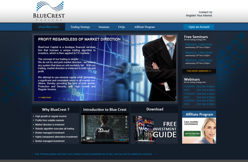
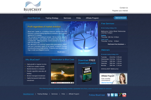
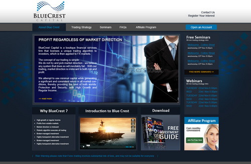
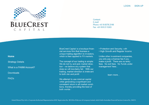
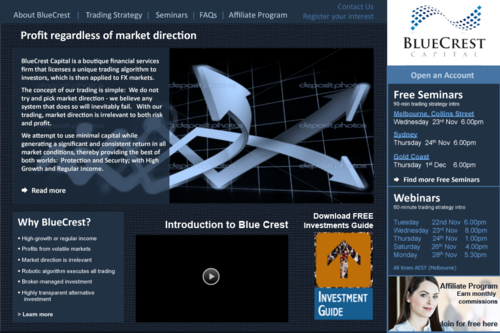
Please refer to the design brief downloadable at this link and the related comments that follow: https://www.yousendit.com/download/T2dlWmdxV3JkMnRESjlVag Notes on the design mock-up: 1. The two slides in PPT represent the home page and then a content page. 2. The dark blue background (1,25,41) is not a fixed choice, however we do like this kind of deep dark greyish blue. Feel free to vary it a little. Also we like the idea of the background having texture and/or gradient. 3. The content used is the actual content except for the 3 images used in the bottom section of the home-page mockup 4. The placement of items on the page is fixed. We want the content to be located where we have placed it. 5. We would like our logo to appear on a white background, however we want the page to mostly have the dark blue background. Feel free to vary the treatment of the header bar. 6. we are open to seeing the top navigation bar being incorporated into the header bar, however we are concerned it will look cluttered 7. For body text we think Arial is the way to go, but are open to other suggestions. For header and link text you will see we have used Calibri, but are open to alternatives. We are interested in seeing a professionals view of how to use different font colours, particularly the blues used in our logo. 8. We want a clean, professional, trustworthy, established, corporate feel for the design. COMMENTS ON REFERRED WEBSITES url 1: we like the modern corporate feel of this site and the use of the deep greys url 2: we really like the use of texture in the backgrounds of this page url 3: while we do not want a white background site, we do like the clean design of this site and we like the dark blue they have used

Related Contests


New corporate website, particularly including a new energy sector.
$450
Prize Money
179
Concepts
New web layout & design for non-profit Private Equity & Venture Capital Association
$350
Prize Money
110
Concepts
Design a killer mainpage for a crowdsourced stock investment website
$350
Prize Money
57
Concepts
Web design for a brogerage co.
$351
Prize Money
160
Concepts

Discussion


Comments

  • November 16, 2011 9:45 AM
    MeGaMax3Ds2Dio MeGaMax3Ds2Dio
     
    Hi PH, please feel free to let me know the required changes so that your expectations are met.Awaiting for your kind feedback Thanks, MegaMax

    Like Icon 0   DislikeIcon 0
  • November 16, 2011 8:31 AM
    InnovativeDesigner InnovativeDesigner
     
    Hi PH, Please check your private message. thanks, InnovativeDesigner

    Like Icon 0   DislikeIcon 0
  • November 15, 2011 6:55 PM
    egene egene
      Project Holder
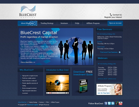
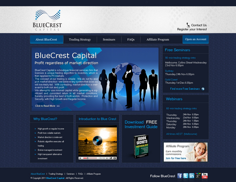
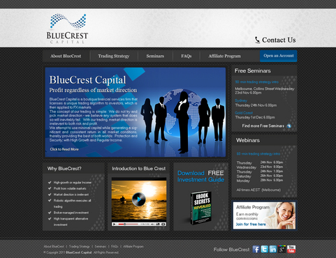
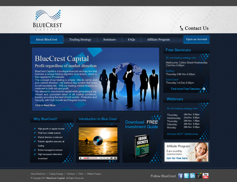
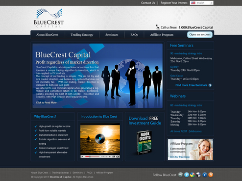
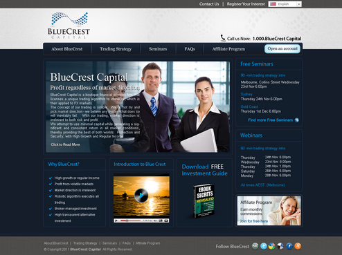
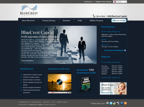
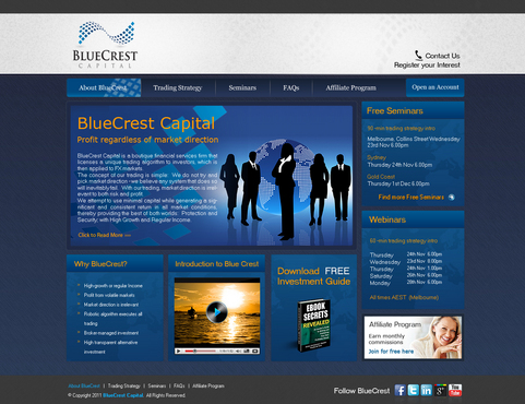
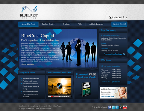
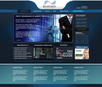
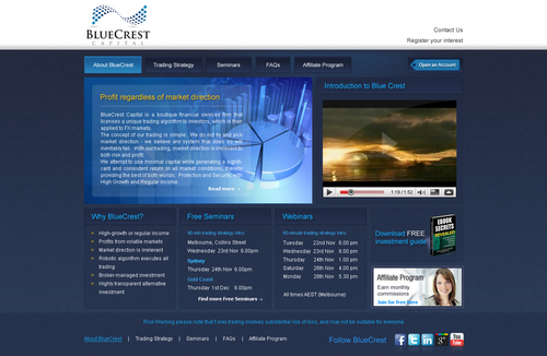
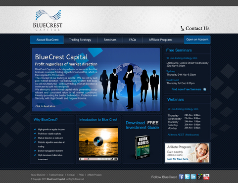
    draft 8, 9, 10 - I like what you've done with the header, and the footer of the page. Please change any Serif fonts on the page to Sans Serif - something other than Arial (which is only used for 'body' text). Please look at moving the Nav bar down so it doesn't overlap the header bar. Please look at adding texture to the background of the body of the page and doing something more interesting with the boxes. Would prefer square-cornered boxes to rounded-corner boxes. please change the social media icons back to traditional square icons as specified in the draft. Please remove the language selection at the top, and consolidate "Contact Us", "Register Your Interest" and "call us now..." into just one link "Contact Us". thanks

    Like Icon 0   DislikeIcon 0
  • November 15, 2011 6:41 PM
    egene egene
      Project Holder
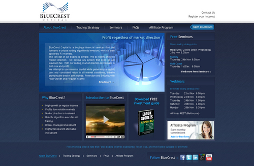
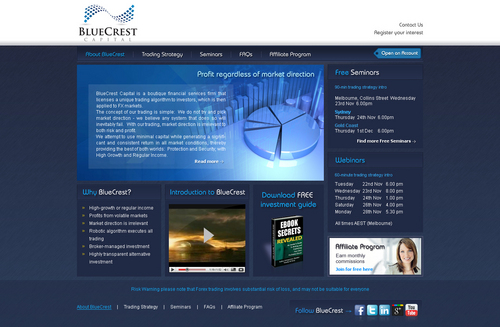
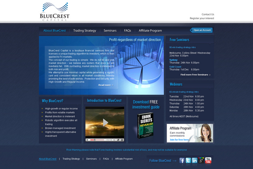
    draft #7 - I like the textured background. i don't like the font used for the box headers, please try something else. Also I like the subtle box around the headers, but please remove the little 'quote' effect with the piece that drops down. Attach the Nav bar to the header bar.

    Like Icon 0   DislikeIcon 0
  • November 15, 2011 6:03 PM
    egene egene
      Project Holder
    COMMENT TO ALL: Thank you for your submissions. A general direction to all of you... Please focus on refining how the page is spaced, the use and balance of colour, the selection of fonts, and adding more 'texture' and 'depth' to the page with subtle design elements that make it feel more higher quality, more luxurious, more substance.

    Like Icon 0   DislikeIcon 0
  • November 15, 2011 6:02 PM
    egene egene
      Project Holder
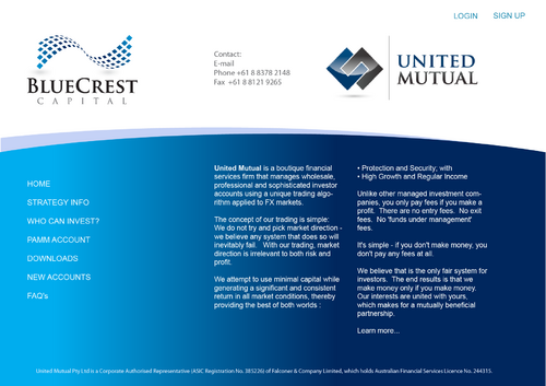
    draft #6 - repositioning the items on the page is not working for me. please work with the items appearing in the locations shown in the brief.

    Like Icon 0   DislikeIcon 0
  • November 15, 2011 5:56 PM
    egene egene
      Project Holder
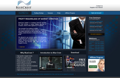
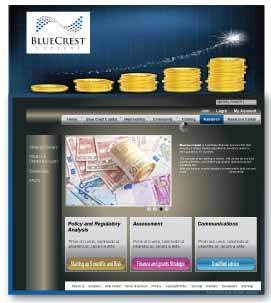
    draft #5 - don't use a serif font anywhere in the page design. Please use a sans serif font other than Arial. Also please have an attempt at doing something more interesting with the boxes on the page, to create more visual depth & detail.

    Like Icon 0   DislikeIcon 0
  • November 14, 2011 9:52 AM
    SiteAdmin SiteAdmin
     
    Contest is extended for 3 more days. -Liz

    Like Icon 0   DislikeIcon 0