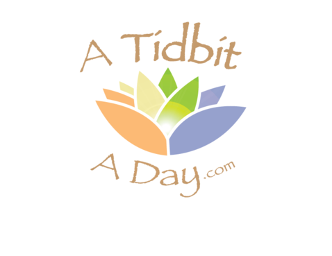
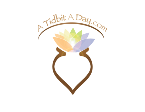
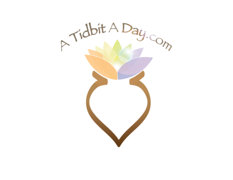
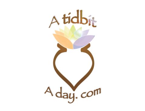
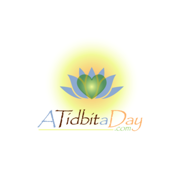
Website/Blog Logo
ATidbitaDay.com
|
Contest Holder
Tidbit
?
Last Logged in : 5582days15hrs ago |
Concepts Submitted
80 |
Guaranteed Prize
150 |
Winner(s) | A Logo, Monogram, or Icon |
|
Live Project
Deciding
Project Finalized


Creative Brief
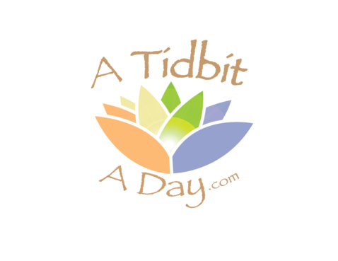
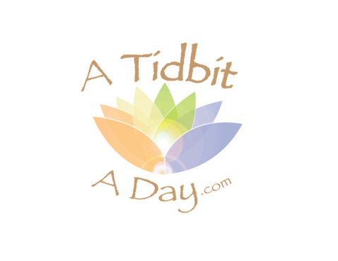
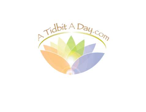
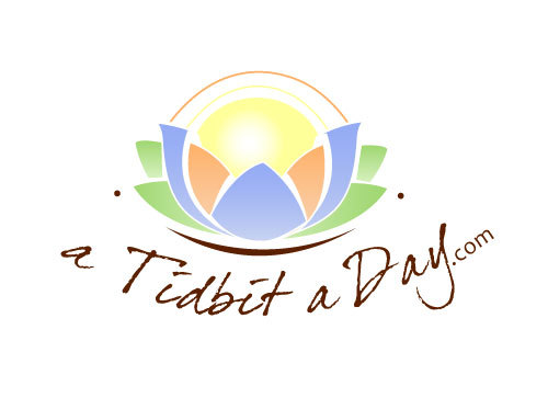
Website/Blog Logo
ATidbitaDay.com
Improving Your Life Bit by Bit
No
A Tidbit a Day saves people time and helps them make the best decisions possible regarding their health and well-being. The website/blog ATidbitaDay,com offers one important, timely and valuable “nugget” each day guaranteed to provide readers a benefit quickly with no effort on their part. Just a very short tip (100 words or less!) with advice, suggestions, recommendations and the links needed to act and benefit. Credibility, trustworthiness and transparency are the keys to this site, backed by solid, careful and unbiased research.
Communications and Media
Symbolic
![]()
Unique/Creative
Clean/Simple
Serious
Just as a jumping off point, I like the feeling of this "palette", especially the blue, green and "orange" blue: 95ABF4, yellow: FFFF99, orange: FEB066, green: 9ED66F, brown: 5C2100
not sure
Feel free to check out the "beta" of my website at www.atidbitaday.com, and you'll see the imagery I've come up with so far. For the logo I've been playing around with an abstract "yoga/lotus" shape with arms up and a solid orb or "head" (tidbit), with the website name in an arc above, but I'm creatively challenged and came here looking for your ideas. What I like is the "ancient wisdom" idea and the feeling of inspiration/epiphany (like a light bulb turning on) that the up-stretched arms gives. Would like to avoid an overly feminine logo though. **please note that capitalization is unimportant - no conventions are required or assumed for this logo (just because I use the
Related Contests