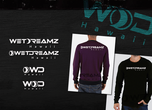
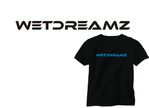
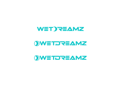
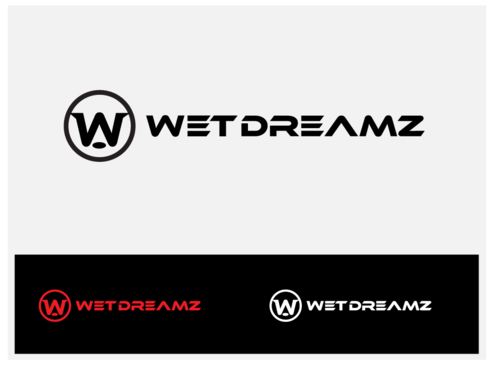
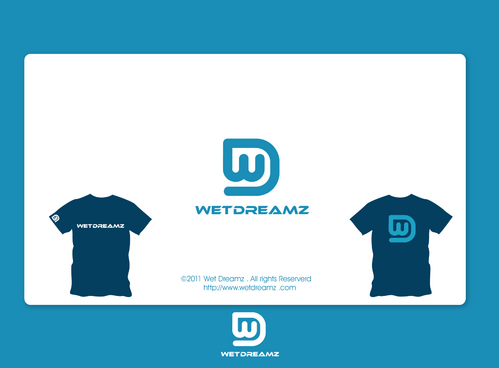
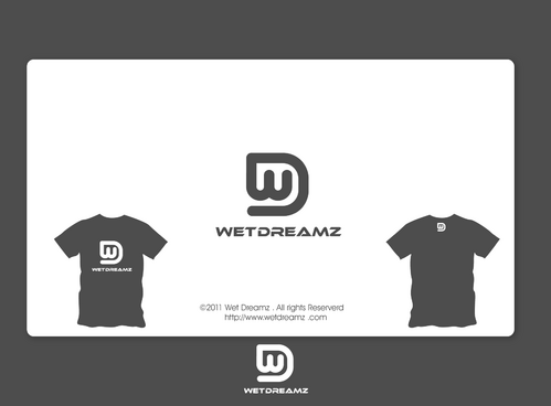
Wet Dreamz Logo
Wet Dreamz
|
Contest Holder
WetDreamz
?
Last Logged in : 5285days13hrs ago |
Concepts Submitted
230 |
Guaranteed Prize
200 |
Winner(s) | A Logo, Monogram, or Icon |
|
Live Project
Deciding
Project Finalized


Creative Brief
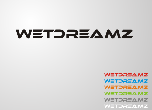
Wet Dreamz Logo
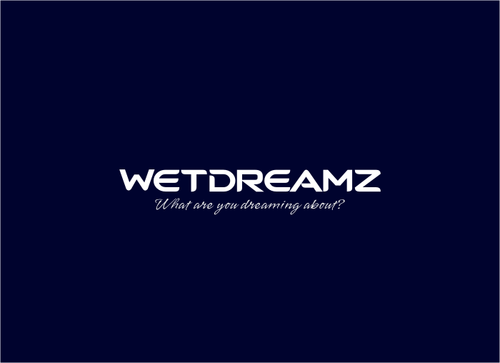
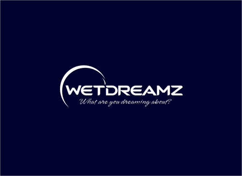
Wet Dreamz
What are you dreaming about?
No
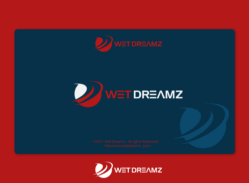
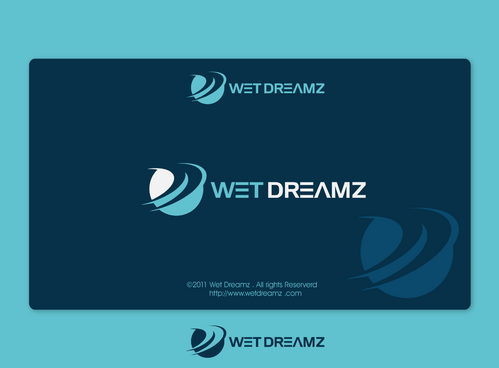
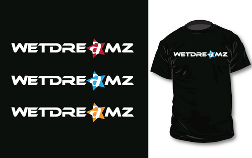
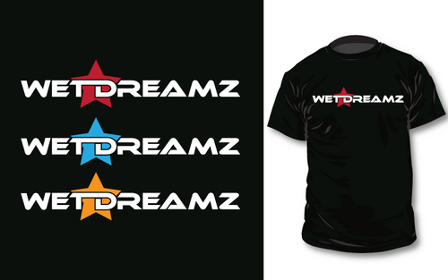
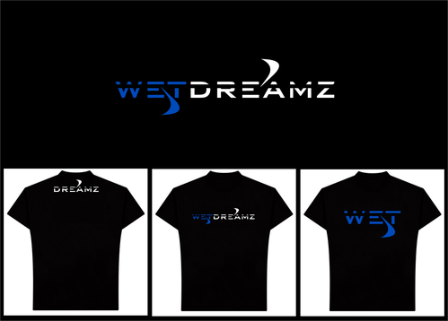
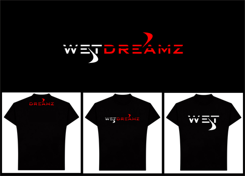
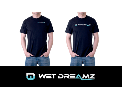
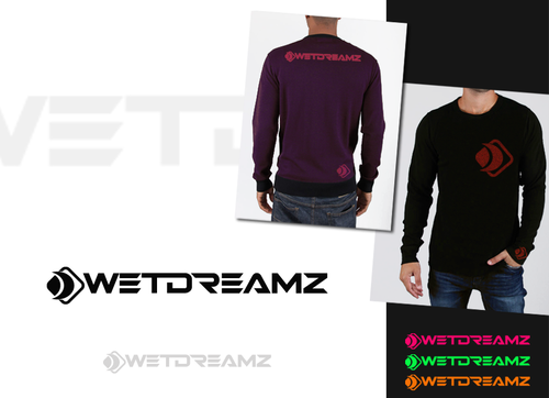
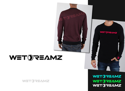
Being from Hawaii the ocean is our life. This name is about dreaming about the perfect day at the beach weather you are a surfer dreaming about the perfect wave getting barreled at the famous Hawaii beach Bonzai pipeline or a spearfisherman in placid crystal clear waters catching the fish of your dreams. For all ocean lovers. Designs will be used for stickers and on t-shirts and other products. We are a clothing brand which will bring the street art feel of urban clothing to beach wear.
Apparel
Logo Type
![]()
Symbolic
![]()
Abstract Mark
![]()
Cutting-Edge
Unique/Creative
Clean/Simple
Sophisticated
Modern
Fun
Serious
Abstract
I want the logo to look good in a variety different colors so we can change it to match accordingly.
not sure
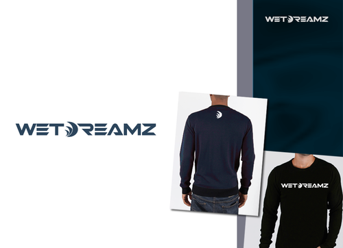
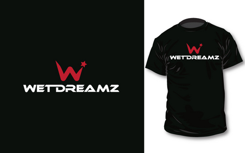
I want it to have a streetwear feel. I want to stay away from cliche things like water drops or waves unless you feel you can make something amazing with it, other then that steer clear of those. Also if able choose a nice cursive font for the name which will be put on clothing tags.(this will be separate from the main logo name and design)
Related Contests