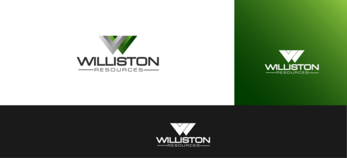
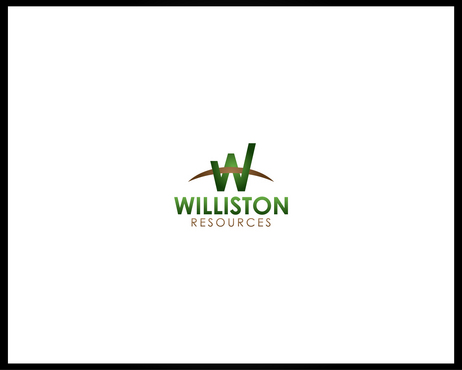
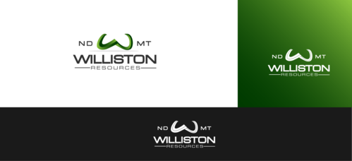
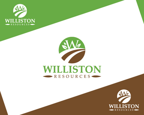
Williston Resources
Williston Resources
|
Contest Holder
joshuawert
?
Last Logged in : 5151days59mins ago |
Concepts Submitted
242 |
Guaranteed Prize
401 |
Winner(s) | A Logo, Monogram, or Icon |
|
Live Project
Deciding
Project Finalized


Creative Brief
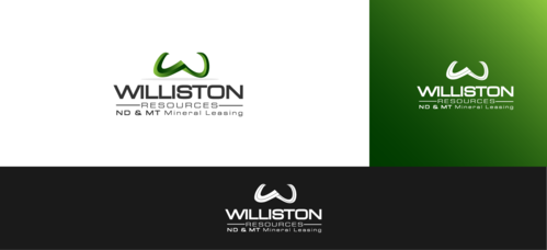
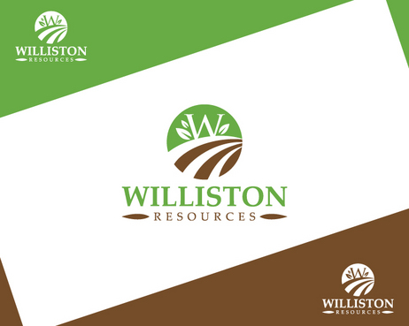
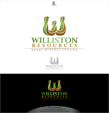
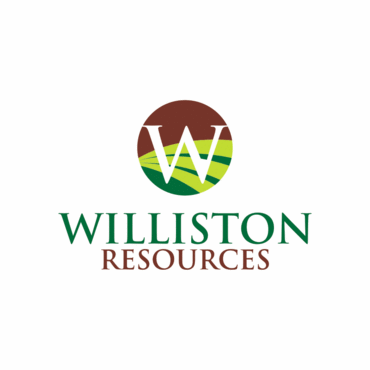
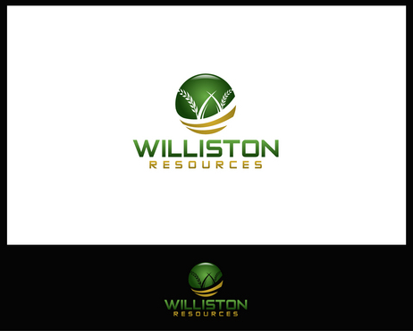
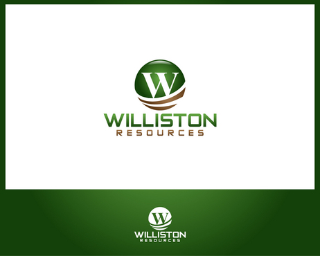
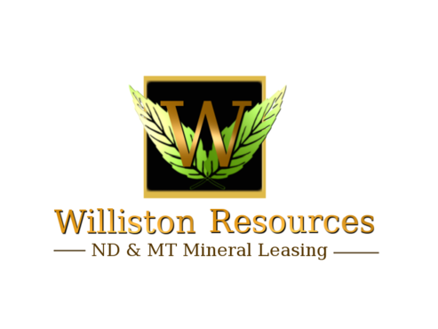
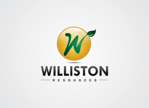
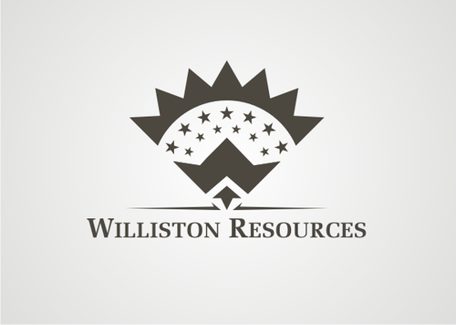
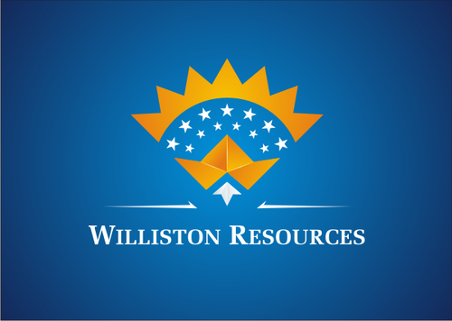
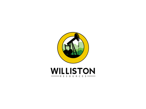
Williston Resources
Williston Resources
ND & MT Mineral Leasing
Yes
This is a business. Our strategy is to drive traffic to a website (the only place this logo will be utilized). The target audience are owners of North Dakota and Montana mineral rights, specifically those located in what is referred to as the Williston Basin. The target audience could be land-owners (farmers) living in North Dakota, or descendants of people who used to own land / mineral rights in North Dakota - this later group usually own their mineral rights by way of a will (i.e., their father / mother / grandparent left them the mineral rights that they owned.
Energy
Illustrative
![]()
Clean/Simple
Corporate
Industry Oriented
Outdoors/Natural
Traditional
Local/Neighborhood
Retro
Serious
Masculine
Colors could be natural and organic: dirt brown, green like leaves on a tree, yellow like wheat, corn, the sun... Although
3
Related Contests