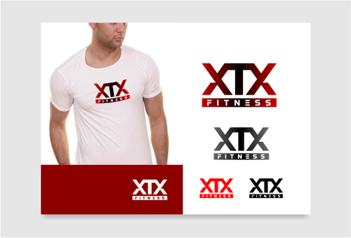
SALES / SUPPORT : +1-877-525-5646   |  


XTX Fitness

XTX Fitness

Contest Holder mrankin ?

Last Logged in : 3341days11hrs ago

Concepts Submitted

141

Guaranteed Prize
200
Winner(s)

1

A Logo, Monogram, or Icon veildAll design entries are veiled from other designers till the end of the contest.
tick_gray

Live Project

tick_gray

Deciding

tick_blue

Project Finalized


Project: XTX Fitness
Industry: Sports Logo
Contest Launched: May 08, 2014
Selected: 1 winning design from 141 concepts
Winning Design by: giddycardenas
Close Date: May 21, 2014


XTX Fitness - Sports


Awarded as a winner
Project Report    

Sort by:


#67

#53

#34

#22

#2

#57

#138

#137

#136

#135

#103

#102

#101

#87

#85

#81

#80

#79

#77

#76

#75

#74

#73

#72

#71


Creative Brief


XTX Fitness

XTX Fitness

No

XTX Fitness is a cross training class similar but not identical to crossfit etc.

Sports

Logo Type
Logo Type


Traditional
Simple
Rustic

i like red and black but am not married to those colors

not sure

XTX Fitness. xtx stands for cross training explosion/extreme/experience. I would like the XTX and fitness to be separate from each other and not intertwined together

Related Contests


Logo for apparel line
$250
Prize Money
273
Concepts
Logo for sports website & apparel
$300
Prize Money
53
Concepts
Vivint
$300
Prize Money
95
Concepts
Gladiadores F.C. soccer logo
$200
Prize Money
49
Concepts

Discussion


Comments

  • May 11, 2014 8:51 AM
    mrankin mrankin
      Project Holder
    I think the red/black color schemes are our favorites. The logos with ~people and abstract symbols in them are not our favorites. We also tend to prefer the XTX over the word fitness and liked it better when the xtx were the same color for the most part Just wanted to provide some feedback on the drafts we are leaning towards. Draft #22 + draft #23- color changes. also would like to know if separating the color shading on the Ts from the Xs might be more effective. But not separating the actual letters Draft #11- #12- would it look better with fitness centered on 11. and while i like the red box i am not sure it's going to work for a logo but the font style and colors are good. Draft #7- we like the ~swords but they might be too big and distracting and the t seems off center draft #4- we like 4 a lot and although very simple the shading is nice. draft #9- probably the most polarizing design where people liked a lot and people didn't like alot. like the concept, maybe the font could be better so many of the other designs and ideas are cool but just don't encompass the toughness and iron we are looking for in this type of logo thank you everybody. this is one of two projects we have in developement, the other is Spring Mill Youth Camp (by a different employee) and wish some of you guys would give that one a try

    Like Icon 0   DislikeIcon 0