Massimo Vignelli (Jan 10, 1931 – May 27, 2014) was an Italian designer born in Milan, Italy. He was a well known graphic designer and was popular for his modernistic perspective in designing.
You might have wondered why his designs were so popular. I can tell you it is because he was never satisfied to stay in one field and studied the design industry with a passion that few can claim to match. As a result, his work holds a timeless quality that designers strive to achieve with their own work.
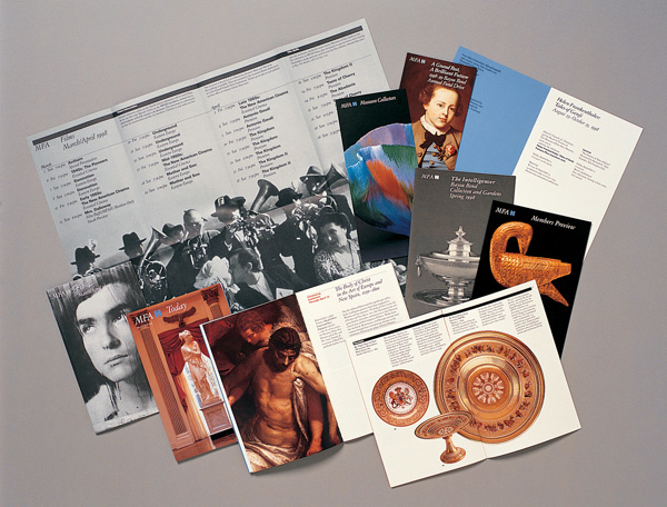
He work spans across various areas of the design field from product packaging, corporate identity and posters, to designing museums and décor. Massimo also known for designing the signage for New York and Washington subways. The signage is still in use today!
Don’t be fooled by the seemly simple nature of his designs, he had a brilliant mind that used an extensive amount of design technique to bring every design to life.
His logo designs only added to the success of the businesses he chose to work with. He had several successful brands as clients and many of them are still customers to his company.
Vignelli preferred to keep his designs simple yet elegant by inculcating geometrical concepts in them.
Shapes are often chosen because of what they represent. Rectangles, squares, and triangles have hard corners that may feel abrasive to people. A circle lacks these hard corners and is viewed as friendly and welcoming. You can see the thought he had behind these logos because he clearly understood how people view shapes.
The Ford logo is Vignelli’s creation. Its description is that of the shape of an ellipse and filled in with blue color. The word ‘Ford’ is written in silver. This logo became the trademark for the company.
He also made the corporate identity and promotional graphics for BK Italia. Its logo was also simple with the use of geometrical concepts i.e. a reddish orange color filled circle with the initials BK in white.
Image Source: designculture.it
Typography is central to good logo design. You have two options with typography: creating your own custom typeface or adapting an existing one.
Designers will choose to go with an existing one when it fits the brand. Consider the brand name – if sounds unusual than a simple typeface might work best.
The Bloomingdale logo is without any symbol; written in simple Bauhaus typeface with the two O’s of the word entwined. Unlike the American Airlines, Bloomingdale still cherishes its logo designed by the most celebrated designer. Vignelli also designed the famous brown bag for them.
He made the famous American Airlines logo that emphasized on two colors; blue and red. He did this to represents the United States of America. That logo was used by the Airlines for 45 years when they changed it last year and was much criticized for that. The typography is simple, but the way it was used made to make it work.
His poster for Knoll International is an excellent specimen of his work. It was a colorful one with each letter of the company name overlapping the other along with the details written in small font.
Check out these simple and clean poster designs! He was no doubt a great graphic designer and just like his logos, the posters made by him were also outstanding!
He studied architecture from Politecnico di Milano and later continued it from Università di Architettura, Venice. He visited America on and off, but in 1966 he returned to New York to set up a new company branch there, namely Unimark International.
While he was working at Unimark International, Vignelli designed the American Airways corporate identity, NYC subway map and signage.
He was not only famous for making the corporate identities. His NYC subway map caused a great controversy. Although it was a colorful map, it had no relation to the actual geography of the system. To many, it was a poor design to start with. According to him, the NYC Subway map wasn’t a map, but a diagram.
However, the map is one of his most famous works.
Apart from being an extraordinary graphic designer, Vignelli designed several corporate identities, was an accomplished furniture designer, a product and an interior designer as well. His best designs resisted overcrowding the room. His designed the space to allow visitors to maneuver with ease.
He designed the interior, which has beautiful walls and spaces, and it speaks well of their creator’s art.
Images source: segd.org
He also designed the interior for St. Peter’s Church, and various showrooms like that of BK Italia under the banner of Vignelli Associates.
No matter what Massimo Vignelli set out to do, he worked hard to create a finished product he could be proud of. He has set the bar high for future designers.
He wore many hats and dipped into every aspect of design, stayed true to the design techniques he studied, and didn’t back down from criticism. Be it graphic designing or any other area of the designing field, Vignelli proved his magnificence and he will be well-remembered.
The legendary artist died at the age of 83 at his home in New York.
He once described the life of a designer as that of a fighter who fights against ugliness. Tell us in the comments below what you think about about Massimo Vignelli and his career. Do you feel he made an impact on the design industry?
The design of your website plays a significant part in determining the outcome of your…
You probably have heard about the saying, "Don't judge a book by its cover." While…
You have probably heard the buzz by now: data is the next big thing! We…
Gen Z, Gen Z, and Gen Z! This looks to be one of the most…
While spirituality and branding may seem very different or even opposing sides, they can come…
If you are in the fintech business you already know that becoming known can take…