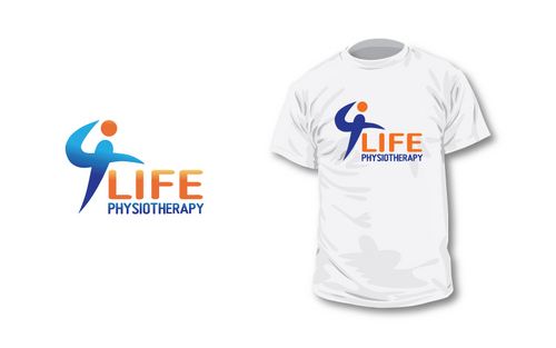
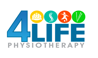
4 Life Physiotherapy Logo
4 Life Physiotherapy
|
Contest Holder
4lifephysiotherapy
?
Last Logged in : 5484days11hrs ago |
Concepts Submitted
275 |
Guaranteed Prize
450 |
Winner(s) | A Logo, Monogram, or Icon |
|
Live Project
Deciding
Project Finalized


Creative Brief
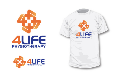
4 Life Physiotherapy Logo
4 Life Physiotherapy
Yes
4 life physiotherapy is a physiotherapy (physical
therapy) practice on the west coast of australia.
The area is surrounded by the ocean and is not
only a fast growing city but also has
a large holiday maker and retiree market.
The owners are young (30ish) but experienced
clinicians who work with some international
mining clients and high level sporting clubs
in addition to the day to day running of the
physiotherapy centre.
The practice has 4 focus areas:
Occupational Health (mining)
Sports (onsite gymnasium)
General Practice (spinal)
Acupuncture
Health
Logo Type
![]()
Symbolic
![]()
Abstract Mark
![]()
Cutting-Edge
Unique/Creative
Modern
Fun
Illustrative
A creative way to include 4 colours would be ideal (going along with the "4" marketing" however we are open to any colour combinations. Wanting the colours to be eye catching and a little fun, but to still maintain a professional feel.
3
Ideally the logo should include a graphic component that could be used away from the logo. Also the number "4" will be used away from the logo.
Related Contests


